

Table of Contents
1 Simple graphs
Overview
Simple graphs are provided for the visualization of data gathered by items.
No configuration effort is required on the user part to view simple graphs. They are freely made available by Zabbix.
Just go to Monitoring → Latest data and click on the Graph link for the respective item and a graph will be displayed.
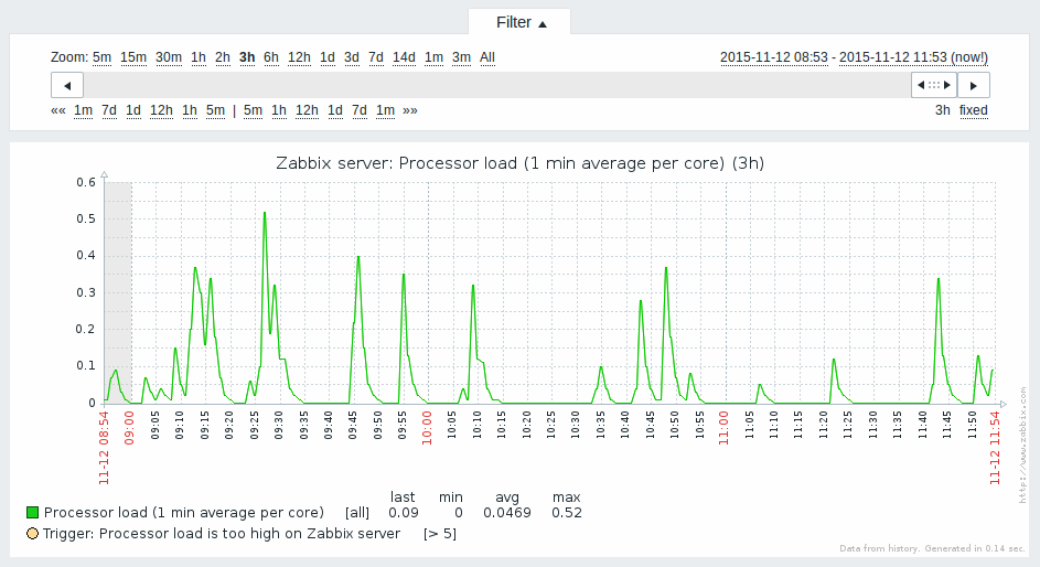
Time period selector
Take note of the time period selector above the graph. It allows you to select the desired time period easily.
The slider within the selector can be dragged back and forth, as well as resized, effectively changing the time period displayed. Links on the left hand side allow to choose some often-used predefined periods (above the slider area) and move them back and forth in time (below the slider area). The dates on the right hand side actually work as links, popping up a calendar and allowing to set a specific start/end time.
The fixed/dynamic link in the lower right hand corner has the following effects:
- controls whether the time period is kept constant when you change the start/end time in the calendar popup.
- when fixed, time moving controls (<< 1m 7d 1d 12h 1h 5m | 5m 1h 12h 1d 7d 1m >>) will move the slider, while not changing its size, whereas when dynamic, the control used will enlarge the slider in the respective direction.
- when fixed, pressing the larger < and > buttons will move the slider, while not changing its size, whereas when dynamic, < and > will enlarge the slider in the respective direction. The slider will move by the amount of its size, so, for example, if it is one month, it will move by a month; whereas the slider will enlarge by 1 day.
Another way of controlling the displayed time is to highlight an area in the graph with the left mouse button. The graph will zoom into the highlighted area once you release the left mouse button.
Simple graphs are provided for all numeric items. For textual items, a link to History is available in Monitoring → Latest data.
Recent data vs longer periods
For very recent data a single line is drawn connecting each received value. The single line is drawn as long as there is at least one horizontal pixel available for one value.
For data that show a longer period three lines are drawn - a dark green one shows the average, while a light pink and a light green line shows the maximum and minimum values at that point in time. The space between the highs and the lows is filled with yellow background.
Working time (working days) is displayed in graphs as a white background, while non-working time is displayed in grey (with the Original blue default frontend theme).
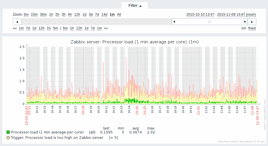
Working time is always displayed in simple graphs, whereas displaying it in custom graphs is a user preference.
Working time is not displayed if the graph shows more than 3 months.
Generating from history/trends
Graphs can be drawn based on either item history or trends. A grey caption at the bottom right of a graph indicates where the data come from.
Several factors influence whether history of trends is used:
- longevity of item history. For example, item history can be kept for 14 days. In that case, any data older than the fourteen days will be coming from trends.
- data congestion in the graph. If the amount of seconds to display in a horizontal graph pixel exceeds 3600/16, trend data are displayed (even if item history is still available for the same period).
- if trends are disabled, item history is used for graph building - if available for that period. This is supported starting with Zabbix 2.2.1 (before, disabled trends would mean an empty graph for the period even if item history was available).
Switching to raw values
A dropdown on the upper right allows to switch from the simple graph to the Values/500 latest values listings. This can be useful for viewing the numeric values making up the graph.
The values represented here are raw, i.e. no units or postprocessing of values is used. Value mapping, however, is applied.
Known issues
See known issues for graphs.