First of all, I really like Zabbix. As a HPOMW trained fellow I really like the simplicity and ease of the global interface. But (as there is always a "but"), I couldn't find a descend way to project relevant data to people who aren't skilled in bits and pieces of our environment. I have tested the screens and maps features a lot but they where not suitable enough.
Gladly, there is the Zabbix Api, and with the massive help of a PHP programmer, I (we) were able to generate a Dashboard screen that fit our needs and I would like to share this with you.
Some features and requirements:
- It’s build with php using the php api ( http://zabbixapi.confirm.ch )
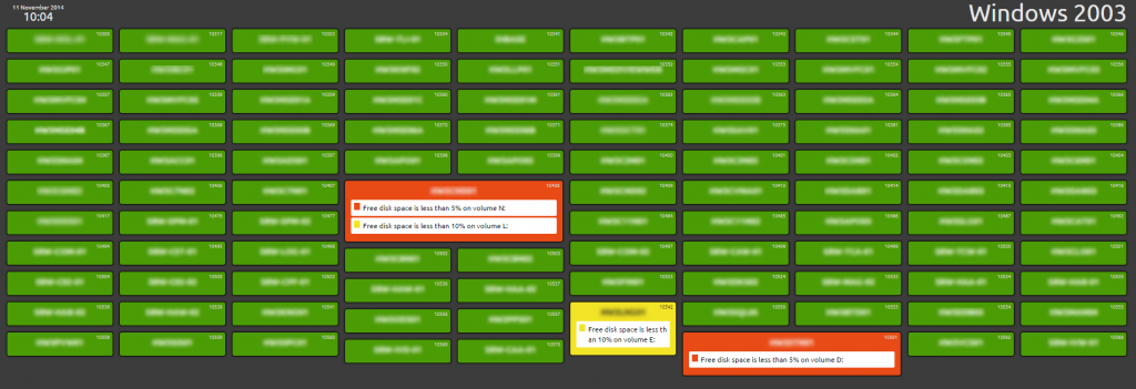
- It queries a Host Group (via a read only user access) and checks it’s active triggers
- If none of it’s trigger are fired, the host is probably ‘ok’ and will be shown in bright green on the dashboard
- If a trigger gets fired, the color and/or size are adjusted
- Using jquery and masonry javascripts hosts are aligned on the dashboard.
This will display a screen like:
Code is available on Github:
Gladly, there is the Zabbix Api, and with the massive help of a PHP programmer, I (we) were able to generate a Dashboard screen that fit our needs and I would like to share this with you.
Some features and requirements:
- It’s build with php using the php api ( http://zabbixapi.confirm.ch )
- It queries a Host Group (via a read only user access) and checks it’s active triggers
- If none of it’s trigger are fired, the host is probably ‘ok’ and will be shown in bright green on the dashboard
- If a trigger gets fired, the color and/or size are adjusted
- Using jquery and masonry javascripts hosts are aligned on the dashboard.
This will display a screen like:
Code is available on Github:


Comment