
1 Screen elements
Overview
This section lists available screen elements and provides details for screen element configuration.
1 Action log
In the action log element you can display details of action operations (notifications, remote commands). It replicates information from Reports → Audit.
To configure, select Action log as resource:
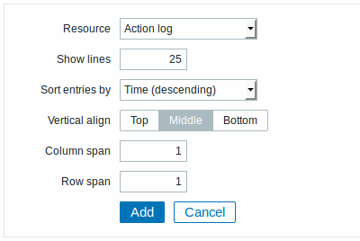
You may set the following specific options:
| Show lines | Set how many action log lines will be displayed in the screen cell. |
| Sort entries by | Sort entries by: Time (descending or ascending) Type (descending or ascending) Status (descending or ascending) Recipient (descending or ascending). |
2 Clock
In the clock element you may display local, server or specified host time.
To configure, select Clock as resource:
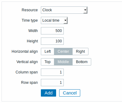
You may set the following specific options:
| Time type | Select local, server or specified host time. |
| Item | Select the item for displaying time. To display host time, use the system.localtime[local] item. This item must exist on the host.This field is available only when Host time is selected. |
| Width | Select clock width. |
| Height | Select clock height. |
3 Data overview
In the data overview element you can display the latest data for a group of hosts. It replicates information from Monitoring → Overview (when Data is selected as Type there).
To configure, select Data overview as resource:
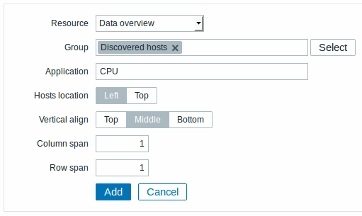
You may set the following specific options:
| Group | Select host group. |
| Application | Enter application name. |
| Hosts location | Select host location - left or top. |
4 Graph
In the graph element you can display a single custom graph.
To configure, select Graph as resource:
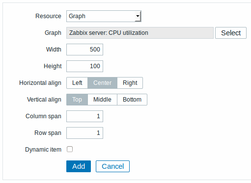
You may set the following specific options:
| Graph | Select the graph to display. |
| Width | Select graph width. |
| Height | Select graph height. |
| Dynamic item | Set graph to display different data depending on the selected host. |
5 Graph prototype
In the graph prototype element you can display a custom graph from a low-level discovery rule.
To configure, select Graph prototype as resource:
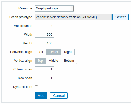
You may set the following specific options:
| Graph prototype | Select the graph prototype to display. |
| Max columns | In how many columns generated graphs should be displayed in the screen cell. Useful when there are many LLD-generated graphs. |
| Width | Select graph width. |
| Height | Select graph height. |
| Dynamic item | Set graph to display different data depending on the selected host. |
6 History of events
In the history of events element you can display latest events.
To configure, select History of events as resource:
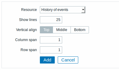
You may set the following specific option:
| Show lines | Set how many event lines will be displayed in the screen cell. |
7 Host group issues
In the host group issue element you can display status of triggers filtered by the host group.
To configure, select Host group issues as resource:
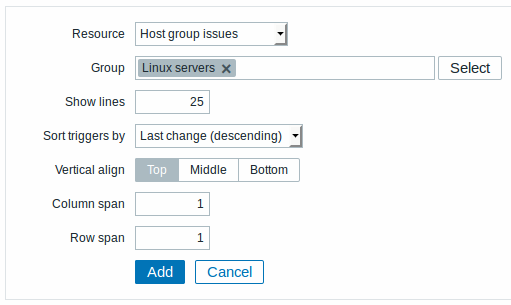
You may set the following specific options:
| Group | Select host group. |
| Show lines | Set how many trigger status lines will be displayed in the screen cell. |
| Sort triggers by | Select from the dropdown to sort triggers by last change, severity (both descending) or host (ascending). |
8 Host info
In the host information element you can display high-level information about host availability.
To configure, select Host info as resource:
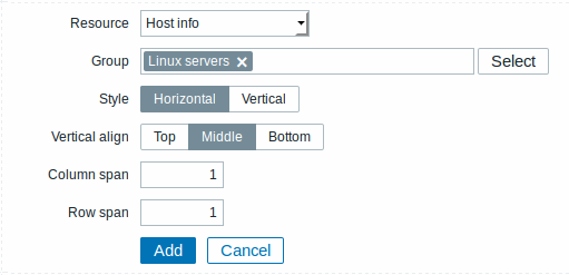
You may set the following specific options:
| Group | Select host group(s). |
| Style | Select vertical or horizontal display. |
9 Host issues
In the host issue element you can display status of triggers filtered by the host.
To configure, select Host issues as resource:
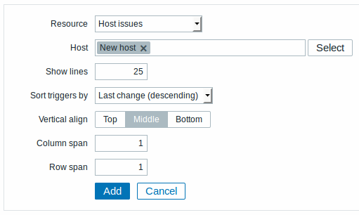
You may set the following specific options:
| Host | Select the host. |
| Show lines | Set how many trigger status lines will be displayed in the screen cell. |
| Sort triggers by | Select from the dropdown to sort triggers by last change, severity (both descending) or host (ascending). |
10 Map
In the map element you can display a configured network map.
To configure, select Map as resource:
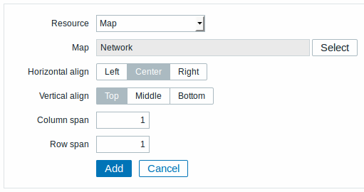
You may set the following specific options:
| Map | Select the map to display. |
11 Plain text
In the plain text element you can display latest item data in plain text.
To configure, select Plain text as resource:
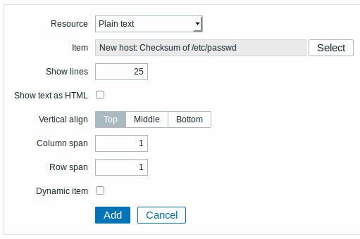
You may set the following specific options:
| Item | Select the item. |
| Show lines | Set how many latest data lines will be displayed in the screen cell. |
| Show text as HTML | Set to display text as HTML. |
| Dynamic item | Set to display different data depending on the selected host. |
12 Screen
In the screen element you can display another Zabbix screen. One screen may contain other screens inside.
To configure, select Screen as resource:
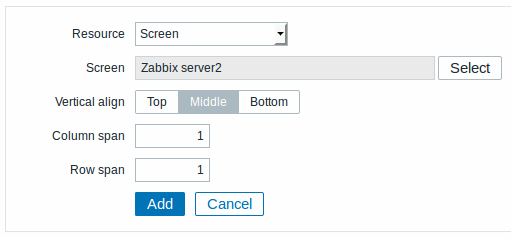
You may set the following specific options:
| Screen | Select the screen to display. |
13 Simple graph
In the simple graph element you can display a single simple graph.
To configure, select Simple graph as resource:
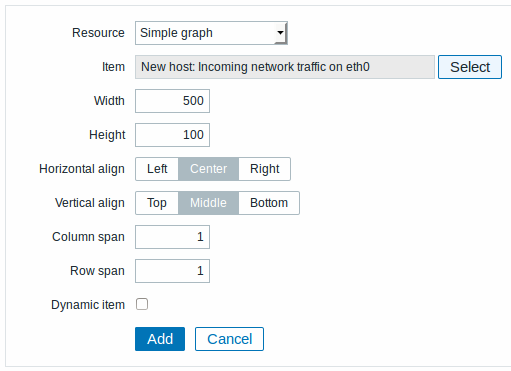
You may set the following specific options:
| Item | Select the item for the simple graph. |
| Width | Select graph width. |
| Height | Select graph height. |
| Dynamic item | Set graph to display different data depending on the selected host. |
14 Simple graph prototype
In the simple graph prototype element you can display a simple graph based on an item generated by low-level discovery.
To configure, select Simple graph prototype as resource:
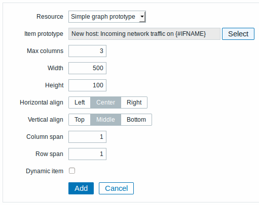
You may set the following specific options:
| Item prototype | Select the item prototype for the simple graph. |
| Max columns | In how many columns generated graphs should be displayed in the screen cell. Useful when there are many LLD-generated graphs. |
| Width | Select graph width. |
| Height | Select graph height. |
| Dynamic item | Set graph to display different data depending on the selected host. |
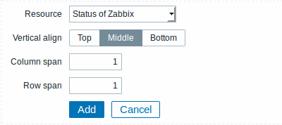
15 Status of Zabbix
In the Zabbix status element you can display high-level Zabbix and Zabbix server information.
To configure, select Status of Zabbix as resource:
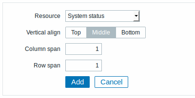
16 System status
In this element you can display system status similarly as in the Dashboard widget.
To configure, select System status as resource:
17 Trigger info
In the trigger info element you can display high-level information about trigger states.
To configure, select Trigger info as resource:
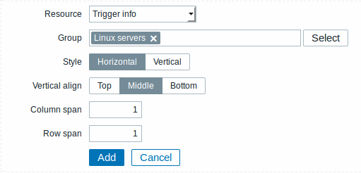
You may set the following specific options:
| Group | Select the host group(s). |
| Style | Select vertical or horizontal display. |
18 Trigger overview
In the trigger overview element you can display the trigger states for a group of hosts. It replicates information from Monitoring → Overview (when Triggers is selected as Type there).
To configure, select Trigger overview as resource:
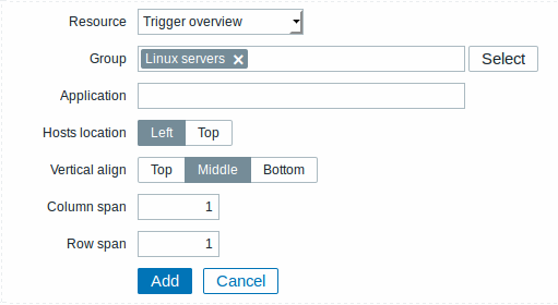
You may set the following specific options:
| Group | Select the host group(s). |
| Application | Enter the application name. |
| Hosts location | Select host location - left or top. |
19 URL
In the URL element you can display a URL content from an external resource.
To configure, select URL as resource:
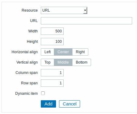
You may set the following specific options:
| URL | Enter the URL to display. |
| Width | Select window width. |
| Height | Select window width. |
| Dynamic item | Set to display different URL content depending on the selected host. |
Browsers might not load an HTTP page included in a screen (using URL element), if Zabbix frontend is accessed over HTTPS.