
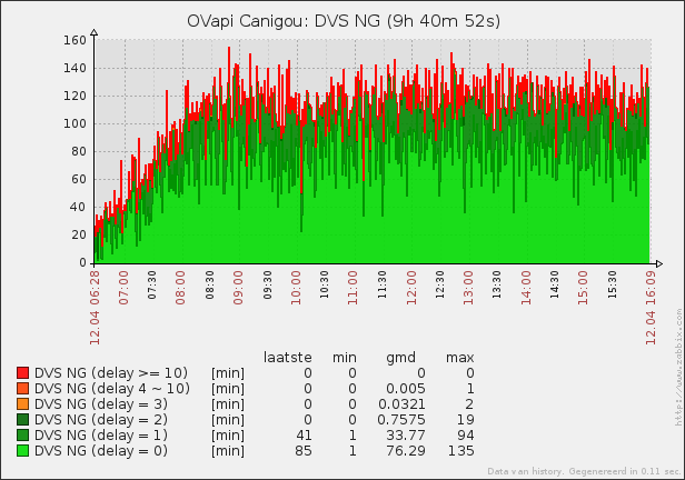
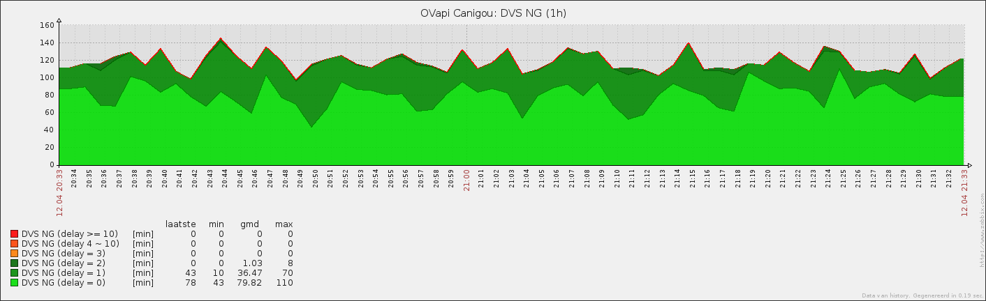
Currently we have some graphs which have 0 values. Especially when zoomed out it is easy to observed that these attributes are stacked as if per time interval they are at least one. My guess is that this kind of bug must be known somewhere by now.
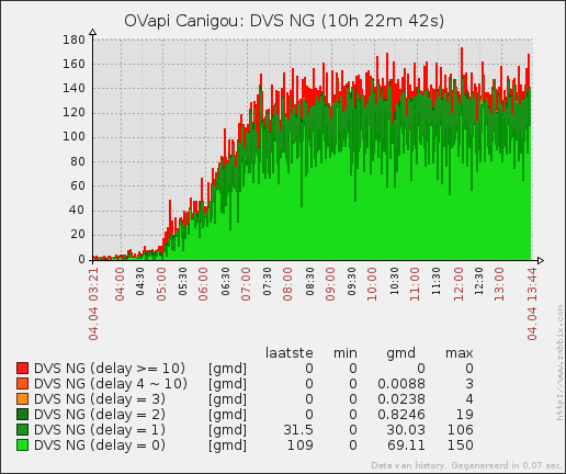
The red surface is wrong. In general it is added on every timepoint, while it is always 0. And in some valleys it is just plain wrong and looks (integrated) as if there is more output than every recorded.
The red surface is wrong. In general it is added on every timepoint, while it is always 0. And in some valleys it is just plain wrong and looks (integrated) as if there is more output than every recorded.


Comment