

Table of Contents
12 Honeycomb
Overview
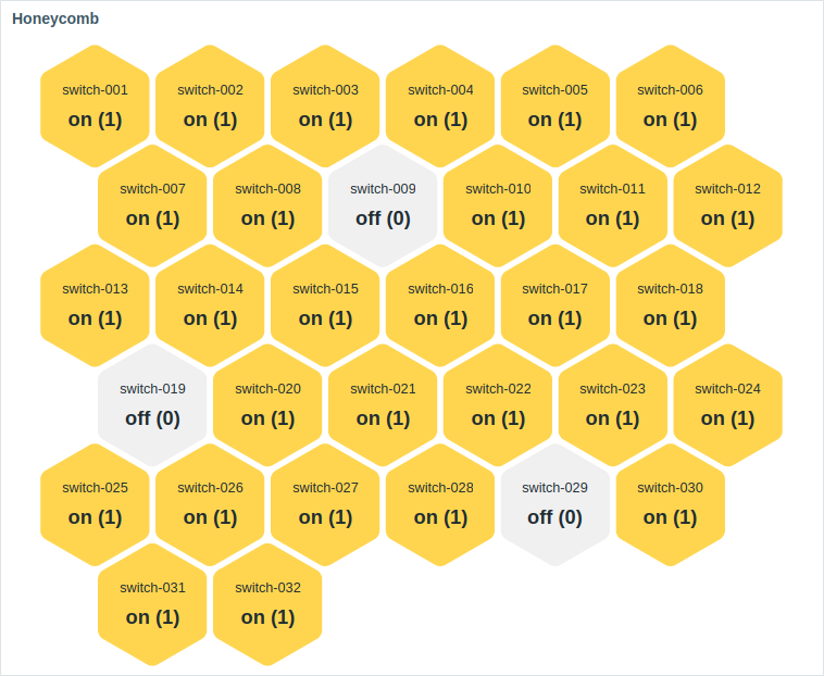
The honeycomb widget offers a dynamic overview of the monitored network infrastructure and resources, where host groups, such as virtual machines and network devices, along with their respective items, are visually represented as interactive hexagonal cells.
The widget can be visually fine-tuned using the advanced configuration options to create a wide variety of visual styles.
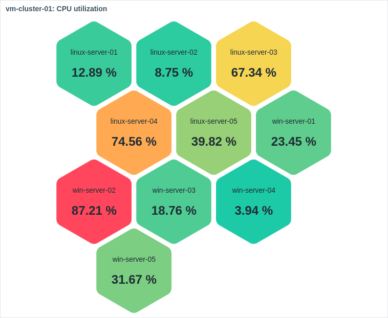
On mouseover, the focused honeycomb cell enlarges for improved visibility. Clicking a cell highlights its border until another cell is selected.
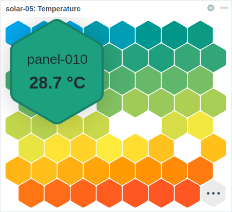
The number of displayed honeycomb cells is constrained by the widget's size and the minimum cell size (32 pixels). If all cells cannot fit within the widget, an ellipsis is shown as the final cell.
The widget can be resized to fit more cells. On resize, the honeycomb cell size and positioning are dynamically adjusted. Each row in the honeycomb will maintain an equal cell count, except for the last row if the total cell count is not divisible by the row's cell count.
Configuration
To configure, select Honeycomb as type:
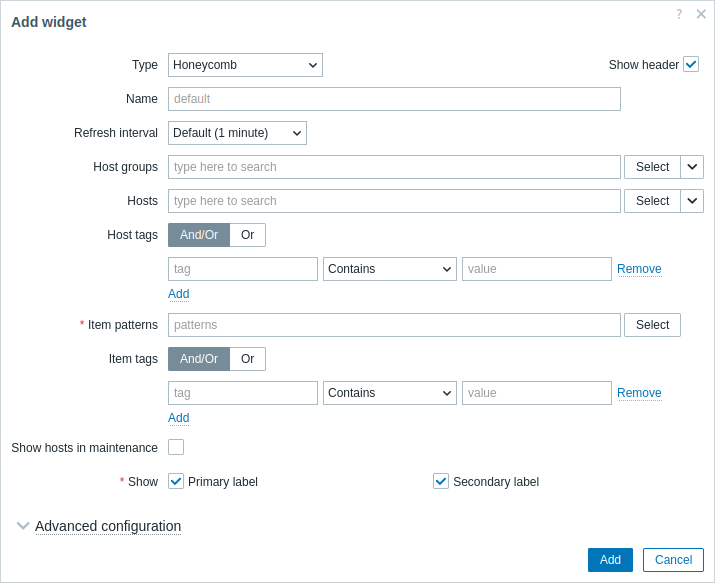
In addition to the parameters that are common for all widgets, you may set the following specific options:
| Host groups | Select host groups. This field is auto-complete, so starting to type the name of a group will offer a dropdown of matching groups. Selecting a parent host group implicitly selects all nested host groups; if no host groups are selected, the widget will display all host groups containing hosts with items matching the selected Item pattern (see below). Alternatively, click the dropdown arrow (next to the Select button) to select a compatible widget as the data source for host groups. This parameter is not available when configuring the widget on a template dashboard. |
| Hosts | Select hosts. This field is auto-complete, so starting to type the name of a host will offer a dropdown of matching hosts. If no hosts are selected, the widget will display all hosts with items matching the selected Item pattern (see below). Alternatively, click the dropdown arrow (next to the Select button) to select a compatible widget (Host navigator) or the dashboard as the data source for hosts. This parameter is not available when configuring the widget on a template dashboard. |
| Host tags | Specify tags to limit the number of hosts displayed in the widget. It is possible to include as well as exclude specific tags and tag values. Several conditions can be set. Tag name matching is always case-sensitive. There are several operators available for each condition: Exists - include the specified tag names; Equals - include the specified tag names and values (case-sensitive); Contains - include the specified tag names where the tag values contain the entered string (substring match, case-insensitive); Does not exist - exclude the specified tag names; Does not equal - exclude the specified tag names and values (case-sensitive); Does not contain - exclude the specified tag names where the tag values contain the entered string (substring match, case-insensitive). There are two calculation types for conditions: And/Or - all conditions must be met, conditions having the same tag name will be grouped by the Or condition; Or - enough if one condition is met. This parameter is not available when configuring the widget on a template dashboard. |
| Item pattern | Enter item patterns or select existing items as item patterns. Data of items that match the entered or selected patterns will be displayed on the honeycomb. The Item pattern parameter is mandatory. Wildcard patterns may be used for selection (for example, * will return items that match zero or more characters; Zabbix* will return items that start with "Zabbix").To specify a wildcard pattern, enter the string manually and press Enter. When you start typing, a dropdown list will show matching items limited to those belonging to selected Hosts or hosts within selected Host groups, if any. The wildcard symbol is always interpreted, therefore, it is not possible to add, for example, an item named item* individually, if there are other matching items (e.g., item2, item3). When configuring the widget on a template dashboard, this parameter allows selecting only items configured on the template. |
| Item tags | Specify tags to limit the number of items displayed in the widget. For more information, see Host tags above. |
| Show hosts in maintenance | Mark this checkbox to display hosts in maintenance (in this case, maintenance icon will be shown next to the host name). This parameter is labeled Show data in maintenance when configuring the widget on a template dashboard. |
| Show | Mark this checkbox to display the respective honeycomb cell element - primary label, secondary label. At least one element must be selected. |
Advanced configuration
Advanced configuration options are available in the collapsible Advanced configuration section and only for elements selected in the Show field (see above) and the background color or thresholds for honeycomb cells.
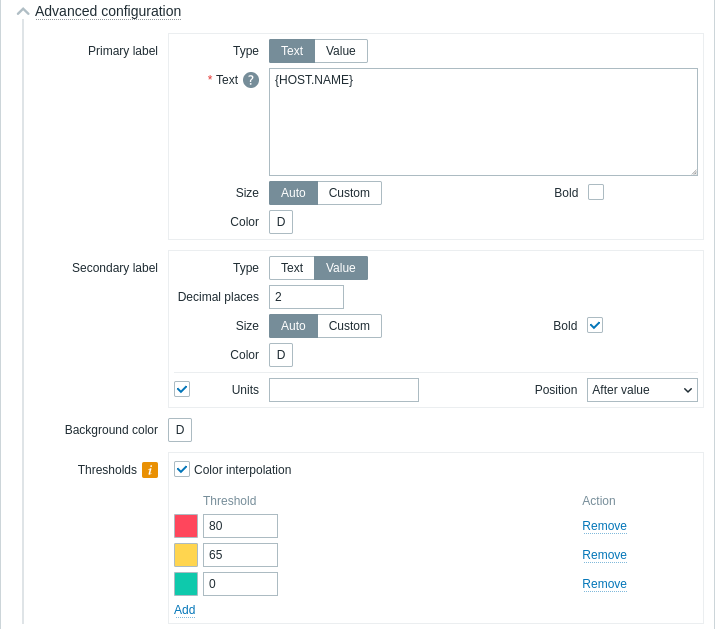
| Primary/Secondary label | |
| Type | Select the label type: Text - the label will display the text specified in the Text parameter; Value - the label will display the item value with decimal places as specified in the Decimal places parameter. |
| Text | Enter the label text. This text may override the default item name. Multiline text is supported. A combination of text and supported macros is possible. {HOST.*}, {ITEM.*}, {INVENTORY.*}, and user macros are supported. Honeycomb cells are ordered alphabetically by host name, and, within each host, by item name. This parameter is available if Type is set to "Text". |
| Decimal places | Enter the number of decimal places to display with the value. This parameter is available if Type is set to "Value", and affects only items that return numeric (float) data. |
| Size | Select the label size: Auto - use automatically adjusted label size; Custom - enter a custom label size (in percent, relative to the honeycomb cell size). Note that labels that do not fit the honeycomb cell size are truncated. |
| Bold | Mark the checkbox to display item units in bold. |
| Color | Select the item units color from the color picker. "D" stands for the default color, which depends on the frontend theme. To return to the default color, click the Use default button in the color picker. |
| Units | |
| Units | Mark the checkbox to display units with the item value. If you enter a unit name, it will override the units set in the item configuration. This parameter is available if Type is set to "Text". |
| Position | Select the position of the item units (before or after the item value). This parameter is ignored for the following time-related units: unixtime, uptime, s. This parameter is available if Type is set to "Text". |
| Background color | |
| Background color | Select the honeycomb cells background color from the color picker. "D" stands for the default color, which depends on the frontend theme. To return to the default color, click the Use default button in the color picker. |
| Thresholds | |
| Color interpolation | Mark the checkbox to enable smooth transitioning between threshold colors for honeycomb cells. This parameter is available if two or more thresholds are set. |
| Threshold | Click Add to add a threshold, select a threshold color from the color picker, and specify a numeric value. The thresholds list will be sorted in ascending order when saved. Note that the colors configured as thresholds will be displayed correctly only for numeric items. Suffixes (for example, "1d", "2w", "4K", "8G") are supported. Value mappings are supported. |
The information displayed by the honeycomb widget can be downloaded as a .png image using the widget menu:
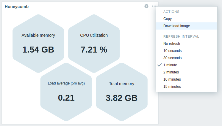
A screenshot of the widget will be saved to the Downloads folder.