
2 Custom graphs
Overview
Custom graphs, as the name suggests, offer customisation capabilities.
While simple graphs are good for viewing data of a single item, they do not offer configuration capabilities.
Thus, if you want to change graph style or the way lines are displayed or compare several items, for example incoming and outgoing traffic in a single graph, you need a custom graph.
Custom graphs are configured manually.
They can be created for a host or several hosts or for a single template.
Configuring custom graphs
To create a custom graph, do the following:
- Go to Configuration → Hosts (or Templates)
- Click on Graphs in the row next to the desired host or template
- In the Graphs screen click on Create graph
- Edit graph attributes
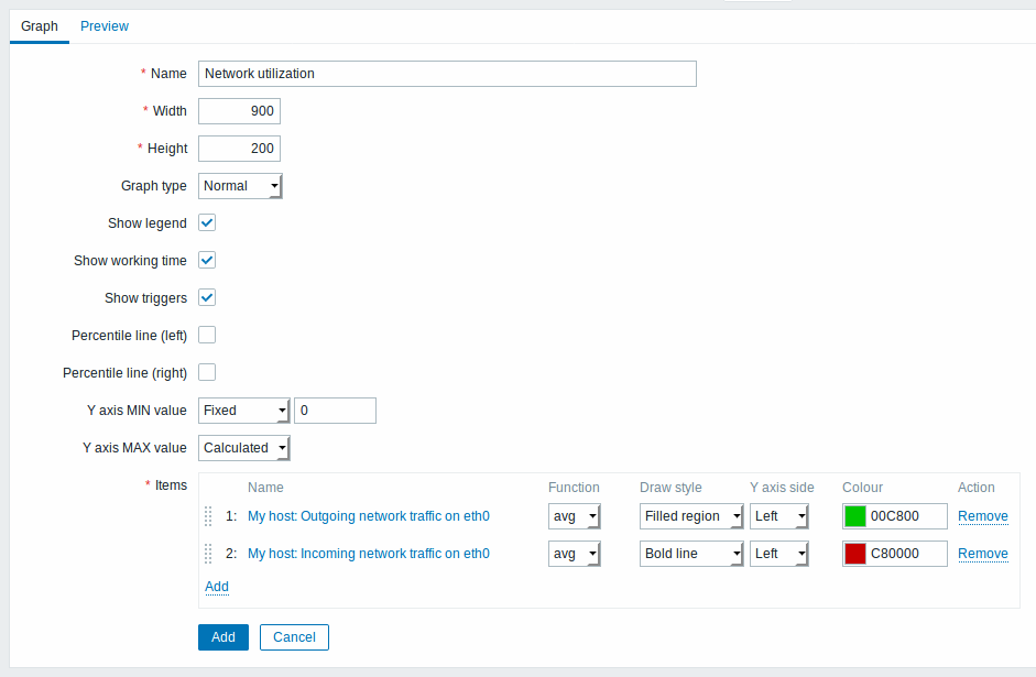
All mandatory input fields are marked with a red asterisk.
Graph attributes:
| Parameter | Description | |
|---|---|---|
| Name | Unique graph name. Starting with Zabbix 2.2, item values can be referenced in the name by using simple macros with the standard {host:key.func(param)} syntax. Only avg, last, max and min as functions with seconds as parameter are supported within this macro. {HOST.HOST<1-9>} macros are supported for the use within this macro, referencing the first, second, third, etc. host in the graph, for example {{HOST.HOST1}:key.func(param)}. |
|
| Width | Graph width in pixels (for preview and pie/exploded graphs only). | |
| Height | Graph height in pixels. | |
| Graph type | Graph type: Normal - normal graph, values displayed as lines Stacked - stacked graph, filled areas displayed Pie - pie graph Exploded - "exploded" pie graph, portions displayed as "cut out" of the pie |
|
| Show legend | Checking this box will set to display the graph legend. | |
| Show working time | If selected, non-working hours will be shown with gray background. Not available for pie and exploded pie graphs. | |
| Show triggers | If selected, simple triggers will be displayed as red lines. Not available for pie and exploded pie graphs. | |
| Percentile line (left) | Display percentile for left Y axis. If, for example, 95% percentile is set, then the percentile line will be at the level where 95 per cent of the values fall under. Displayed as a bright green line. Only available for normal graphs. | |
| Percentile line (right) | Display percentile for right Y axis. If, for example, 95% percentile is set, then the percentile line will be at the level where 95 per cent of the values fall under. Displayed as a bright red line. Only available for normal graphs. | |
| Y axis MIN value | Minimum value of Y axis: Calculated - Y axis minimum value will be automatically calculated Fixed - fixed minimum value for Y axis. Not available for pie and exploded pie graphs. Item - last value of the selected item will be the minimum value |
|
| Y axis MAX value | Maximum value of Y axis: Calculated - Y axis maximum value will be automatically calculated Fixed - fixed maximum value for Y axis. Not available for pie and exploded pie graphs. Item - last value of the selected item will be the maximum value |
|
| 3D view | Enable 3D style. For pie and exploded pie graphs only. | |
| Items | Items, data of which are to be displayed in this graph. Click on Add to select items. You can also select various displaying options (function, draw style, left/right axis display, colour). | |
| Sort order (0→100) | Draw order. 0 will be processed first. Can be used to draw lines or regions behind (or in front of) another. You can drag and drop items by the arrow in the beginning of line to set the sort order or which item is displayed in front of the other. |
|
| Name | Name of the selected item is displayed as a link. Clicking on the link opens the list of other available items. | |
| Type | Type (only available for pie and exploded pie graphs): Simple - value of the item is represented proportionally on the pie Graph sum - value of the item represents the whole pie Note that colouring of the "graph sum" item will only be visible to the extent that it is not taken up by "proportional" items. |
|
| Function | Select what values will be displayed when more than one value exists per vertical graph pixel for an item: all - display all possible values (minimum, maximum, average) in the graph. Note that for shorter periods this setting has no effect; only for longer periods, when data congestion in a vertical graph pixel increases, 'all' starts displaying minimum, maximum and average values. This function is only available for Normal graph type. See also: Generating graphs from history/trends. avg - display the average values last - display the latest values. This function is only available if either Pie/Exploded pie is selected as graph type. max - display the maximum values min - display the minimum values |
|
| Draw style | Select the draw style (only available for normal graphs; for stacked graphs filled region is always used) to apply to the item data - Line, Bold line, Filled region, Dot, Dashed line, Gradient line. | |
| Y axis side | Select the Y axis side to show the item data - Left, Right. | |
| Colour | Select the colour to apply to the item data. | |
Graph preview
In the Preview tab, a preview of the graph is displayed so you can immediately see what you are creating.
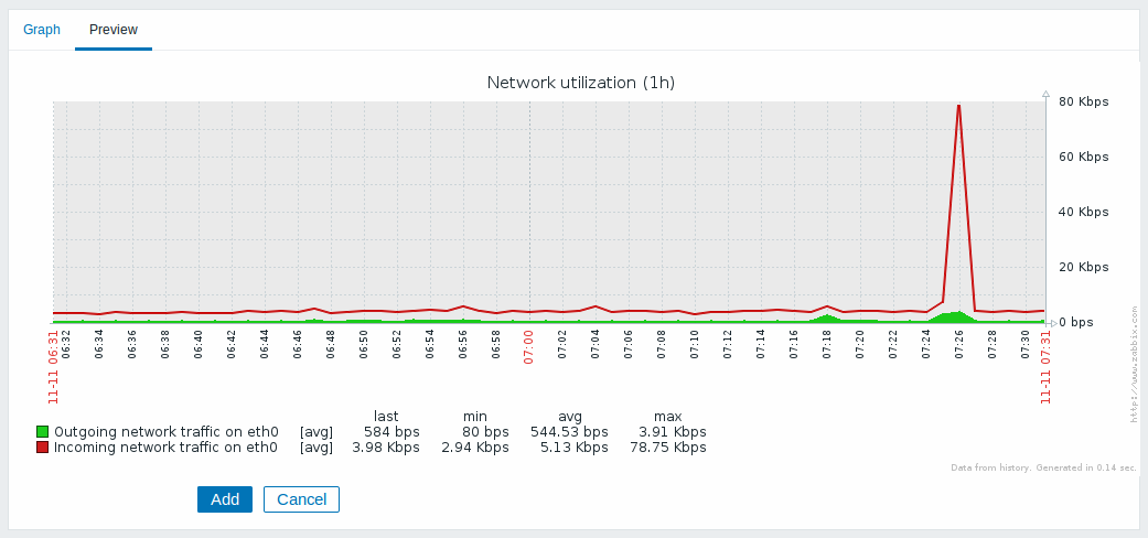
Note that the preview will not show any data for template items.
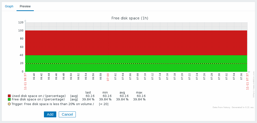
In this example, pay attention to the dashed bold line displaying the trigger level and the trigger information displayed in the legend.
3 triggers is the hard-coded limit for the number of triggers displayed in the legend.
If graph height is set as less than 120 pixels, no trigger will be displayed in the legend.