
1 Dashboard widgets
Overview
This section lists available dashboard widgets and provides details for widget configuration.
The following parameters are common for every single widget:
| Name | Enter a widget name. |
| Refresh interval | Configure default refresh interval. Default refresh intervals for widgets range from No refresh to 15 minutes depending on the type of widget. For <example://> No refresh// for URL widget, 1 minute for action log widget, 15 minutes for clock widget. |
| Show header | Mark the checkbox to show the header permanently. When unchecked the header is hidden to save space and only slides up and becomes visible again when the mouse is positioned over the widget, both in view and edit modes. It is also semi-visible when dragging a widget to a new place. |
Refresh intervals for a widget can be set to a default value for all the corresponding users and also each user can set his own refresh interval value:
- To set a default value for all the corresponding users switch to editing mode (click the Edit dashboard button, find the right widget, click the Edit button opening the editing form of a widget) and choose the required refresh interval from the dropdown list.
- Setting a unique refresh interval for each user separately is
possible in view mode by clicking the
 button for a certain widget.
Unique refresh interval set by a user has priority over the widget setting and once it's set it's always preserved when the widget's setting is modified.
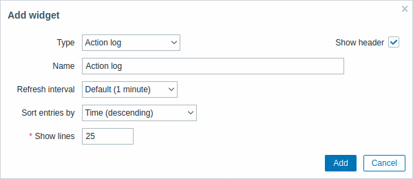
Action log
In the action log widget you can display details of action operations (notifications, remote commands). It replicates information from Administration → Audit.
To configure, select Action log as type:
 |
|---|
You may set the following specific options:
| Sort entries by | Sort entries by: Time (descending or ascending) Type (descending or ascending) Status (descending or ascending) Recipient (descending or ascending). |
| Show lines | Set how many action log lines will be displayed in the widget. |
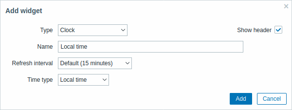
Clock
In the clock widget you may display local, server or specified host time.
To configure, select Clock as type:
 |
|---|
You may set the following specific options:
| Time type | Select local, server or specified host time. |
| Item | Select the item for displaying time. To display host time, use the system.localtime[local] item. This item must exist on the host.This field is available only when Host time is selected. |
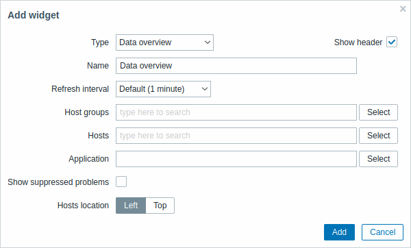
Data overview
In the data overview widget you can display the latest data for a group of hosts. It replicates information from Monitoring → Overview (when viewing Data overview).
Note that there is a hard-coded limit of 50 records displayed. There is no pagination. If more records exist, a message is displayed at the bottom of the table, asking to provide more specific filtering criteria.
To configure, select Data overview as type:
 |
|---|
You may set the following specific options:
| Host groups | Select host groups. This field is auto-complete so starting to type the name of a group will offer a dropdown of matching groups. Scroll down to select. Click on 'x' to remove the selected. |
| Hosts | Select hosts. This field is auto-complete so starting to type the name of a host will offer a dropdown of matching hosts. Scroll down to select. Click on 'x' to remove the selected. |
| Application | Enter application name. |
| Show suppressed problems | Mark the checkbox to display problems which would otherwise be suppressed (not shown) because of host maintenance. |
| Hosts location | Select host location - left or top. |
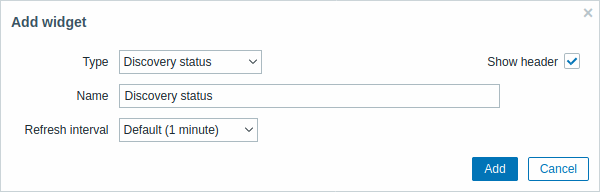
Discovery status
This widget displays a status summary of the active network discovery rules.
 |
|---|
Favorite graphs
This widget contains shortcuts to the most needed graphs, sorted alphabetically.
The list of shortcuts is populated when you
view
a graph and then click on its
 Add to favorites button.
Favorite maps
This widget contains shortcuts to the most needed maps, sorted alphabetically.
The list of shortcuts is populated when you
view
a map and then click on its
Add to favorites button.
Favorite screens
This widget contains shortcuts to the most needed screens and slide shows, sorted alphabetically.
The list of shortcuts is populated when you
view
a screen/slide show and then click on its
Add to favorites button.
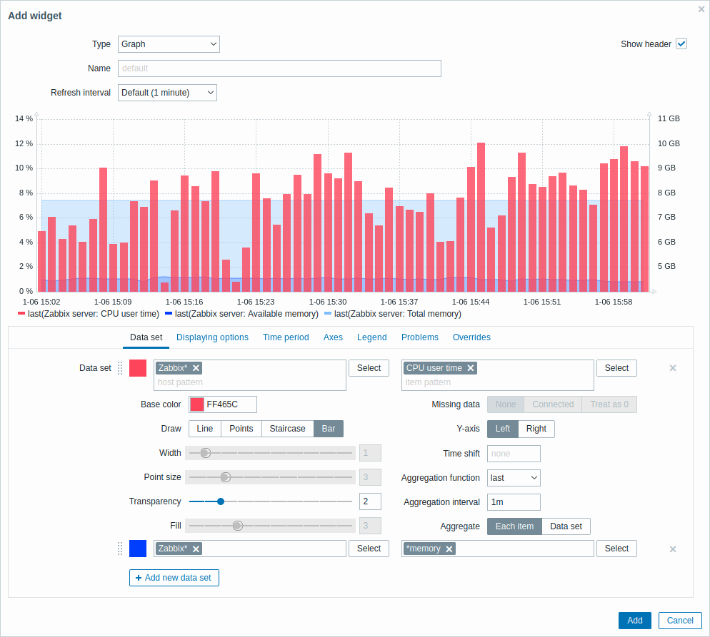
Graph
The graph widget provides a modern and versatile way of visualizing data collected by Zabbix using a vector image drawing technique. This graph widget is supported since Zabbix 4.0. Note that the graph widget supported before Zabbix 4.0 can still be used as Graph (classic).
To configure, select Graph as type:
 |
|---|
The Data set tab allows to add data sets and define their visual representation:
| Data set | Select hosts and items to display on the graph. Alternatively you may enter host and item patterns. Wildcard patterns may be used (for example, * will return results that match zero or more characters). To specify a wildcard pattern, just enter the string manually and press Enter. While you are typing, note how all matching hosts are displayed in the dropdown.Up to 50 items may be displayed in the graph. Host pattern and item pattern fields are mandatory. Note that item names containing deprecated positional macros ($1-$9) are not resolved in this field. Therefore it will not be possible to add any of the items named like CPU $2 time individually to the graph using its resolved name (like CPU user time); while using its unresolved name CPU $2 time will add all corresponding items to the graph (e.g. CPU user time, CPU system time, CPU idle time, etc.).The wildcard symbol is always interpreted, therefore it is not possible to add, for example, an item named "item*" individually, if there are other matching items (e.g. item2, item3). |
|
| Base color | Adjust base color, either from the color picker or manually. Base color is used to calculate different colors for each item of the data set. Base color input field is mandatory. | |
| Draw | Choose the draw type of the metric. Possible draw types are Line (set by default), Points, Staircase and Bar. Note that if there's only one data point in line/staircase graph it is drawn as point regardless of draw type. The point size is calculated from line width, but it cannot be smaller than 3 pixels, even if line width is less. |
|
| Width | Set the line width. This option is available when Line or Staircase draw type is selected. | |
| Point size | Set the point size. This option is available when Points draw type is selected. | |
| Transparency | Set the transparency level. | |
| Fill | Set the fill level. This option is available when Line or Staircase draw type is selected. | |
| Missing data | Select the option for displaying missing data: None - the gap is left empty Connected - two border values are connected Treat as 0 - the missing data is displayed as 0 values Not applicable for the Points and Bar draw type. |
|
| Y-axis | Select the side of the graph where Y-axis will be displayed. | |
| Time shift | Specify time shift if required. You may use time suffixes in this field. Negative values are allowed. | |
| Aggregation function | Specify which aggregation function to use: min - display the smallest value max - display the largest value avg - display the average value sum - display the sum of values count - display the count of values first - display the first value last - display the last value none - display all values (no aggregation) Aggregation allows to display an aggregated value for the chosen interval (5 minutes, an hour, a day), instead of all values. See also: Aggregation in graphs. This option is supported since Zabbix 4.4. |
|
| Aggregation interval | Specify the interval for aggregating values. You may use time suffixes in this field. A numeric value without a suffix will be regarded as seconds. This option is supported since Zabbix 4.4. |
|
| Aggregate | Specify whether to aggregate: Each item - each item in the dataset will be aggregated and displayed separately. Data set - all dataset items will be aggregated and displayed as one value. This option is supported since Zabbix 4.4. |
|
Existing data sets are displayed in a list. You may:
 -
click on this button to add a new data set
-
click on this button to add a new data set -
click on the color icon to expand/collapse data set details
-
click on the color icon to expand/collapse data set details -
click on the move icon and drag a data set to a new place in the
list
-
click on the move icon and drag a data set to a new place in the
list
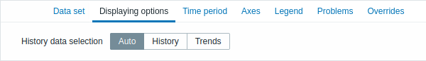
The Displaying options tab allows to define history data selection:
 |
|---|
| History data selection | Set the source of graph data: Auto - data are sourced according to the classic graph algorithm (default) History - data from history Trends - data from trends |
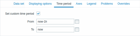
The Time period tab allows to set a custom time period:
 |
|---|
| Set custom time period | Mark this checkbox to set custom time period for the graph (unmarked by default). |
| From | Set the start time of the custom time period for the graph. |
| To | Set the end time of the custom time period for the graph. |
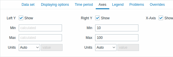
The Axes tab allows to customize how axes are displayed:
 |
|---|
| Left Y | Mark this checkbox to make left Y axis visible. The checkbox may be disabled if unselected either in Data set or in Overrides tab. |
| Right Y | Mark this checkbox to make right Y axis visible. The checkbox may be disabled if unselected either in Data set or in Overrides tab. |
| X-Axis | Unmark this checkbox to hide X axis (marked by default). |
| Min | Set the minimum value of the corresponding axis. Visible range minimum value of Y axis is specified. |
| Max | Set the maximum value of the corresponding axis. Visible range maximum value of Y axis is specified. |
| Units | Choose the unit for the graph axis values from the dropdown. If Auto option is chosen axis values are displayed using units of the first item of corresponding axis. Static option allows you to assign corresponding axis' custom name. If Static option is chosen and value input field left blank the corresponding axis' name will only consist of a numeric value. |
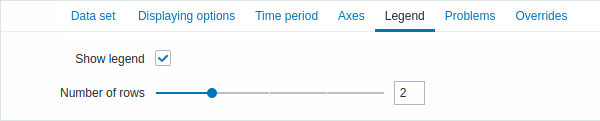
The Legend tab allows to customize the graph legend:
 |
|---|
| Show legend | Unmark this checkbox to hide the legend on the graph (marked by default). |
| Number of rows | Set the number of rows to be displayed on the graph. |
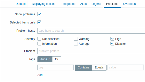
The Problems tab allows to customize the problem display:
 |
|---|
| Show problems | Mark this checkbox to enable problem displaying on the graph (unmarked, i.e. disabled by default). |
| Selected items only | Mark this checkbox to include problems for the selected items only to be displayed on the graph. |
| Problem hosts | Select the problem hosts to be displayed on the graph. Wildcard patterns may be used (for example, * will return results that match zero or more characters). To specify a wildcard pattern, just enter the string manually and press Enter. While you are typing, note how all matching hosts are displayed in the dropdown. |
| Severity | Mark the problem severities to be displayed on the graph. |
| Problem | Specify the problem's name to be displayed on the graph. |
| Tags | Specify tag name and value to limit the number of problems displayed on the graph. To add more tag names and values, click on Add. There are two calculation types for several conditions: And/Or - all conditions must be met, conditions having same tag name will be grouped by Or condition Or - enough if one condition is met There are two ways of matching the tag value: Contains - case-sensitive substring match (tag value contains the entered string) Equals - case-sensitive string match (tag value equals the entered string). |
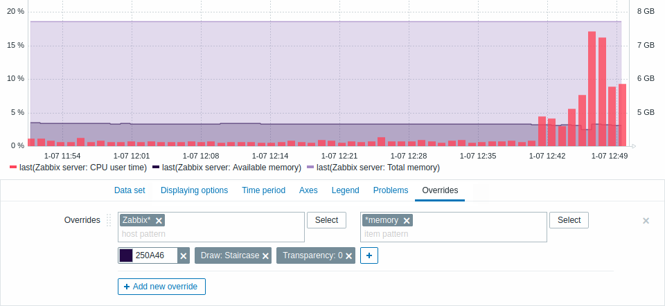
The Overrides tab allows to add custom overrides for data sets:
 |
|---|
Overrides are useful when several items are selected for a data set
using the * wildcard and you want to change how the items are
displayed by default (e.g. default base color or any other property).
Existing overrides (if any) are displayed in a list. To add a new override:
- Click on the
 button
 - Select hosts and items for the override. Alternatively you may enter
host and item patterns. Wildcard patterns may be used (for example,
*will return results that match zero or more characters). To specify a wildcard pattern, just enter the string manually and press Enter. While you are typing, note how all matching hosts are displayed in the dropdown. The wildcard symbol is always interpreted, therefore it is not possible to add, for example, an item named "item*" individually, if there are other matching items (e.g. item2, item3). Host pattern and item pattern fields are mandatory. - Click on
 ,
to select override parameters. At least one override parameter
should be selected. For parameter descriptions, see the Data set
tab above.
,
to select override parameters. At least one override parameter
should be selected. For parameter descriptions, see the Data set
tab above.
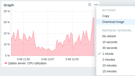
Information displayed by the graph widget can be downloaded as a .png image using the widget menu:
 |
|---|
A screenshot of the widget will be saved to the Downloads folder.
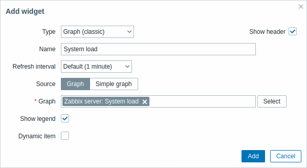
Graph (classic)
In the classic graph widget you can display a single custom graph or simple graph.
To configure, select Graph as type:
 |
|---|
You may set the following specific options:
| Source | Select graph type: Graph - custom graph Simple graph - simple graph |
| Graph | Select the custom graph to display. This option is available if 'Graph' is selected as Source. |
| Item | Select the item to display in a simple graph. This option is available if 'Simple graph' is selected as Source. |
| Show legend | Unmark this checkbox to hide the legend on the graph (marked by default). |
| Dynamic item | Set graph to display different data depending on the selected host. |
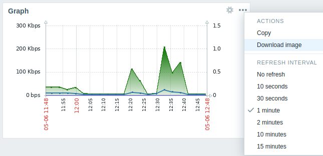
Information displayed by the classic graph widget can be downloaded as .png image using the widget menu:
 |
|---|
A screenshot of the widget will be saved to the Downloads folder.
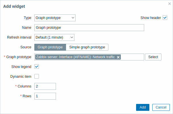
Graph prototype
In the graph prototype widget you can display a grid of graphs created from either a graph prototype or an item prototype by low-level discovery.
To configure, select Graph prototype as widget type:
 |
|---|
You may set the following specific options:
| Source | Select source: either a Graph prototype or a Simple graph prototype. |
| Graph prototype | Select a graph prototype to display discovered graphs of the graph prototype. This option is available if 'Graph prototype' is selected as Source. |
| Item prototype | Select an item prototype to display simple graphs based on discovered items of an item prototype. This option is available if 'Simple graph prototype' is selected as Source. |
| Show legend | Mark this checkbox to show the legend on the graphs (marked by default). |
| Dynamic item | Set graphs to display different data depending on the selected host. |
| Columns | Enter number of columns of graphs to display within a graph prototype widget. |
| Rows | Enter number of rows of graphs to display within a graph prototype widget. |
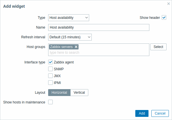
Host availability
In the host availability widget you can display high-level statistics about host availability.
To configure, select Host availability as type:
 |
|---|
You may set the following specific options:
| Host groups | Select host group(s). This field is auto-complete so starting to type the name of a group will offer a dropdown of matching groups. Scroll down to select. Click on 'x' to remove the selected. |
| Interface type | Select which host interfaces you want to see availability data for. Availability of all interfaces is displayed by default, if nothing is selected. |
| Layout | Select vertical or horizontal display. |
| Show hosts in maintenance | Include hosts that are in maintenance in the statistics. |
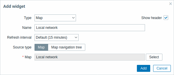
Map
In the map widget you can display either:
- a single configured network map
- one of the configured network maps in the map navigation tree (when clicking on the map name in the tree).
To configure, select Map as type:
 |
|---|
You may set the following specific options:
| Source type | Select to display: Map - network map Map navigation tree - one of the maps in the selected map navigation tree |
| Map | Select the map to display. This option is available if 'Map' is selected as Source type. |
| Filter | Select the map navigation tree to display the maps of. This option is available if 'Map navigation tree' is selected as Source type. |
See also: known issue with IE11
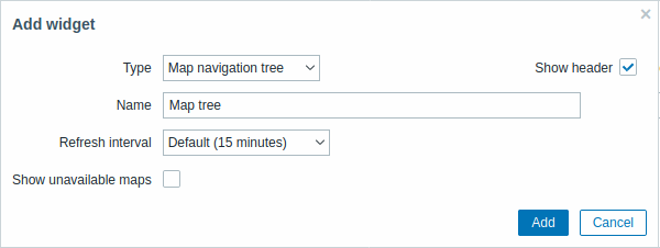
Map navigation tree
This widget allows to build a hierarchy of existing maps while also displaying problem statistics with each included map and map group.
It becomes even more powerful if you link the Map widget to the navigation tree. In this case, clicking on a map name in the navigation tree displays the map in full in the Map widget.
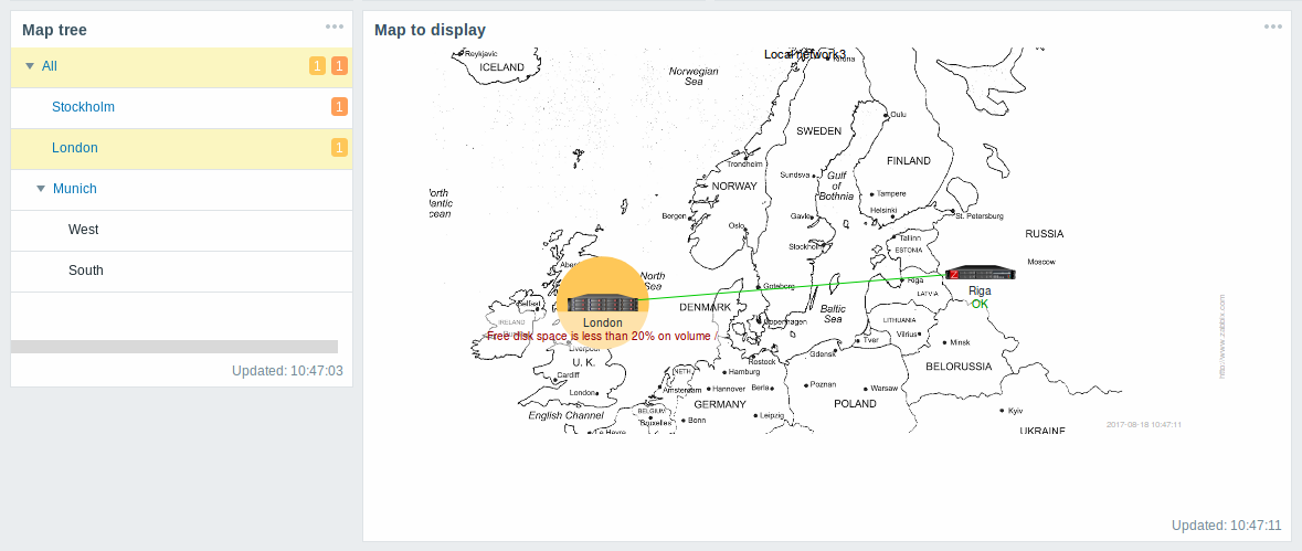
Statistics with the top level map in the hierarchy display a sum of problems of all submaps and its own problems.
To configure the navigation tree widget, select Map navigation tree as type:
 |
|---|
You may set the following specific options:
| Show unavailable maps | Mark this checkbox to display maps that the user does not have read permission to. Unavailable maps in the navigation tree will be displayed with a grayed out icon. Note that if this checkbbox is marked, available submaps are displayed even if the parent level map is unavailbale. If unmarked, available submaps to an unavailable parent map will not be displayed at all. Problem count is calculated based on available maps and available map elements. |
Plain text
In the plain text widget you can display latest item data in plain text.
To configure, select Plain text as type:
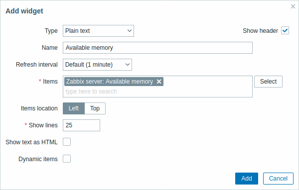 |
|---|
You may set the following specific options:
| Items | Select the items. |
| Items location | Choose the location of selected items to be displayed in the widget. |
| Show lines | Set how many latest data lines will be displayed in the widget. |
| Show text as HTML | Set to display text as HTML. |
| Dynamic item | Set to display different data depending on the selected host. |
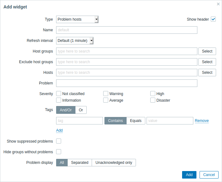
Problem hosts
In the host information widget you can display high-level information about host availability.
To configure, select Problem hosts as type:
 |
|---|
You may set the following specific options:
| Parameter | Description |
|---|---|
| Host groups | Enter host groups to display in the widget. This field is auto-complete so starting to type the name of a group will offer a dropdown of matching groups. Specifying a parent host group implicitly selects all nested host groups. Host data from these host groups will be displayed in the widget. If no host groups are entered, all host groups will be displayed. |
| Exclude host groups | Enter host groups to hide from the widget. This field is auto-complete so starting to type the name of a group will offer a dropdown of matching groups. Specifying a parent host group implicitly selects all nested host groups. Host data from these host groups will not be displayed in the widget. For example, hosts 001, 002, 003 may be in Group A and hosts 002, 003 in Group B as well. If we select to show Group A and exclude Group B at the same time, only data from host 001 will be displayed in the Dashboard. |
| Hosts | Enter hosts to display in the widget. This field is auto-complete so starting to type the name of a host will offer a dropdown of matching hosts. If no hosts are entered, all hosts will be displayed. |
| Problem | You can limit the number of problem hosts displayed by the problem name. If you enter a string here, only those hosts with problems whose name contains the entered string will be displayed. Macros are not expanded. |
| Severity | Mark the problem severities to be displayed in the widget. |
| Tags | Specify tag name and value to limit the number of problems displayed on the graph. To add more tag names and values, click on Add. There are two calculation types for several conditions: And/Or - all conditions must be met, conditions having same tag name will be grouped by Or condition Or - enough if one condition is met There are two ways of matching the tag value: Contains - case-sensitive substring match (tag value contains the entered string) Equals - case-sensitive string match (tag value equals the entered string). |
| Show suppressed problems | Mark the checkbox to display problems which would otherwise be suppressed (not shown) because of host maintenance. |
| Hide groups without problems | Mark the Hide groups without problems option to hide data from host groups without problems in the widget. |
| Problem display | Display problem count as: All - full problem count will be displayed Separated - unacknowledged problem count will be displayed separated as a number of the total problem count Unacknowledged only - only the unacknowledged problem count will be displayed. |
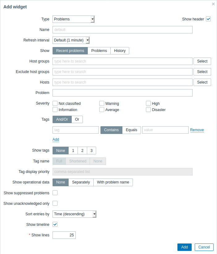
Problems
In this widget you can display current problems. The information in this widget is similar to Monitoring → Problems.
To configure, select Problems as type:
 |
|---|
You can limit how many problems are displayed in the widget in various ways - by problem status, problem name, severity, host group, host, event tag, acknowledgment status, etc.
| Parameter | Description |
|---|---|
| Show | Filter by problem status: Recent problems - unresolved and recently resolved problems are displayed (default) Problems - unresolved problems are displayed History - history of all events is displayed |
| Host groups | Enter host groups to display problems of in the widget. This field is auto-complete so starting to type the name of a group will offer a dropdown of matching groups. Specifying a parent host group implicitly selects all nested host groups. Problems from these host groups will be displayed in the widget. If no host groups are entered, problems from all host groups will be displayed. |
| Exclude host groups | Enter host groups to hide problems of from the widget. This field is auto-complete so starting to type the name of a group will offer a dropdown of matching groups. Specifying a parent host group implicitly selects all nested host groups. Problems from these host groups will not be displayed in the widget. For example, hosts 001, 002, 003 may be in Group A and hosts 002, 003 in Group B as well. If we select to show Group A and exclude Group B at the same time, only problems from host 001 will be displayed in the widget. |
| Hosts | Enter hosts to display problems of in the widget. This field is auto-complete so starting to type the name of a host will offer a dropdown of matching hosts. If no hosts are entered, problems of all hosts will be displayed. |
| Problem | You can limit the number of problems displayed by their name. If you enter a string here, only those problems whose name contains the entered string will be displayed. Macros are not expanded. |
| Severity | Mark the problem severities to be displayed in the widget. |
| Tags | Specify event tag name and value to limit the number of problems displayed. To add more event tag names and values, click on Add. There are two calculation types for several conditions: And/Or - all conditions must be met, conditions having same tag name will be grouped by Or condition Or - enough if one condition is met There are two ways of matching the tag value: Contains - case-sensitive substring match (tag value contains the entered string) Equals - case-sensitive string match (tag value equals the entered string) When filtered, the tags specified here will be displayed first with the problem, unless overridden by the Tag display priority (see below) list. |
| Show tags | Select the number of displayed tags: None - no Tags column in Monitoring → Problems 1 - Tags column contains one tag 2 - Tags column contains two tags 3 - Tags column contains three tags To see all tags for the problem roll your mouse over the three dots icon. |
| Tag name | Select tag name display mode: Full - tag names and values are displayed in full Shortened - tag names are shortened to 3 symbols; tag values are displayed in full None - only tag values are displayed; no names |
| Tag display priority | Enter tag display priority for a problem, as a comma-separated list of tags (for example: Services,Applications,Application). Tag names only should be used, no values. The tags of this list will always be displayed first, overriding the natural ordering by alphabet. |
| Show operational data | Select the mode for displaying operational data: None - no operational data is displayed Separately - operational data is displayed in a separate column With problem name - append operational data to the problem name, using parentheses for the operational data |
| Show suppressed problems | Mark the checkbox to display problems which would otherwise be suppressed (not shown) because of host maintenance. |
| Show unacknowledged only | Mark the checkbox to display unacknowledged problems only. |
| Sort entries by | Sort entries by: Time (descending or ascending) Severity (descending or ascending) Problem name (descending or ascending) Host (descending or ascending). |
| Show timeline | Mark the checkbox to display a visual timeline. |
| Show lines | Specify the number of problem lines to display. |
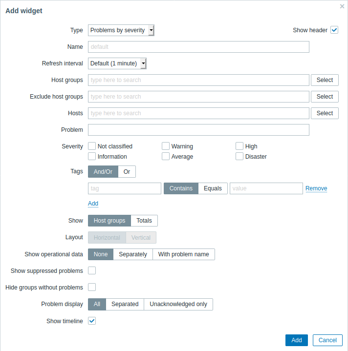
Problems by severity
In this widget you can display problems by severity. You can limit what hosts and triggers are displayed in the widget and define how the problem count is displayed.
To configure, select Problems by severity as type:
 |
|---|
You may set the following specific options:
| Parameter | Description |
|---|---|
| Host groups | Enter host groups to display in the widget. This field is auto-complete so starting to type the name of a group will offer a dropdown of matching groups. Specifying a parent host group implicitly selects all nested host groups. Host data from these host groups will be displayed in the widget. If no host groups are entered, all host groups will be displayed. |
| Exclude host groups | Enter host groups to hide from the widget. This field is auto-complete so starting to type the name of a group will offer a dropdown of matching groups. Specifying a parent host group implicitly selects all nested host groups. Host data from these host groups will not be displayed in the widget. For example, hosts 001, 002, 003 may be in Group A and hosts 002, 003 in Group B as well. If we select to show Group A and exclude Group B at the same time, only data from host 001 will be displayed in the Dashboard. |
| Hosts | Enter hosts to display in the widget. This field is auto-complete so starting to type the name of a host will offer a dropdown of matching hosts. If no hosts are entered, all hosts will be displayed. |
| Problem | You can limit the number of problem hosts displayed by the problem name. If you enter a string here, only those hosts with problems whose name contains the entered string will be displayed. Macros are not expanded. |
| Severity | Mark the problem severities to be displayed in the widget. |
| Tags | Specify tag name and value to limit the number of problems displayed on the graph. To add more tag names and values, click on Add. There are two calculation types for several conditions: And/Or - all conditions must be met, conditions having same tag name will be grouped by Or condition Or - enough if one condition is met There are two ways of matching the tag value: Contains - case-sensitive substring match (tag value contains the entered string) Equals - case-sensitive string match (tag value equals the entered string). |
| Show | Select the show option: Host groups - display problems per host group Totals - display a problem total for all selected host groups in colored blocks corresponding to the problem severity. |
| Layout | Select the layout option: Horizontal - colored blocks of totals will be displayed horizontally Vertical - colored blocks of totals will be displayed vertically This field is available for editing if 'Totals' is selected as the Show option. |
| Show suppressed problems | Mark the checkbox to display problems which would otherwise be suppressed (not shown) because of host maintenance. |
| Hide groups without problems | Mark the Hide groups without problems option to hide data from host groups without problems in the widget. |
| Show operational data | Mark the checkbox to display operational data (see description of Operational data in Monitoring → Problems). |
| Problem display | Display problem count as: All - full problem count will be displayed Separated - unacknowledged problem count will be displayed separated as a number of the total problem count Unacknowledged only - only the unacknowledged problem count will be displayed. |
| Show timeline | Mark the checkbox to display a visual timeline. |
System information
In the System information widget you can display high-level Zabbix and Zabbix server information.
To configure, select System information as type:
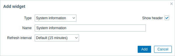 |
|---|
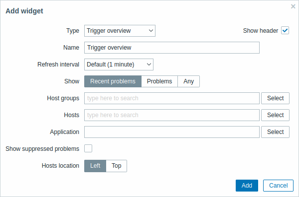
Trigger overview
In the trigger overview widget you can display the trigger states for a group of hosts. It replicates information from Monitoring → Overview (when viewing Trigger overview).
Note that there is a hard-coded limit of 50 records displayed. There is no pagination. If more records exist, a message is displayed at the bottom of the table, asking to provide more specific filtering criteria.
To configure, select Trigger overview as type:
 |
|---|
You may set the following specific options:
| Show | Filter by problem status: Recent problems - unresolved and recently resolved problems are displayed (default) Problems - unresolved problems are displayed Any - history of all events is displayed |
| Host groups | Select the host group(s). This field is auto-complete so starting to type the name of a group will offer a dropdown of matching groups. |
| Hosts | Select hosts. This field is auto-complete so starting to type the name of a host will offer a dropdown of matching hosts. Scroll down to select. Click on 'x' to remove the selected. |
| Application | Enter the application name. |
| Show suppressed problems | Mark the checkbox to display problems which would otherwise be suppressed (not shown) because of host maintenance. |
| Hosts location | Select host location - left or top. |
URL
This widget displays the content retrieved from the specified URL.
To configure, select URL as type:
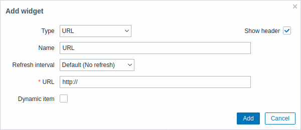 |
|---|
You may set the following specific options:
| URL | Enter the URL to display. Relative paths are allowed since Zabbix 4.4.8. {HOST.*} macros are supported. |
| Dynamic item | Set to display different URL content depending on the selected host. This can work if {HOST.*} macros are used in the URL. |
Browsers might not load an HTTP page included in the widget, if Zabbix frontend is accessed over HTTPS.
Web monitoring
This widget displays a status summary of the active web monitoring scenarios.
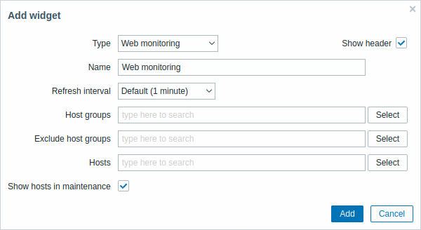 |
|---|
In cases when a user does not have permission to access certain widget elements, that element's name will appear as Inaccessible during the widget's configuration. This results in Inaccessible Item, Inaccessible Host, Inaccessible Group, Inaccessible Map and Inaccessible Graph appearing instead of the "real" name of the element.