
2 Прилагођени графикони
Преглед
Прилагођени графикони, као што име говори, нуде могућности прилагођавања.
Иако су једноставни графикони добри за преглед података једне ставке, они то чине не нуде могућности конфигурације.
Дакле, ако желите да промените стил графикона или начин на који се приказују линије или упоредите неколико ставки, на пример, долазни и одлазни саобраћај један графикон, потребан вам је прилагођени графикон.
Прилагођени графикони се конфигуришу ручно.
Могу се креирати за домаћина или неколико домаћина или за један шаблон.
Конфигурисање прилагођених графикона
Да бисте креирали прилагођени графикон, урадите следеће:
- Идите на Прикупљање података > Домаћини (или шаблони)
- Кликните на Графикони у реду поред жељеног домаћина или шаблона
- На екрану Графикони кликните на Креирај графикон
- Измените атрибуте графикона
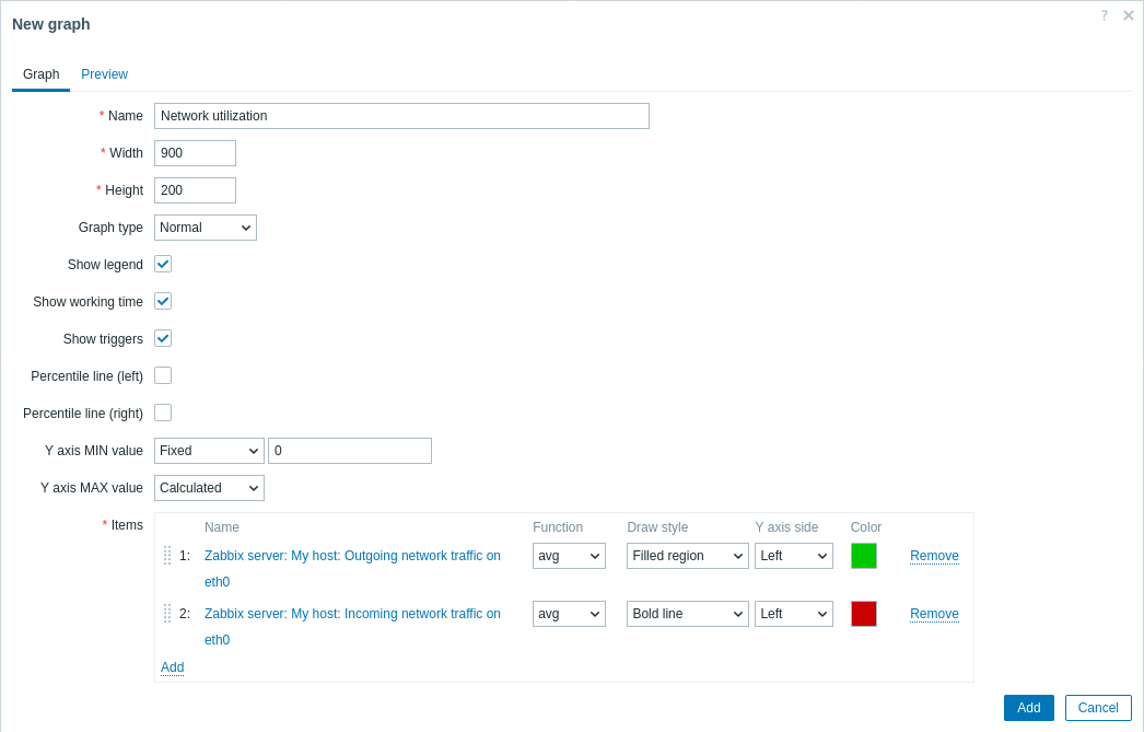
Сва обавезна поља за унос су означена црвеном звездицом.
Атрибути графикона:
| Parameter | Description | |
|---|---|---|
| Назив | Јединствено име графикона. Изрази макрои су подржани у овом пољу, али само са функцијама avg, last, min и max, са временом као параметром (на пример, {?avg(/host/key,1h)}).Макрои {HOST.HOST<1-9>} су подржани за употребу у оквиру овог макроа, референцирајући првог, другог, трећег, итд. домаћина на графикону, на пример {?avg(/{HOST.HOST2}/key,1h)}. Имајте на уму да је референцирање првог домаћина помоћу овог макроа сувишно, јер се на првог домаћина може имплицитно референцирати, на пример {?avg(//key,1h)}. |
|
| Ширина | Ширина графикона у пикселима (само за преглед и пита/разложене графиконе). | |
| Висина | Висина графикона у пикселима. | |
| Тип графикона | Тип графикона: Нормални - нормалан графикон, вредности приказане као линије Наслагани - наслагани графикон, приказане попуњене области Пита - пита графикон Разложени - "разложени" пита графикон, делови приказани као "исечени" из пита графикона |
|
| Прикажи легенду | Означавањем овог поља подесићете приказ легенде графикона. | |
| Приказ радног времена | Ако је изабрано, нерадно време ће бити приказано са сивом позадином. Овај параметар није доступан за пита и разложене пита графиконе. | |
| Прикз окидача | Ако је изабрано, једноставни окидачи ће бити приказани као линије са црним цртицама преко боје озбиљности окидача. Овај параметар није доступан за кружне и разложене пита графиконе. | |
| Перцентилна линија (лево) | Приказује перцентил за леву Y-осу. Ако је, на пример, подешен на 95% перцентил, онда ће линија перцентила бити на нивоу испод којег се налази 95процената вредности. Приказује се као светло зелена линија. Доступно само за нормалне графиконе. | |
| Перцентилна линија (десно) | Приказује процентила за десну Y-осу. Ако је, на пример, подешен 95% перцентил, онда ће перцентилна линија бити на нивоу испод којег се налази 95 процената вредности. Приказује се као светло црвена линија. Доступно само за нормалне графиконе. | |
| MIN вредност Y-осе | Минимална вредност Y-осе: Израчунато - минимална вредност Y-осе ће се аутоматски израчунати. Фиксно - фиксна минимална вредност за Y-осу. Ставка - последња вредност изабране ставке ће бити минимална вредност. Овај параметар није доступан за пита и разложене пита графиконе. |
|
| MAX вредност Y осе | Максимална вредност Y-осе: Израчунато - максимална вредност Y-осе ће бити аутоматски израчуната. Фиксно - фиксна максимална вредност за Y-осу. Ставка - последња вредност изабране ставке ће бити максимална вредност Овај параметар није доступан за пита и разложене пита графиконе. |
|
| 3D приказ | Омогући 3D стил. Само за пита и разложене пита графиконе. | |
| Ставке | Ставке, чији подаци треба да се прикажу на овом графикону. Кликните на Додај да бисте изабрали ставке. Такође можете изабрати различите опције приказивања (функција, стил цртања, приказ леве/десне осе, боја). | |
| Редослед сортирања (0→100) | Редослед цртања. 0 ће бити обрађено прво. Може се користити за цртање линија или региона иза (или испред) другог. Можете превлачити и испуштати ставке користећи икону на почетку линије да бисте подесили редослед сортирања или која ставка се приказује испред друге. |
|
| Име | Име изабране ставке се приказује као линк. Кликом на линк отвара се листа других доступних ставки. | |
| Тип | Тип (доступно само за пита и разложене пита графиконе): Једноставно - вредност ставке је пропорционално представљена на пита графикону Збир графикона - вредност ставке представља цео пита графикон Имајте на уму да ће бојење ставке "збир графикона" бити видљиво само у мери у којој је не заузимају "пропорционалне" ставке. |
|
| Функција | Изаберите које вредности ће се приказивати када постоји више од једне вредности по вертикалном пикселу графикона за ставку: све - приказује све могуће вредности (минимум, максимум, просек) на графикону. Имајте на уму да за краће периоде ово подешавање нема ефекта; само током дужег периода, када се повећа загушење података у вертикалном пикселу графикона, 'all' почиње да приказује минималне, максималне и просечне вредности. Ова функција је доступна само за тип графикона Нормални. Погледајте такође: Генерисање графикона из историје/трендова. просек - приказ просечних вредности последњи - приказ најновијих вредности. Ова функција је доступна само ако је као тип графикона изабран Пита/Разложен пита графикон. max - приказ максималних вредности min - приказ минималних вредности |
|
| Стил цртања | Изаберите стил цртања (доступно само за нормалне графиконе; за наслагане графиконе увек се користи попуњена област) који ће се применити на податке ставке - Линија, Подебљана линија, Попуњена област, Тачка, Испрекидана линија, Линија градијента. | |
| Страна Y-осе | Изаберите страну Y-осе да бисте приказали податке ставке - Лево, Десно. | |
| Боја | Изаберите боју која ће се применити на податке ставке. | |
Преглед графикона
На картици Преглед, приказује се преглед графикона тако да можете одмах види шта ствараш.
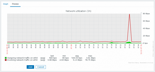
Имајте на уму да преглед неће приказати никакве податке за ставке шаблона.
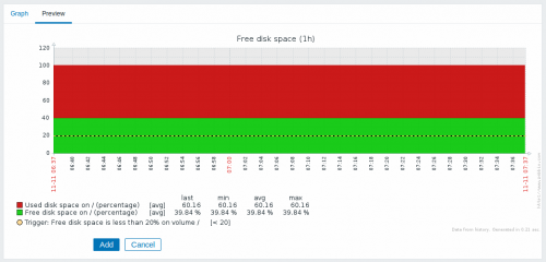
У овом примеру обратите пажњу на испрекидану подебљану линију која приказује ниво окидача и информације о окидачу приказане у легенди.
Не могу се приказати више од 3 линије окидача. Ако постоје
више окидача од окидача са нижом озбиљношћу имају приоритет
приказ.
Ако је висина графикона подешена на мању од 120 пиксела, окидач неће бити
приказано у легенди.