20 Pie chart
Overview
The pie chart widget allows to display values of selected items as a pie or doughnut chart.
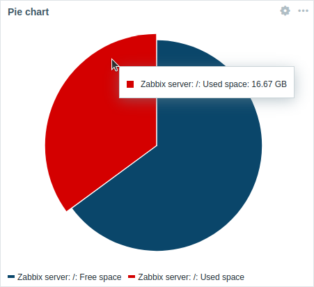 Pie chart. |
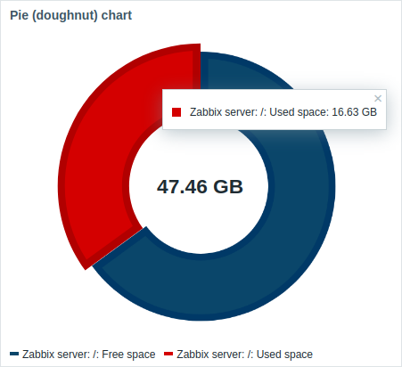 Doughnut chart. |
On mouseover, the focused sector enlarges outwards and the legend for this sector is displayed. Clicking on the focused sector makes the pop-out effect permanent, until closed with "x".
The charts are drawn using a vector image drawing technique.
Configuration
To configure, select Pie chart as type:
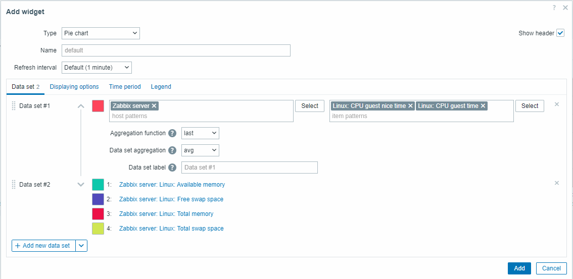
Data set
The Data set tab allows selecting data for the pie chart by adding data sets. Two types of data sets can be added:
- Item patterns - data from matching items is displayed. The chart is drawn using different shades of single color for each item.
- Item list - data from selected items is displayed. The chart is drawn using different colors for each item.
By default, an Item patterns data set is added.
| Data set | For Item patterns data set: Select or enter host and item patterns; data of items that match the entered patterns will be displayed on the pie chart; up to 50 items may be displayed. Wildcard patterns may be used for selection (for example, * will return results that match zero or more characters).To specify a wildcard pattern, enter the string manually and press Enter. The wildcard symbol is always interpreted, so it is not possible to add, for example, an item named item* individually if there are other matching items (for example, item2, item3). Specifying host and item patterns is mandatory for "Item patterns" data sets. See also: Data set configuration details. For Item list data set: Select items for the pie chart by clicking on the Add item button. The Type dropdown after the item name allows to select the display type for each item: Normal - item value is represented proportionally on the pie chart (default); Total - item value takes up the whole pie chart. Note that only one "Total" item can exist per pie chart, and it will be placed first on the pie chart legend. If an item is set to "Total", the Data set aggregation parameter (see below) will be disabled and set to "not used". Since Zabbix 7.0.1, you may also select compatible widgets as the data source for items by clicking on the Add widget button. The same options apply to widgets as to individual items. Specifying items or widgets is mandatory for "Item list" data sets. See also: Data set configuration details. Note that only numeric item types are allowed. When configuring the widget on a template dashboard, the parameter for specifying host patterns is not available, and the parameter for specifying an item list allows to select only the items configured on the template. |
|
| Aggregation function | Specify which aggregation function to use for each item in the data set within the selected Time period: min - display the smallest value; max - display the largest value; avg - display the average value; sum - display the sum of values; count - display the count of values; first - display the first value; last - display the last value (default). Aggregation allows to display an aggregated value for the chosen interval (5 minutes, an hour, a day). Only numeric data can be displayed for min, max, avg and sum. For count, non-numeric data will be changed to numeric. |
|
| Data set aggregation | Specify which aggregation function to use for the whole data set: not used - no aggregation, items are displayed separately (default); min - display the smallest value; max - display the largest value; avg - display the average value; sum - display the sum of values; count - display the count of values. Aggregation allows to display an aggregated value for the interval (5 minutes, an hour, a day) selected in the Time period tab or used for the whole dashboard. |
|
| Data set label | Specify a custom label for the data set. The label is displayed in the data set configuration and the pie chart legend (for aggregated data sets). All data sets are numbered including those with a specified Data set label. If no label is specified, the data set will be labeled automatically according to its number (e.g. "Data set #2", "Data set #3", etc.). Data set numbering is recalculated after reordering/dragging data sets. Data set labels that are too long will be shortened to fit where displayed (e.g. "Number of proc..."). |
|
Data set configuration details
Existing data sets are displayed in a list. You can rearrange, expand/collapse, change colors, and clone these data sets.
For more information, see data set configuration details in the Graph widget. These details also apply to the Pie chart widget.
Displaying options
The Displaying options tab allows to define history data selection and visualization options for the pie chart:
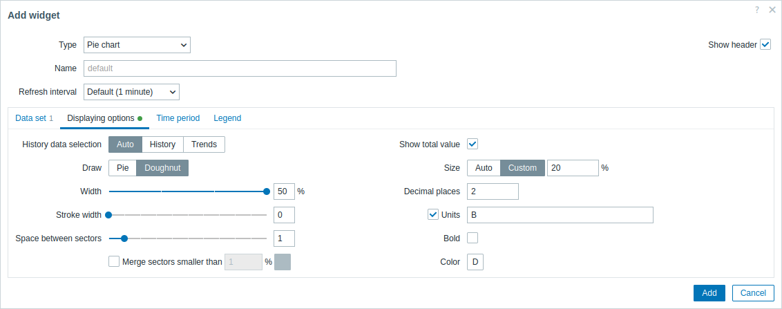
| History data selection | Select the data source: Auto - data are sourced according to the classic algorithm (default); History - data from history; Trends - data from trends. |
||
| Draw | Select the visualization style of the pie chart: Pie - a full pie (sectors take up 100% of the radius); Doughnut - a pie with empty circle in the middle (sectors use up to 50% of radius). |
||
| Space between sectors | Select the space size (in units of 0-10) between sectors (default is "1"). | ||
| Merge sectors smaller than N% | Mark the checkbox to merge sectors smaller than the N%. If enabled, select the color for the merged sectors and the percentage threshold (N) for merging small sectors. |
||
| Draw style: Doughnut | |||
| Width | Select the doughnut width: 20, 30, 40 or 50% (default) of the radius. | ||
| Stroke width | Select the width of the doughnut sector border (0-10). Supported since Zabbix 7.0.1. |
||
| Show total value | Mark the checkbox to show the total value in the middle of the doughnut chart. | ||
| Size | Select the size option for the total value: Auto - the text is sized automatically to fit the doughnut middle readably; Custom - specify the text size as height percentage from the total widget height. |
||
| Decimal places | Specify the number of decimal places for the total value (0-6). | ||
| Units | Specify the units for the total value. | ||
| Bold | Mark the checkbox to display the total value in bold. | ||
| Color | Select the color for the total value. | ||
Time period
The Time period tab allows to set a custom time period for the aggregation settings of the pie chart:
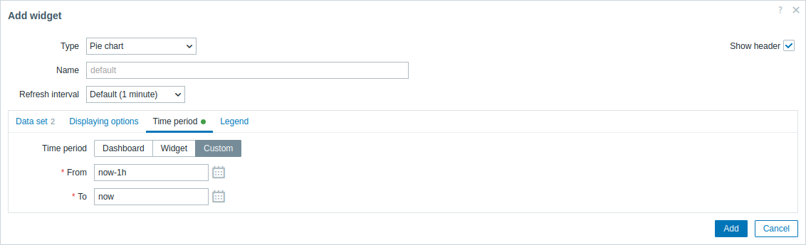
| Time period | Select the data source for the time period: Dashboard - set the Time period selector as the data source; Widget - set a compatible widget specified in the Widget parameter as the data source; Custom - set the time period specified in the From and To parameters as the data source; if set, a clock icon will be displayed in the top right corner of the widget, indicating the set time on mouseover. |
| Widget | Enter or select a compatible widget (Graph, Graph (classic), Graph prototype) as the data source for the time period. This parameter is available if Time period is set to "Widget". |
| From | Enter or select the start of the time period. Relative time syntax ( now, now/d, now/w-1w, etc.) is supported.This parameter is available if Time period is set to "Custom". |
| To | Enter or select the end of the time period. Relative time syntax ( now, now/d, now/w-1w, etc.) is supported.This parameter is available if Time period is set to "Custom". |
Legend
The Legend tab allows to customize the pie chart legend:
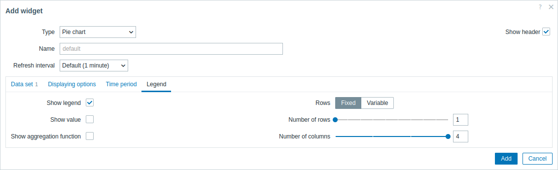
| Show legend | Unmark this checkbox to hide the legend on the pie chart (marked by default). |
| Show value | Mark this checkbox to show the value of the item in the legend. |
| Show aggregation function | Mark this checkbox to show the aggregation function in the legend. |
| Rows | Select the display mode for legend rows: Fixed - the number of rows displayed is determined by the Number of rows parameter value; Variable - the number of rows displayed is determined by the amount of configured items while not exceeding the Maximum number of rows parameter value. |
| Number of rows/ Maximum number of rows |
If Rows is set to "Fixed", set the number of legend rows to be displayed (1-10). If Rows is set to "Variable", set the maximum number of legend rows to be displayed (1-10). |
| Number of columns | Set the number of legend columns to be displayed (1-4). This parameter is available if Show value is unmarked. |
The information displayed by the pie chart widget can be downloaded as a .png image using the widget menu.
A screenshot of the widget will be saved to the Downloads folder.