
1 Simple graphs
Overview
Simple graphs are provided for the visualization of data gathered by items.
No configuration effort is required on the user part to view simple graphs. They are freely made available by Zabbix.
Just go to Monitoring → Latest data and click on the Graph link for the respective item and a graph will be displayed.
Simple graphs are provided for all numeric items. For textual items, a link to History is available in Monitoring → Latest data.
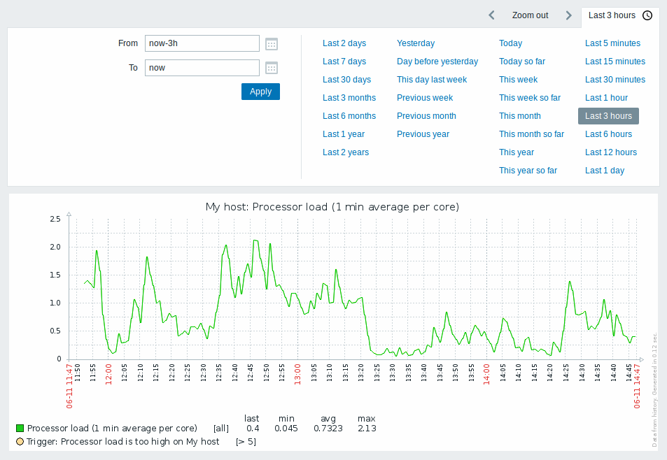
Time period selector
Take note of the time period selector above the graph. It allows to select often required periods with one mouse click.
Note that such options as Today, This week, This month, This year display the whole period, including the hours/days in the future. Today so far, in contrast, only displays the hours passed.
Once a period is selected, it can be moved back and forth in time by
clicking on the
![]()
![]() arrow buttons. The Zoom out button allows to zoom out the period two
times or by 50% in each direction. Zoom out is also possible by
double-clicking in the graphs. The whole time period selector can be
collapsed by clicking on the tab label containing the selected period
string.
arrow buttons. The Zoom out button allows to zoom out the period two
times or by 50% in each direction. Zoom out is also possible by
double-clicking in the graphs. The whole time period selector can be
collapsed by clicking on the tab label containing the selected period
string.
The From/To fields display the selected period in either:
- absolute time syntax in format
Y-m-d H:i:s - relative time syntax, e.g.:
now-1d
A date in relative format can contain one or several mathematical
operations (- or +), e.g. now-1d or now-1d-2h+5m. For relative time
the following abbreviations are supported:
- now
- s (seconds)
- m (minutes)
- h (hours)
- d (days)
- w (weeks)
- M (months)
- y (years)
Precision is supported in the time filter (e. g., an expression like now-1d/M).
Details of precision:
| Precision | From | To |
|---|---|---|
| m | Y-m-d H:m:00 | Y-m-d H:m:59 |
| h | Y-m-d H:00:00 | Y-m-d H:59:59 |
| d | Y-m-d 00:00:00 | Y-m-d 23:59:59 |
| w | Monday of the week 00:00:00 | Sunday of the week 23:59:59 |
| M | First day of the month 00:00:00 | Last day of the month 23:59:59 |
| y | 1st of January of the year 00:00:00 | 31st of December of the year 23:59:59 |
For example:
| From | To | Selected period |
|---|---|---|
now/d |
now/d |
00:00 - 23:59 today |
now/d |
now/d+1d |
00:00 today - 23:59 tomorrow |
now/w |
now/w |
Monday 00:00:00 - Sunday 23:59:59 this week |
now-1y/w |
now-1y/w |
The week of Monday 00:00:00 - Sunday 23:59:59 one year ago |
Date picker
It is possible to pick a specific start/end date by clicking on the calendar icon next to the From/To fields. In this case, the date picker pop up will open.
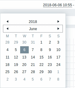
Within the date picker, it is possible to navigate between the blocks of year/month/date using Tab and Shift+Tab. Keyboard arrows or arrow buttons allow to select the desired value. Pressing Enter (or clicking on the desired value) activates the choice.
Another way of controlling the displayed time is to highlight an area in the graph with the left mouse button. The graph will zoom into the highlighted area once you release the left mouse button.
In case no time value is specified or field is left blank, time value will be set to "00:00:00". This doesn't apply to today's date selection: in that case time will be set to current value.
Recent data vs longer periods
For very recent data a single line is drawn connecting each received value. The single line is drawn as long as there is at least one horizontal pixel available for one value.
For data that show a longer period three lines are drawn - a dark green one shows the average, while a light pink and a light green line shows the maximum and minimum values at that point in time. The space between the highs and the lows is filled with yellow background.
Working time (working days) is displayed in graphs as a white background, while non-working time is displayed in gray (with the Original blue default frontend theme).
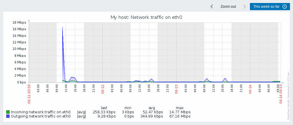
Working time is always displayed in simple graphs, whereas displaying it in custom graphs is a user preference.
Working time is not displayed if the graph shows more than 3 months.
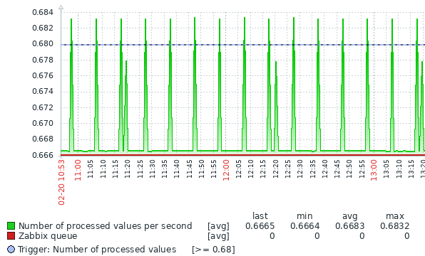
Trigger lines
Simple triggers are displayed as lines with black dashes over trigger severity color -- take note of the blue line on the graph and the trigger information displayed in the legend. Up to 3 trigger lines can be displayed on the graph; if there are more triggers then the triggers with lower severity are prioritized. Triggers are always displayed in simple graphs, whereas displaying them in custom graphs is a user preference.
Generating from history/trends
Graphs can be drawn based on either item history or trends.
For the users who have frontend debug mode activated, a gray, vertical caption is displayed at the bottom right of a graph indicating where the data come from.
Several factors influence whether history of trends is used:
- longevity of item history. For example, item history can be kept for 14 days. In that case, any data older than the fourteen days will be coming from trends.
<!-- -->- data congestion in the graph. If the amount of seconds to display in a horizontal graph pixel exceeds 3600/16, trend data are displayed (even if item history is still available for the same period).
<!-- -->- if trends are disabled, item history is used for graph building - if available for that period. This is supported starting with Zabbix 2.2.1 (before, disabled trends would mean an empty graph for the period even if item history was available).
Absence of data
For items with a regular update interval, nothing is displayed in the graph if item data are not collected.
However, for trapper items and items with a scheduled update interval (and regular update interval set to 0), a straight line is drawn leading up to the first collected value and from the last collected value to the end of graph; the line is on the level of the first/last value respectively.
Switching to raw values
A dropdown on the upper right allows to switch from the simple graph to the Values/500 latest values listings. This can be useful for viewing the numeric values making up the graph.
The values represented here are raw, i.e. no units or postprocessing of values is used. Value mapping, however, is applied.
Known issues
See known issues for graphs.