
On this page
2 Clock
Overview
In the clock widget, you may display local, server, or specified host time.
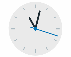
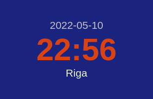
Both analog and digital clocks can be displayed:
Configuration
To configure, select Clock as type:
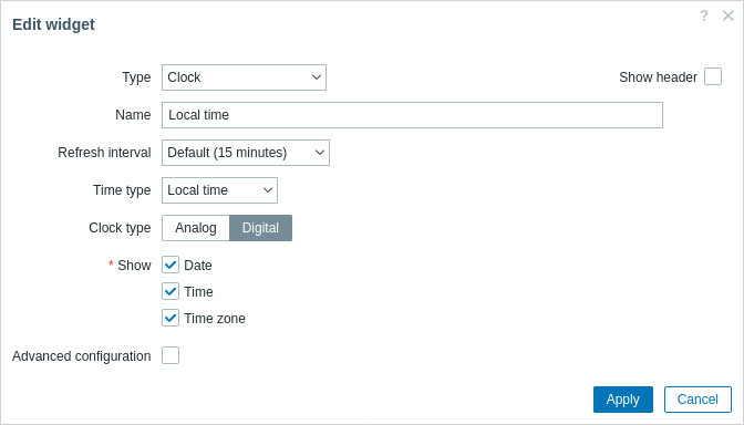
In addition to the parameters that are common for all widgets, you may set the following specific options:
| Time type | Select local, server, or specified host time. Server time will be identical to the time zone set globally or for the Zabbix user. |
| Item | Select the item for displaying time. To display host time, use the system.localtime[local] item. This item must exist on the host.This field is available only when Host time is selected. |
| Clock type | Select clock type: Analog - analog clock Digital - digital clock |
| Show | Select information units to display in the digital clock (date, time, time zone). This field is available only if "Digital" is selected in the Clock type field. |
| Advanced configuration | Mark the checkbox to display advanced configuration options for the digital clock. This field is available only if "Digital" is selected in the Clock type field. |
Advanced configuration
Advanced configuration options become available if the Advanced configuration checkbox is marked (see screenshot) and only for those elements that are selected in the Show field (see above).
Additionally, advanced configuration allows to change the background color for the whole widget.
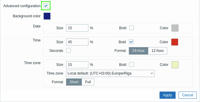
| Background color | Select the background color from the color picker.D stands for default color (depends on the frontend theme). To return to the default value, click the Use default button in the color picker. |
| Date | |
| Size | Enter font size height for the date (in percent relative to total widget height). |
| Bold | Mark the checkbox to display date in bold type. |
| Color | Select the date color from the color picker.D stands for default color (depends on the frontend theme). To return to the default value, click the Use default button in the color picker. |
| Time | |
| Size | Enter font size height for the time (in percent relative to total widget height). |
| Bold | Mark the checkbox to display time in bold type. |
| Color | Select the time color from the color picker.D stands for default color (depends on the frontend theme). To return to the default value, click the Use default button in the color picker. |
| Seconds | Mark the checkbox to display seconds. Otherwise only hours and minutes will be displayed. |
| Format | Select to display a 24-hour or 12-hour time. |
| Time zone | |
| Size | Enter font size height for the time zone (in percent relative to total widget height). |
| Bold | Mark the checkbox to display time zone in bold type. |
| Color | Select the time zone color from the color picker.D stands for default color (depends on the frontend theme). To return to the default value, click the Use default button in the color picker. |
| Time zone | Select the time zone. |
| Format | Select to display time zone in short format (e.g. New York) or full format (e.g.(UTC-04:00) America/New York). |