
1 Configuring a network map
Overview
Configuring a map in Zabbix requires that you first create a map by defining its general parameters and then you start filling the actual map with elements and their links.
You can populate the map with elements that are a host, a host group, a trigger, an image, or another map.
Icons are used to represent map elements. You can define the information that will be displayed with the icons and set that recent problems are displayed in a special way. You can link the icons and define information to be displayed on the links.
You can add custom URLs to be accessible by clicking on the icons. Thus you may link a host icon to host properties or a map icon to another map.
Maps are managed in Monitoring → Maps, where they can be configured, managed and viewed. In the monitoring view, you can click on the icons and take advantage of the links to some scripts and URLs.
Network maps are based on vector graphics (SVG) since Zabbix 3.4.
Public and private maps
All users in Zabbix (including non-admin users) can create network maps. Maps have an owner - the user who created them. Maps can be made public or private.
- Public maps are visible to all users, although to see it the user must have read access to at least one map element. Public maps can be edited in case a user/ user group has read-write permissions for this map and at least read permissions to all elements of the corresponding map including triggers in the links.
<!-- -->- Private maps are visible only to their owner and the users/user groups the map is shared with by the owner. Regular (non-Super admin) users can only share with the groups and users they are members of. Admin level users can see private maps regardless of being the owner or belonging to the shared user list. Private maps can be edited by the owner of the map and in case a user/ user group has read-write permissions for this map and at least read permissions to all elements of the corresponding map including triggers in the links.
Map elements that the user does not have read permission to are displayed with a grayed-out icon and all textual information on the element is hidden. However, the trigger label is visible even if the user has no permission to the trigger.
To add an element to the map the user must also have at least read permission to it.
Creating a map
To create a map, do the following:
- Go to Monitoring → Maps
- Go to the view with all maps
- Click on Create map
You can also use the Clone and Full clone buttons in the configuration form of an existing map to create a new map. Clicking on Clone will retain general layout attributes of the original map, but no elements. Full clone will retain both the general layout attributes and all elements of the original map.
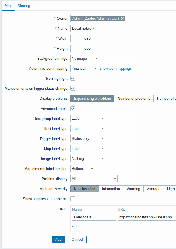
The Map tab contains general map attributes:
All mandatory input fields are marked with a red asterisk.
General map attributes:
| Parameter | Description |
|---|---|
| Owner | Name of map owner. |
| Name | Unique map name. |
| Width | Map width in pixels. |
| Height | Map height in pixels. |
| Background image | Use background image: No image - no background image (white background) Image - selected image to be used as a background image. No scaling is performed. You may use a geographical map or any other image to enhance your map. |
| Automatic icon mapping | You can set to use an automatic icon mapping, configured in Administration → General → Icon mapping. Icon mapping allows mapping certain icons against certain host inventory fields. |
| Icon highlighting | If you check this box, map elements will receive highlighting. Elements with an active trigger will receive a round background, in the same color as the highest severity trigger. Moreover, a thick green line will be displayed around the circle, if all problems are acknowledged. Elements with "disabled" or "in maintenance" status will get a square background, gray and orange respectively. See also: Viewing maps |
| Mark elements on trigger status change | A recent change of trigger status (recent problem or resolution) will be highlighted with markers (inward-pointing red triangles) on the three sides of the element icon that are free of the label. Markers are displayed for 30 minutes. |
| Display problems | Select how problems are displayed with a map element: Expand single problem - if there is only one problem, the problem name is displayed. Otherwise, the total number of problems is displayed. Number of problems - the total number of problems is displayed Number of problems and expand most critical one - the name of the most critical problem and the total number of problems is displayed. 'Most critical' is determined based on problem severity and, if equal, problem event ID (higher ID or later problem displayed first). For a trigger map element it is based on problem severity and if equal, trigger position in the trigger list. In case of multiple problems of the same trigger, the most recent one will be displayed. |
| Advanced labels | If you check this box you will be able to define separate label types for separate element types. |
| Map element label type | Label type used for map elements: Label - map element label IP address - IP address Element name - element name (for example, host name) Status only - status only (OK or PROBLEM) Nothing - no labels are displayed |
| Map element label location | Label location in relation to the map element: Bottom - beneath the map element Left - to the left Right - to the right Top - above the map element |
| Problem display | Display problem count as: All - full problem count will be displayed Separated - unacknowledged problem count will be displayed separated as a number of the total problem count Unacknowledged only - only the unacknowledged problem count will be displayed |
| Minimum trigger severity | Problems below the selected minimum severity level will not be displayed on the map. For example, with Warning selected, changes with Information and Not classified level triggers will not be reflected in the map. This parameter is supported starting with Zabbix 2.2. |
| Show suppressed problems | Mark the checkbox to display problems that would otherwise be suppressed (not shown) because of host maintenance. |
| URLs | URLs for each element type can be defined (with a label). These will be displayed as links when a user clicks on the element in the map viewing mode. Macros can be used in map URL names and values. For a full list, see supported macros and search for 'map URL names and values'. |
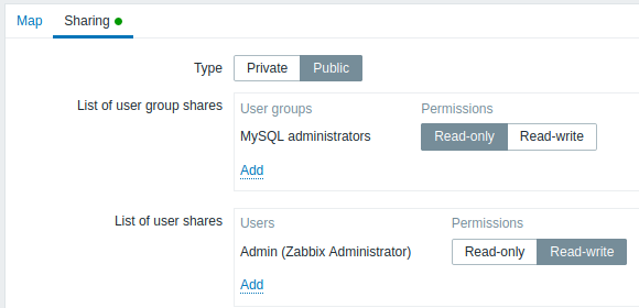
Sharing
The Sharing tab contains the map type as well as sharing options (user groups, users) for private maps:
| Parameter | Description |
|---|---|
| Type | Select map type: Private - map is visible only to selected user groups and users Public - map is visible to all |
| List of user group shares | Select user groups that the map is accessible to. You may allow read-only or read-write access. |
| List of user shares | Select users that the map is accessible to. You may allow read-only or read-write access. |
When you click on Add to save this map, you have created an empty map with a name, dimensions, and certain preferences. Now you need to add some elements. For that, click on Constructor in the map list to open the editable area.
Adding elements
To add an element, click on Add next to Map element. The new element
will appear at the top left corner of the map. Drag and drop it wherever
you like.
Note that with the Grid option "On", elements will always align to the grid (you can pick various grid sizes from the dropdown, also hide/show the grid). If you want to put elements anywhere without alignment, turn the option to "Off". (Random elements can later again be aligned to the grid with the Align map elements button.)
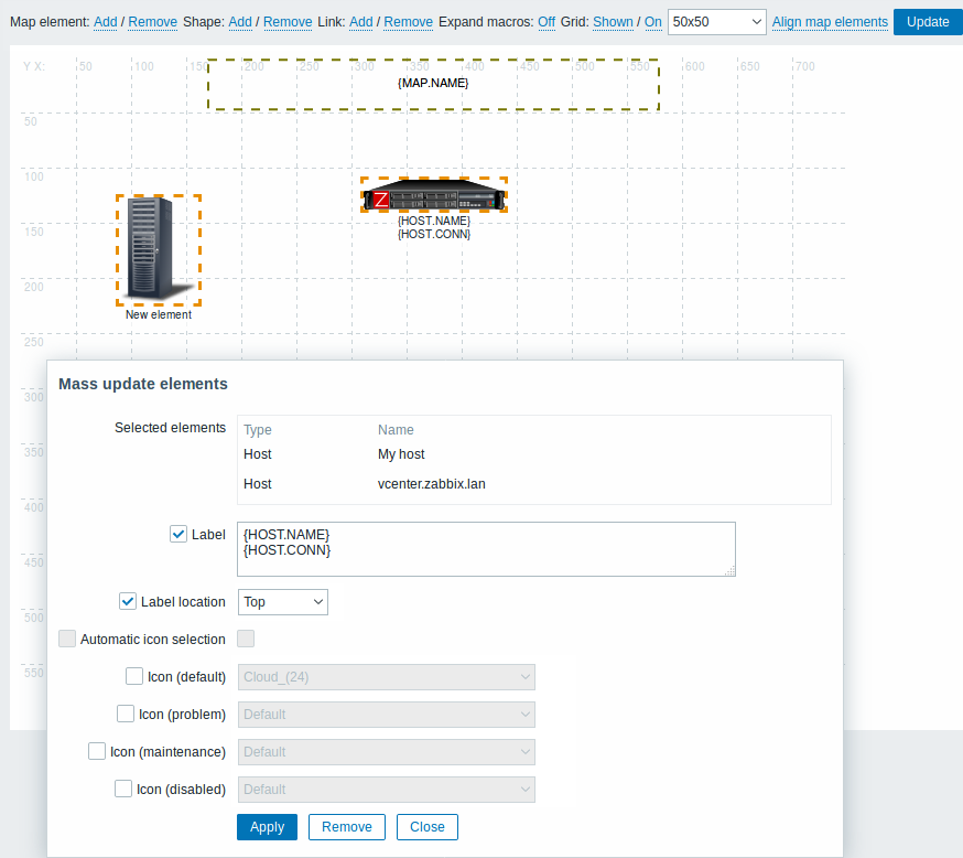
Now that you have some elements in place, you may want to start differentiating them by giving names, etc. By clicking on the element, a form is displayed and you can set the element type, give a name, choose a different icon, etc.
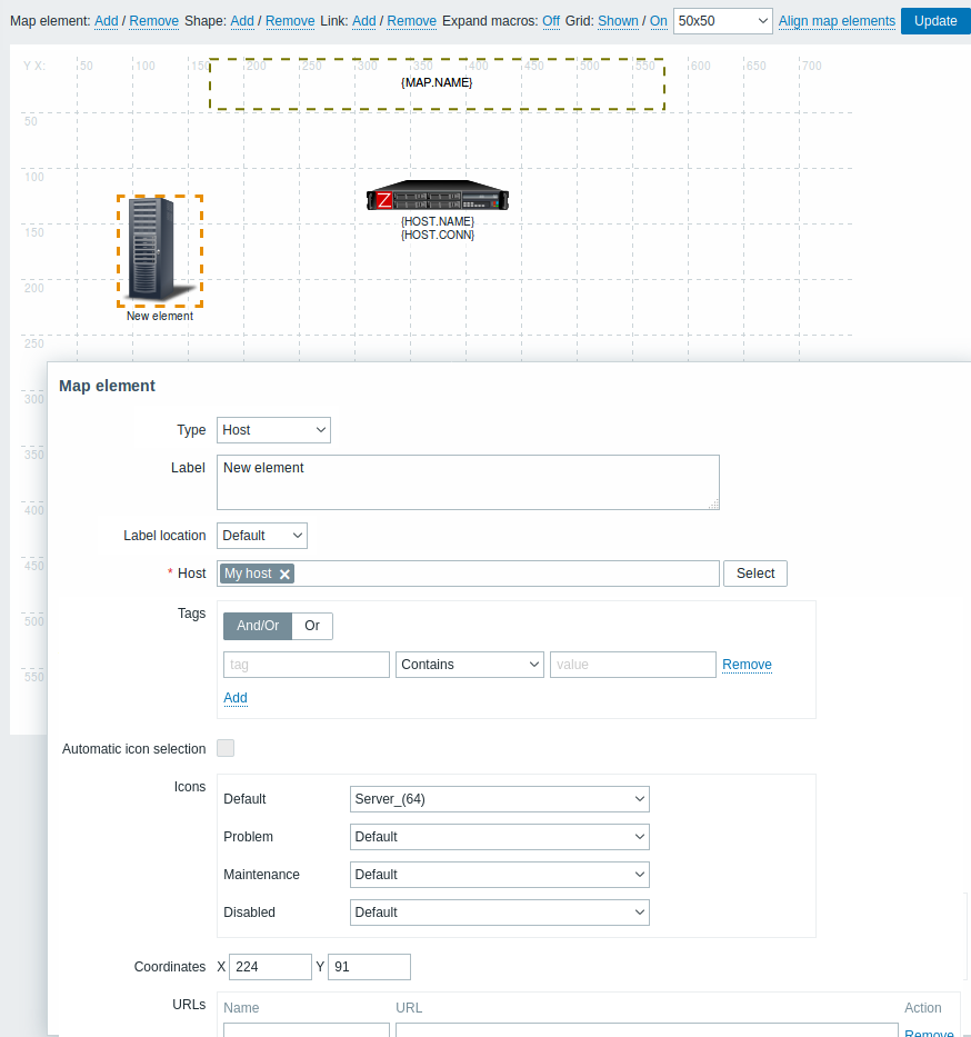
Map element attributes:
| Parameter | Description |
|---|---|
| Type | Type of the element: Host - icon representing status of all triggers of the selected host Map - icon representing status of all elements of a map Trigger - icon representing status of one or more triggers Host group - icon representing status of all triggers of all hosts belonging to the selected group Image - an icon, not linked to any resource |
| Label | Icon label, any string. Macros and multi-line strings can be used in labels. For a full list of supported macros, see supported macros and search for 'map element labels'. |
| Label location | Label location in relation to the icon: Default - map's default label location Bottom - beneath the icon Left - to the left Right - to the right Top - above the icon |
| Host | Enter the host if the element type is 'Host'. This field is auto-complete so starting to type the name of a host will offer a dropdown of matching hosts. Scroll down to select. Click on 'x' to remove the selected. |
| Map | Select the map, if the element type is 'Map'. |
| Triggers | If the element type is 'Trigger', select one or more triggers in the New triggers field below and click on Add. The order of selected triggers can be changed, but only within the same severity of triggers. Multiple trigger selection also affects {HOST.*} macro resolution both in the construction and view modes. // 1 In construction mode// the first displayed {HOST.*} macros will be resolved depending on the first trigger in the list (based on trigger severity). // 2 View mode// depends on the Display problems parameter in General map attributes. * If Expand single problem mode is chosen the first displayed {HOST.*} macros will be resolved depending on the latest detected problem trigger (not mattering the severity) or the first trigger in the list (in case no problem detected); * If Number of problems and expand most critical one mode is chosen the first displayed {HOST.*} macros will be resolved depending on the trigger severity. |
| Host group | Enter the host group if the element type is 'Host group'. This field is auto-complete so starting to type the name of a group will offer a dropdown of matching groups. Scroll down to select. Click on 'x' to remove the selected. |
| Tags | Specify tags to limit the number of problems displayed in the widget. It is possible to include as well as exclude specific tags and tag values. Several conditions can be set. Tag name matching is always case-sensitive. There are several operators available for each condition: Exists - include the specified tag names Equals - include the specified tag names and values (case-sensitive) Contains - include the specified tag names where the tag values contain the entered string (substring match, case-insensitive) Does not exist - exclude the specified tag names Does not equal - exclude the specified tag names and values (case-sensitive) Does not contain - exclude the specified tag names where the tag values contain the entered string (substring match, case-insensitive) There are two calculation types for conditions: And/Or - all conditions must be met, conditions having the same tag name will be grouped by the Or condition Or - enough if one condition is met This field is available for host and host group element types. |
| Automatic icon selection | In this case an icon mapping will be used to determine which icon to display. |
| Icons | You can choose to display different icons for the element in these cases: default, problem, maintenance, disabled. |
| Coordinate X | X coordinate of the map element. |
| Coordinate Y | Y coordinate of the map element. |
| URLs | Element-specific URLs can be set for the element. These will be displayed as links when a user clicks on the element in the map viewing mode. If the element has its own URLs and there are map level URLs for its type defined, they will be combined in the same menu. Macros can be used in map element names and values. For a full list, see supported macros and search for 'map URL names and values'. |
Added elements are not automatically saved. If you navigate away from the page, all changes may be lost.
Therefore it is a good idea to click on the Update button in the top right corner. Once clicked, the changes are saved regardless of what you choose in the following popup.
Selected grid options are also saved with each map.
Selecting elements
To select elements, select one and then hold down Ctrl to select the others.
You can also select multiple elements by dragging a rectangle in the editable area and selecting all elements in it.
Once you select more than one element, the element property form shifts to the mass-update mode so you can change attributes of selected elements in one go. To do so, mark the attribute using the checkbox and enter a new value for it. You may use macros here (for example, {HOST.NAME} for the element label).
Linking elements
Once you have put some elements on the map, it is time to start linking them. To link two elements you must first select them. With the elements selected, click on Add next to Link.
With a link created, the single element form now contains an additional Links section. Click on Edit to edit link attributes.
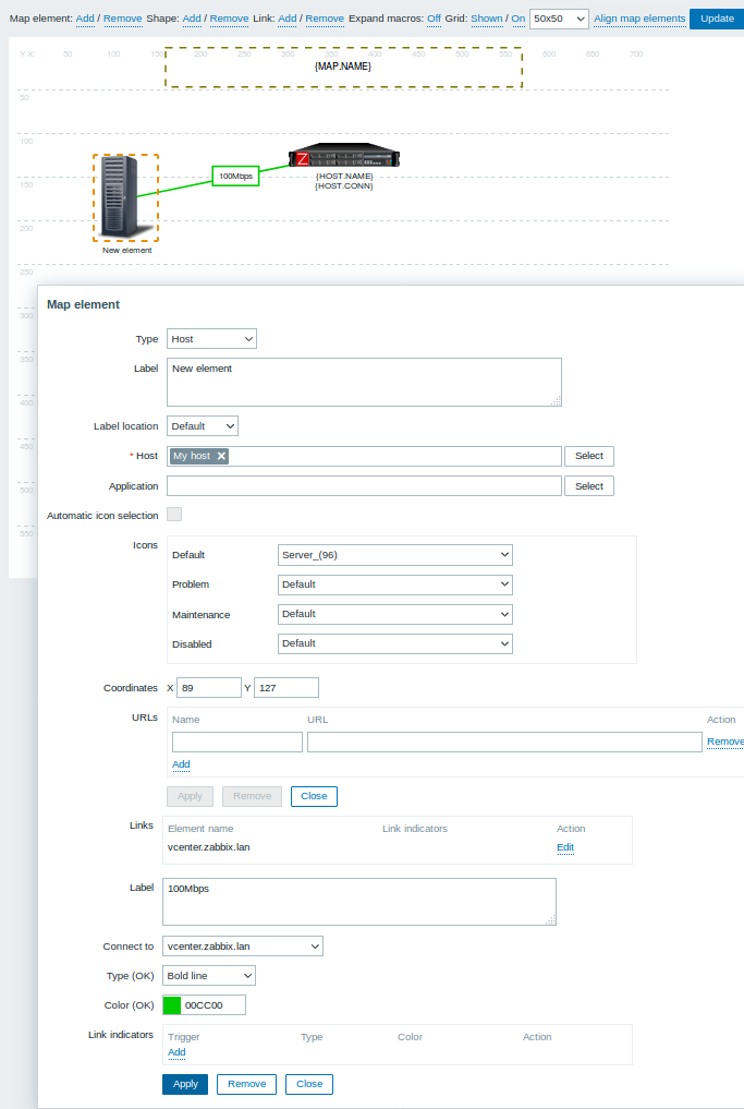
Link attributes:
| Parameter | Description |
|---|---|
| Label | Label that will be rendered on top of the link. The {host:key.func(param)} macro is supported in this field, but only with avg, last, min and max trigger functions, with seconds as parameter. |
| Connect to | The element that the link connects to. |
| Type (OK) | Default link style: Line - single line Bold line - bold line Dot - dots Dashed line - dashed line |
| Color (OK) | Default link color. |
| Link indicators | List of triggers linked to the link. In case a trigger has status PROBLEM, its style is applied to the link. |
Moving and copy-pasting elements
Several selected elements can be moved to another place in the map by clicking on one of the selected elements, holding down the mouse button, and moving the cursor to the desired location.
One or more elements can be copied by selecting the elements, then clicking on a selected element with the right mouse button and selecting Copy from the menu.
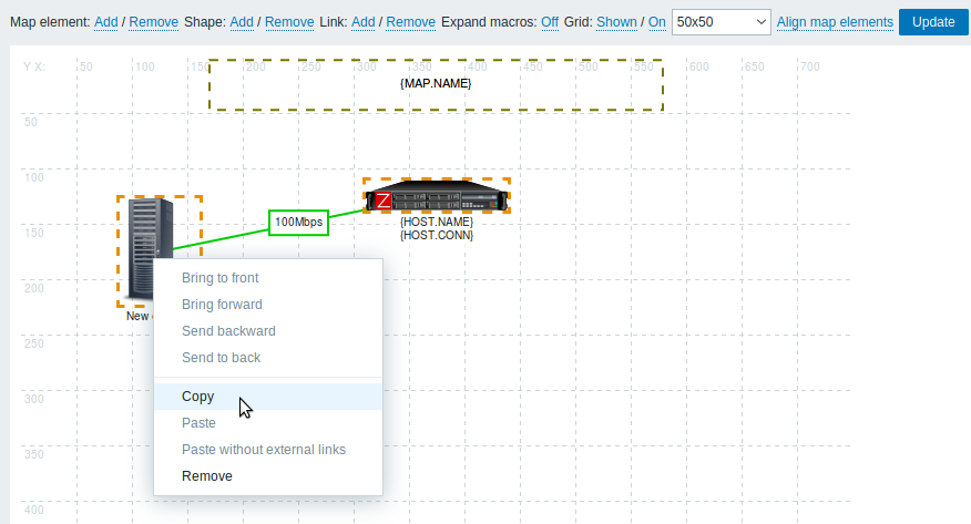
To paste the elements, click on a map area with the right mouse button and select Paste from the menu. The Paste without external links option will paste the elements retaining only the links that are between the selected elements.
Copy-pasting works within the same browser window. Keyboard shortcuts are not supported.
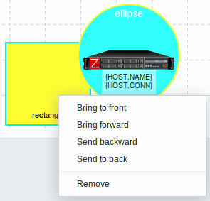
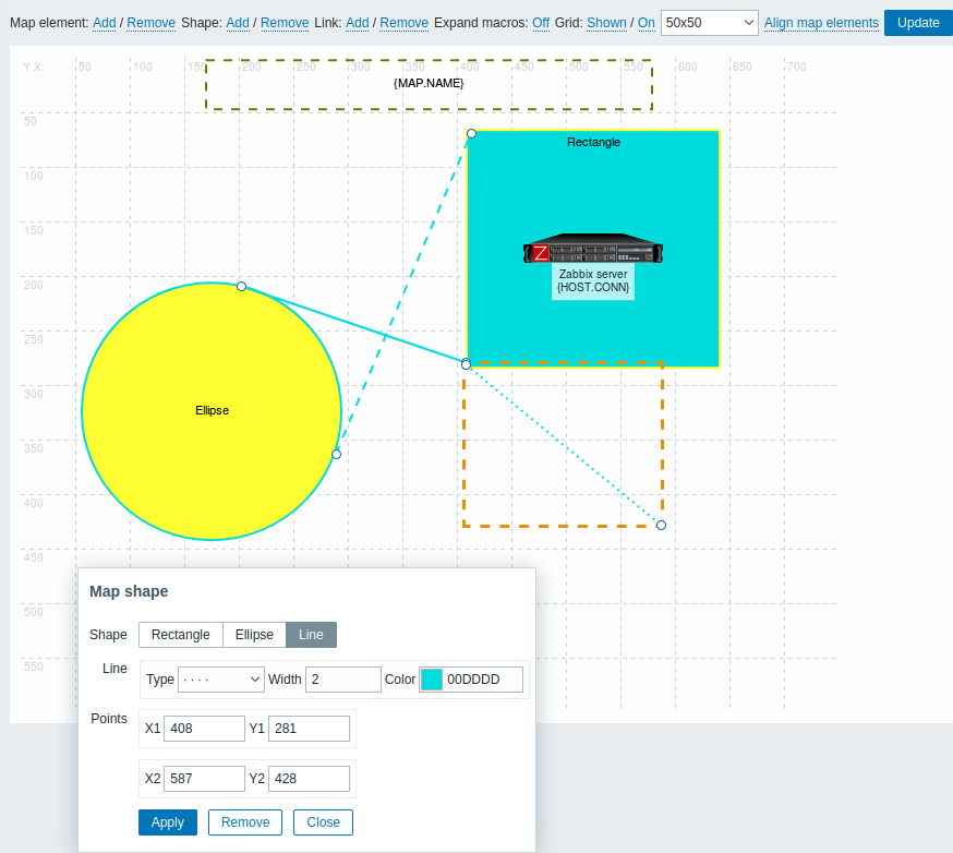
Adding shapes
In addition to map elements, it is also possible to add some shapes. Shapes are not map elements; they are just a visual representation. For example, a rectangle shape can be used as a background to group some hosts. Rectangle and ellipse shapes can be added.
To add a shape, click on Add next to Shape. The new shape will appear at the top left corner of the map. Drag and drop it wherever you like.
A new shape is added with default colors. By clicking on the shape, a form is displayed and you can customize the way a shape looks, add text, etc.
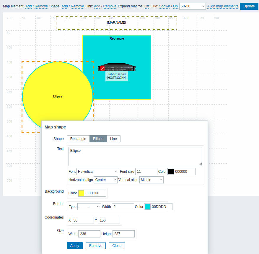
To select shapes, select one and then hold down Ctrl to select the others. With several shapes selected, common properties can be mass updated, similarly as with elements.
Text can be added in the shapes. To display text only the shape can be made invisible by removing the shape border (select 'None' in the Border field). For example, take note of how the {MAP.NAME} macro, visible in the screenshot above, is actually a rectangle shape with text, which can be seen when clicking on the macro:
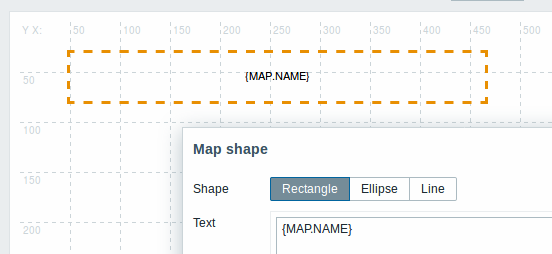
{MAP.NAME} resolves to the configured map name when viewing the map.
If hyperlinks are used in the text, they become clickable when viewing the map.
Line wrapping for text is always "on" within shapes. However, within an ellipse, the lines are wrapped as though the ellipse were a rectangle. Word wrapping is not implemented, so long words (words that do not fit the shape) are not wrapped, but are masked (constructor page) or clipped (other pages with maps).
Adding lines
In addition to shapes, it is also possible to add some lines. Lines can be used to link elements or shapes in a map.
To add a line, click on Add next to Shape. A new shape will appear at the top left corner of the map. Select it and click on Line in the editing form to change the shape into a line. Then adjust line properties, such as line type, width, color, etc.
Ordering shapes and lines
To bring one shape in front of the other (or vice versa) click on the shape with the right mouse button bringing up the map shape menu.