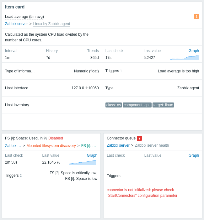
Item card
Overview
The Item card widget displays details of a single item, allowing you to quickly assess the status and configuration of an item (latest data, errors, description, etc.).
The item can be set directly in the widget configuration or selected from a compatible widget on the dashboard.
The widget can display multiple sections, each showing different information. The section layout is adjusted automatically based on the widget width; when expanded horizontally, sections are automatically rearranged into multiple columns.
Configuration
To configure, select Item card as type:
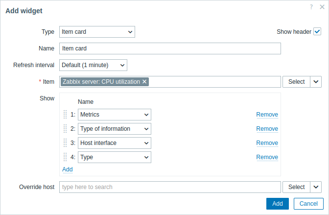
In addition to the parameters that are common for all widgets, you may set the following specific options:
| Item | Select the item. Alternatively, select a compatible widget as the data source for items. Matching suggestions appear as you type. The top section of the widget always displays the item name (clicking it opens the item menu): - If the item is disabled, a red Disabled label is displayed next to the item name. - In case of errors, a square icon with the letter "i" is displayed. In case of problems, a square icon with the problem count is displayed for each problem severity. Hovering over an icon opens a pop-up with details. - On a template dashboard, the technical name (instead of visible name) of the item is displayed. The top section of the widget also displays the item path—its host and, if applicable, template, low-level discovery (LLD) rule, or master item (clicking an entity opens its configuration). Item path is displayed only to users with permissions to the respective entities. |
|
| Show | Add sections to display in the widget. Sections can be rearranged by dragging and dropping. | |
| Description | Displays item description. Macros are resolved. | |
| Error text | Displays item error (if any). | |
| Metrics | Displays the following information: - Item update interval (except for trapper items); - Item history configuration (if any); - Item trends configuration (if any). Macros are resolved. If the item uses custom intervals, a help icon is displayed next to item update interval. Hovering over the icon opens a pop-up with custom interval details. |
|
| Latest data | Displays the following information: - Time since last item check; - Item last value; - Link to simple graph/history of item values (if history or trends are stored); - Configurable sparkline chart (if item is numeric). For binary type items, a thumbnail or the Show option is displayed instead of last value. Hovering over the thumbnail opens a pop-up with the image. Hovering over Show opens a pop-up with the item value (Base64 string). On a template dashboard, No data is displayed instead of item last value. |
|
| Type of information | Displays item type of information. | |
| Triggers | Displays the following information: - Triggers label with trigger count (hovering over Triggers opens a pop-up with trigger details); - List of trigger names (macros are resolved). |
|
| Host interface | Displays host interface used by the item, or No data if the item does not have a host interface (e.g., dependent items, simple checks). On a template dashboard, No data is displayed. |
|
| Type | Displays item type. | |
| Host inventory | Displays host inventory field that item value populates. | |
| Tags | Displays item tags. | |
| Override host | Select a compatible widget or the dashboard host selector as the data source for hosts. This parameter is not available when configuring the widget on a template dashboard. |
|
Sparkline
Sparkline chart configuration options are available only if the Latest data section is added to the widget.
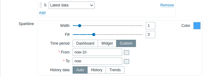
| Width | Set the graph line thickness by using the slider or manually entering a value in the range from 0 to 10. |
| Color | Select line and fill color. |
| Fill | Set fill color transparency level by using the slider or manually entering a value in the range from 0 to 10. |
| Time period | Select the data source for the time period: Dashboard - use the dashboard time period selector; Widget - use a compatible widget (set in the Widget parameter); Custom - use a custom time period set in the From and To parameters; if set, a clock icon will be displayed in the upper-right corner of the widget, indicating the set time on mouseover. Note that regardless of the widget's Time period configuration, compatible widgets can still use it as a data source for the time period. |
| Widget | Enter or select a compatible widget as the data source for the time period. This parameter is available if Time period is set to "Widget". |
| From | Enter or select the start of the time period. Relative time syntax ( now, now/d, now/w-1w, etc.) is supported.This parameter is available if Time period is set to "Custom". |
| To | Enter or select the end of the time period. Relative time syntax ( now, now/d, now/w-1w, etc.) is supported.This parameter is available if Time period is set to "Custom". |
| History data | Take data from history or trends: Auto - automatic selection; History - take history data; Trends - take trend data. This parameter applies only to numeric data. Non-numeric data will always be taken from history. |