
10 Graph prototype
Overview
The Graph prototype widget displays a grid of automatically created custom graphs based on low-level discovery rule graph prototypes or item prototypes.
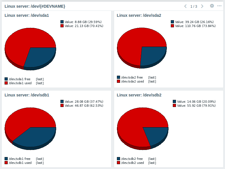
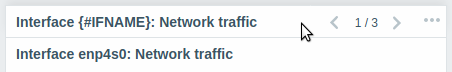
Graphs are arranged in a configurable grid layout; if the number of graphs exceeds the layout, paging is enabled in the widget.
Configuration
To configure, select Graph prototype as widget type:
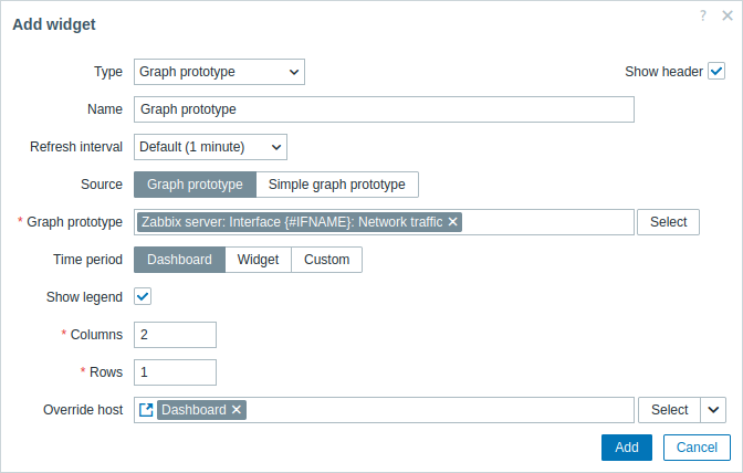
In addition to the parameters that are common for all widgets, you may set the following specific options:
| Source | Select the source of the graphs: Graph prototype or Simple graph prototype. |
| Graph prototype | Select a graph prototype to display graphs discovered by the graph prototype. This parameter is available if Source is set to "Graph prototype". |
| Item prototype | Select an item prototype to display simple graphs for items discovered by the item prototype. This parameter is available if Source is set to "Simple graph prototype". |
| Time period | Set a time period for which to display data in the graphs. Select the data source for the time period: Dashboard - use the dashboard time period selector; Widget - use a compatible widget (set in the Widget parameter); Custom - use a custom time period set in the From and To parameters; if set, a clock icon will be displayed in the upper-right corner of the widget, indicating the set time on mouseover. Note that regardless of the widget's Time period configuration, compatible widgets can still use it as a data source for the time period. |
| Widget | Enter or select a compatible widget as the data source for the time period. This parameter is available if Time period is set to "Widget". |
| From | Enter or select the start of the time period. Relative time syntax ( now, now/d, now/w-1w, etc.) is supported.This parameter is available if Time period is set to "Custom". |
| To | Enter or select the end of the time period. Relative time syntax ( now, now/d, now/w-1w, etc.) is supported.This parameter is available if Time period is set to "Custom". |
| Show legend | Unmark this checkbox to hide the legend on the graphs (marked by default). |
| Override host | Select a compatible widget or the dashboard host selector as the data source for hosts. This parameter is not available when configuring the widget on a template dashboard. |
| Columns | Enter the number of columns of graphs to display within a graph prototype widget. |
| Rows | Enter the number of rows of graphs to display within a graph prototype widget. |
The legend of the graph consists of three sections:
- Items and their aggregated values
- Percentiles (if configured)
- Triggers (if any are associated with the displayed items)
If the height of the graph within the widget is insufficient, the legend may not be displayed or may be displayed only partially. Triggers and percentiles are hidden first, followed by the item legend. To display the full legend, increase the widget's vertical size.
No more than 3 trigger lines can be displayed. If there are more triggers then the triggers with lower severity are prioritized for display.
While the Columns and Rows parameters allow fitting more than one graph in the widget, there still may be more discovered graphs than there are columns/rows in the widget. In this case, paging becomes available in the widget, and a slide-up header allows to switch between pages using the left and right arrows: