
- #1 Configuring a network map
Overview
Configuring a map in Zabbix requires that you first create a map by defining its general parameters and then you start filling the actual map with elements and their links.
You can populate the map with elements that are a host, a host group, a trigger, an image or another map.
Icons are used to represent map elements. You can define the information that will be displayed with the icons and set that recent problems are displayed in a special way. You can link the icons and define information to be displayed on the links.
Maps that are ready can be viewed in Monitoring → Maps. In the monitoring view you can click on the icons and take advantage of the links to some scripts and URLs.
You can add custom URLs to be accessible by clicking on the icons. Thus you may link a host icon to host properties or a map icon to another map.
Creating a map
To create a map, do the following:
- Go to Configuration → Maps
- Click on Create map
- Edit general map attributes
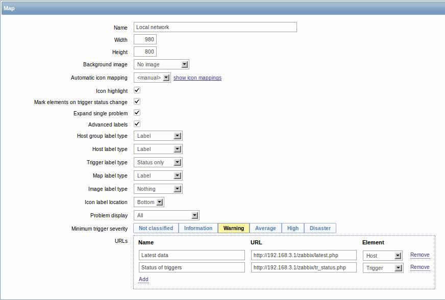
General map attributes:
| Parameter | Description |
|---|---|
| Name | Unique map name. |
| Width | Map width in pixels. |
| Height | Map height in pixels. |
| Background image | Use background image: No image - no background image (white background) Image - selected image to be used as a background image. No scaling is performed. You may use a geographical map or any other image to enhance your map. |
| Automatic icon mapping | You can set to use an automatic icon mapping, configured in Administration → General → Icon mapping. Icon mapping allows to map certain icons against certain host inventory fields. |
| Icon highlighting | If you check this box, icons will receive highlighting. Elements with an active trigger will receive a round background, in the same colour as the highest severity trigger. Moreover, a thick green line will be displayed around the circle, if all problems are acknowledged. Elements with "disabled" or "in maintenance" status will get a square background, gray and orange respectively. See also: Viewing maps |
| Mark elements on trigger status change | A recent change of trigger status (recent problem or resolution) will be highlighted with markers (inward-pointing red triangles) on the three sides of the element icon that are free of the label. Markers are displayed for 30 minutes. |
| Expand single problem | If a map element (host, host group or another map) has one single problem, this option controls whether the problem (trigger) name is displayed, or problem count. If marked, problem name is used. |
| Advanced labels | If you check this box you will be able to define separate label types for separate element types. |
| Icon label type | Label type used for icons: Label - icon label IP address - IP address Element name - element name (for example, host name) Status only - status only (OK or PROBLEM) Nothing - no labels are displayed |
| Icon label location | Label location in relation to the icon: Bottom - beneath the icon Left - to the left Right - to the right Top - above the icon |
| Problem display | Display problem count as: All - full problem count will be displayed Separated - unacknowledged problem count will be displayed separated as a number of the total problem count Unacknowledged only - only the unacknowledged problem count will be displayed |
| Minimum trigger severity | Problems below the selected minimum severity level will not be displayed in the map. For example, with Warning selected, changes with Information and Not classified level triggers will not be reflected in the map. This parameter is supported starting with Zabbix 2.2. |
| URLs | URLs for each element type can be defined (with a label). These will be displayed as links when a user clicks on the element in the monitoring section. Macros that can be used in map URLs: {MAP.ID}, {HOSTGROUP.ID}, {HOST.ID}, {TRIGGER.ID} |
When you save this, you have created an empty map with a name, dimensions and certain preferences. Now you need to add some elements. For that, click on the map name in the list to open the editable area.
Adding elements
To add an element, click on the "+" next to Icon. The new element will appear at the top left corner of the map. Drag and drop it wherever you like.
Note that with the Grid option "On", elements will always align to the grid (you can pick various grid sizes from the dropdown, also hide/show the grid). If you want to put elements anywhere without alignment, turn the option to "Off". (Random elements can later again be aligned to the grid with the Align icons button.)
Now that you have some elements in place, you may want to start differentiating them by giving names etc. By clicking on the element, a form is displayed and you can set the element type, give a name, choose a different icon etc.
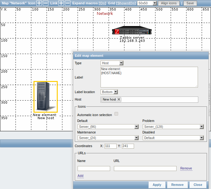
Map element attributes:
| Parameter | Description |
|---|---|
| Type | Type of the element: Host - icon representing status of all triggers of the selected host Map - icon representing status of all elements of a map Trigger - icon representing status of a single trigger Host group - icon representing status of all triggers of all hosts belonging to the selected group Image - an icon, not linked to any resource |
| Label | Icon label, any string. Macros and multi-line strings can be used in labels. |
| Label location | Label location in relation to the icon: Default - map's default label location Bottom - beneath the icon Left - to the left Right - to the right Top - above the icon |
| Host | Enter the host, if the element type is 'Host'. This field is auto-complete so starting to type the name of a host will offer a dropdown of matching hosts. Scroll down to select. Click on 'x' to remove the selected. |
| Map | Select the map, if the element type is 'Map'. |
| Trigger | Select the trigger, if the element type is 'Trigger'. |
| Host group | Enter the host group, if the element type is 'Host group'. This field is auto-complete so starting to type the name of a group will offer a dropdown of matching groups. Scroll down to select. Click on 'x' to remove the selected. |
| Icon (default) | Icon to be used. |
| Automatic icon selection | In this case an icon mapping will be used to determine which icon to display. |
| Icons | You can choose to display different icons for the element in these cases: default, problem, maintenance, disabled. |
| Coordinate X | X coordinate of the map element. |
| Coordinate Y | Y coordinate of the map element. |
| URLs | Element-specific URLs can be set for the element. These will be displayed as links when a user clicks on the element in the monitoring section. If the element has its own URLs and there are map level URLs for its type defined, they will be combined in the same menu. Macros that can be used in map URLs: {MAP.ID}, {HOSTGROUP.ID}, {HOST.ID}, {TRIGGER.ID} |
Added elements are not automatically saved. If you navigate away from the page, all changes may be lost.
Therefore it is a good idea to click on the Save button in the top right corner. Once clicked, the changes are saved regardless of what you choose in the following popup.
Selected grid options are also saved with each map.
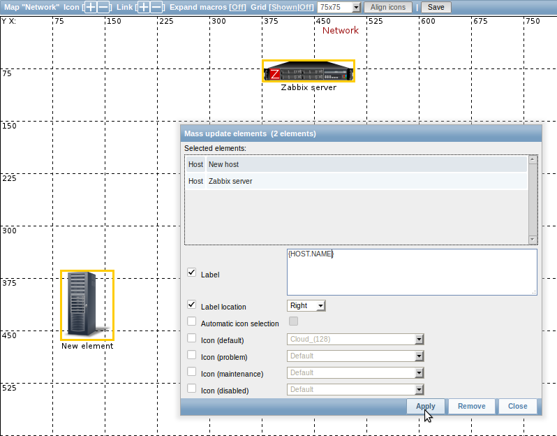
Selecting elements
To select elements, select one and then hold down Ctrl (or Shift) to select the others.
You can also select multiple elements by dragging a rectangle in the editable area and selecting all elements in it (option available since Zabbix 2.0).
Once you select more than one element, the element property form shifts to the mass-update mode so you can change attributes of selected elements in one go. To do so, mark the attribute using the checkbox and enter a new value for it. You may use macros here (such as, say, {HOSTNAME} for the element label).
Linking elements
Once you have put some elements on the map, it is time to start linking them. To link two elements you must first select them. With the elements selected, click on the "+" next to Link.
With a link created, the single element form now contains an additional Edit element links section. Click on Edit before the link to edit its attributes.
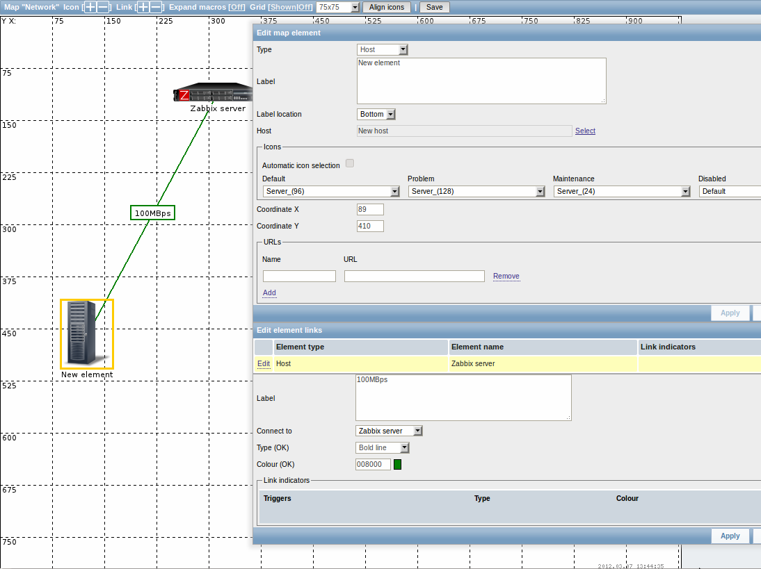
Link attributes:
| Parameter | Description |
|---|---|
| Label | Label that will be rendered on top of the link. The {host:key.func(param)} macro is supported in this field, but only with avg, last, min and max trigger functions, with seconds as parameter. |
| Connect to | The element that the link connects to. |
| Type (OK) | Default link style: Line - single line Bold line - bold line Dot - dots Dashed line - dashed line |
| Colour (OK) | Default link colour. |
| Link indicators | List of triggers linked to the link. In case a trigger has status PROBLEM, its style is applied to the link. |