
На странице
6 Шкала
Обзор
Виджет Gauge отображает значение одного числового элемента данных в виде шкалы. Он полезен для отслеживания важных метрик, визуализации порогов и обнаружения резких изменений.
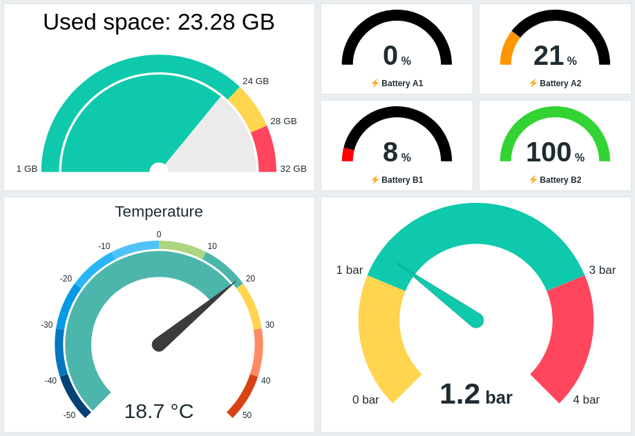
Вы можете настроить виджет так, чтобы он отображал следующее:
- Описание элемента данных (Used space: {ITEM.LASTVALUE}, Temperature)
- Значение элемента данных и единицы измерения (21 %, 18.7 °C, 1.2 bar)
- Шкалу Gauge (1GB/24GB/28GB/32GB, -50/-40/-30/etc.)
- Дугу Gauge (дуга значения gauge и дуга порогов gauge)
- Стрелку Gauge
При нажатии на виджет открывается простой график для элемента данных.
Информацию, отображаемую в виджете Gauge, можно скачать в виде изображения PNG, выбрав опцию Download image в меню виджета.
Конфигурация
Чтобы настроить, выберите Gauge в качестве типа:
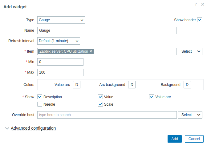
Помимо параметров, общих для всех виджетов, можно задать следующие специальные параметры:
| Item | Выберите элемент данных. Либо выберите совместимый виджет в качестве источника данных для элементов данных. Это поле поддерживает автодополнение, поэтому при вводе имени элемента данных будет предлагаться выпадающий список совпадающих элементов данных. Обратите внимание, что можно выбрать только элементы данных, которые возвращают числовые данные (кроме двоичных данных). |
| Min | Введите минимальное значение шкалы. Поддерживаются суффиксы (например, "1d", "2w", "4K", "8G"). Поддерживаются преобразования значений. |
| Max | Введите максимальное значение шкалы. Поддерживаются суффиксы (например, "1d", "2w", "4K", "8G"). Поддерживаются преобразования значений. |
| Colors | Выберите цвет в палитре: Value arc - выберите цвет дуги значения шкалы; Arc background - выберите цвет фона дуги значения шкалы и дуги порогов шкалы; Background - выберите цвет фона виджета. "D" означает цвет по умолчанию, который зависит от темы веб-интерфейса. Если заданы Thresholds, цвет по умолчанию для Value arc зависит от цвета порога. Чтобы вернуться к цвету по умолчанию, нажмите кнопку Use default в палитре цветов. |
| Show | Установите флажок, чтобы отображать соответствующий элемент шкалы - описание, значение, дугу значения, стрелку, шкалу (минимальное и максимальное значение шкалы в начале и конце дуги шкалы). Снимите флажок, чтобы скрыть. Должен быть выбран как минимум один элемент. Обратите внимание, что стрелка шкалы и шкала могут отображаться, если отображается дуга значения шкалы или дуга порогов шкалы (см. параметры расширенной настройки). Также обратите внимание, что если отображается стрелка шкалы, значение размещается под стрелкой; если стрелка скрыта, значение выравнивается по нижнему краю дуги шкалы. |
| Override host | Выберите совместимый виджет или селектор узла сети на панели мониторинга в качестве источника данных для узлов сети. Этот параметр недоступен при настройке виджета на шаблонной панели мониторинга. |
| Advanced configuration | Нажмите заголовок Advanced configuration, чтобы отобразить параметры расширенной настройки. Здесь же можно настроить элементы шкалы, выбранные в поле Show. |
Расширенная настройка
Параметры расширенной настройки доступны в сворачиваемом разделе Расширенная настройка (Advanced configuration):
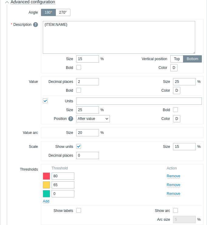
| Угол (Angle) | Выберите угол шкалы (180° или 270°). |
| Описание (Description) | |
| Описание (Description) |
Введите описание элемента данных. Это описание может переопределять название элемента данных по умолчанию. Поддерживаются многострочные описания. Допустима комбинация текста и поддерживаемых макросов. Поддерживаются макросы {HOST.*}, {ITEM.*}, {INVENTORY.*} и пользовательские макросы. |
| Размер (Size) | Введите высоту шрифта для описания элемента данных (в процентах, относительно общей высоты виджета). |
| Расположение по вертикали (Vertical position) |
Выберите расположение по вертикали описания элемента данных (по верхнему либо нижнему краю, относительно дуги шкалы). |
| Жирный (Bold) | Установите флажок, чтобы описание отображалось жирным шрифтом. |
| Цвет (Color) |
Выберите из палитры цветов цвет описания элемента данных. «D» означает цвет по умолчанию (зависит от темы веб-интерфейса). Чтобы вернуться к значению по умолчанию, нажмите в палитре кнопку Использовать умолчание (Use default). |
| Значение (Value) | |
| Число десятичных знаков (Decimal places) |
Введите количество десятичных знаков, отображаемых со значением. Эта опция влияет только на элементы данных, которые возвращают значения с типом числовой (с плавающей точкой). |
| Размер (Size) | Введите высоту шрифта для значения (в процентах, относительно высоты дуги). |
| Жирный (Bold) | Установите флажок, чтобы значение отображалось жирным шрифтом. |
| Цвет (Color) |
Выберите из палитры цветов цвет значения. «D» означает цвет по умолчанию (зависит от темы веб-интерфейса). Чтобы вернуться к значению по умолчанию, нажмите в палитре кнопку Использовать умолчание (Use default). |
| Единицы измерения (Units) | |
| Единицы измерения (Units) |
Установите флажок, чтобы вместе со значением элемента данных отображались единицы измерения. Если вы вводите название единицы измерения, это переопределит единицы измерения, заданные в настройках элемента данных. |
| Размер (Size) | Введите высоту шрифта для единиц измерения элемента данных (в процентах, относительно высоты дуги). |
| Жирный (Bold) | Установите флажок, чтобы единицы измерения отображались жирным шрифтом. |
| Расположение (Position) |
Выберите расположение единиц измерения элемента данных (выше, ниже, перед или после, относительно значения элемента данных). Эта опция игнорируется для слудещих единиц измерения, относящихся ко времени: unixtime, uptime, s. |
| Цвет (Color) |
Выберите из палитры цветов цвет единиц измерения. «D» означает цвет по умолчанию (зависит от темы веб-интерфейса). Чтобы вернуться к значению по умолчанию, нажмите в палитре кнопку Использовать умолчание (Use default). |
| Значение дуги (Value arc) | |
| Размер дуги (Arc size) |
Введите высоту значения дуги радиального датчика (в процентах, относительно радиуса дуги). |
| Стрелка (Needle) | |
| Цвет (Color) |
Выберите из палитры цветов цвет стрелки радиального датчика. «D» означает цвет по умолчанию (зависит от темы веб-интерфейса). Если заданы Пороги, цвет по умолчанию для стрелки зависит от цвета порога . Чтобы вернуться к значению по умолчанию, нажмите в палитре кнопку Использовать умолчание (Use default). |
| Шкала (Scale) | |
| Показывать единицы измерения (Show units) |
Установите флажок, чтобы вместе с минимальным и максимальным значением шкалы отображались единицы измерения. |
| Размер (Size) |
Введите высоту шрифта для минимального и максимального значения шкалы (в процентах, относительно высоты дуги шкалы). |
| Число десятичных знаков (Decimal places) |
Введите количество десятичных знаков, отображаемых с минимальным и максимальным значением шкалы. Эта опция влияет только на элементы данных, которые возвращают значения с типом числовой (с плавающей точкой). |
| Пороги (Thresholds) | |
| Пороги (Thresholds) |
Нажмите Добавить (Add) для добавления порога, выберите цвет порога из палитры и укажите числовое значение. При сохранении список порогов будет отсортирован в возрастающем порядке. Обратите внимание, что цвета, настроенные для порогов, будут правильно отображаться только для числовых элементов данных. Поддерживаются суффиксы (например, «1d», «2w», «4K», «8G»). Поддерживаются преобразования значений. |
| Показывать подписи (Show labels) | Установите флажок, чтобы пороговые значения отображались как подписи на шкале. |
| Показать дугу (Show arc) | Установите флажок, чтобы отображалась дуга порогов. |
| Размер дуги (Arc size) |
Введите высоту дуги порогов (в процентах, относительно радиуса дуги значений). |