
En esta página
Indicador
Resumen
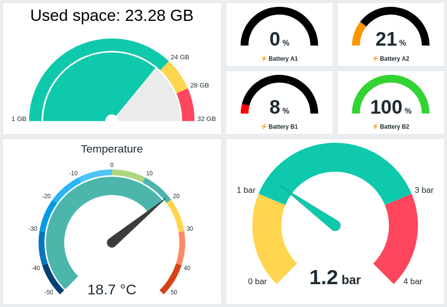
El widget Gauge muestra el valor de un único item numérico como un indicador. Es útil para vigilar métricas importantes, visualizar umbrales y detectar cambios repentinos.
Puede configurar el widget para mostrar lo siguiente:
- Descripción del item (Espacio usado: {ITEM.LASTVALUE}, Temperatura)
- Valor y unidades del item (21 %, 18.7 °C, 1.2 bar)
- Escala del indicador (1GB/24GB/28GB/32GB, -50/-40/-30/etc.)
- Arco del indicador (arco del valor del indicador y arco de los umbrales del indicador)
- Aguja del indicador
Al hacer clic en el widget, se abre un gráfico simple para el item.
La información mostrada en el widget Gauge se puede descargar como una imagen PNG seleccionando la opción Download image en el menú del widget.
Configuración
Para configurar, seleccione Gauge como tipo:
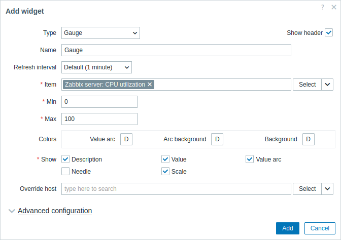
Además de los parámetros comunes para todos los widgets, puede establecer las siguientes opciones específicas:
| Item | Seleccione el item. Como alternativa, seleccione un widget compatible como origen de datos para items. Este campo tiene autocompletado, por lo que al comenzar a escribir el nombre de un item se ofrecerá una lista desplegable con los items coincidentes. Tenga en cuenta que solo puede seleccionar items que devuelvan datos numéricos (excepto datos binarios). |
| Min | Introduzca el valor mínimo del gauge. Se admiten sufijos (por ejemplo, "1d", "2w", "4K", "8G"). Se admiten mapeos de valores. |
| Max | Introduzca el valor máximo del gauge. Se admiten sufijos (por ejemplo, "1d", "2w", "4K", "8G"). Se admiten mapeos de valores. |
| Colors | Seleccione el color en el selector de color: Value arc - seleccione el color del arco de valor del gauge; Arc background - seleccione el color de fondo del arco de valor del gauge y del arco de umbrales del gauge; Background - seleccione el color de fondo del widget. "D" representa el color predeterminado, que depende del tema del frontend. Si se establecen Thresholds, el color predeterminado de Value arc depende del color del umbral. Para volver al color predeterminado, haga clic en el botón Use default del selector de color. |
| Show | Marque la casilla para mostrar el elemento correspondiente del gauge: descripción, valor, arco de valor, aguja, escala (el valor mínimo y máximo del gauge al principio y al final del arco del gauge). Desmárquela para ocultarlo. Debe seleccionarse al menos un elemento. Tenga en cuenta que la aguja y la escala del gauge pueden mostrarse si se muestra el arco de valor del gauge o el arco de umbrales del gauge (consulte las opciones de configuración avanzada). Tenga en cuenta también que, si se muestra la aguja del gauge, el valor se coloca debajo de la aguja; si la aguja está oculta, el valor se alinea con la parte inferior del arco del gauge. |
| Override host | Seleccione un widget compatible o el selector de host del dashboard como origen de datos para hosts. Este parámetro no está disponible al configurar el widget en un dashboard de template. |
| Advanced configuration | Haga clic en el encabezado Advanced configuration para mostrar las opciones de configuración avanzada. Aquí también podrá ajustar los elementos del gauge seleccionados en el campo Show. |
Configuración avanzada
Las opciones de configuración avanzada están disponibles en la sección plegable Configuración avanzada:
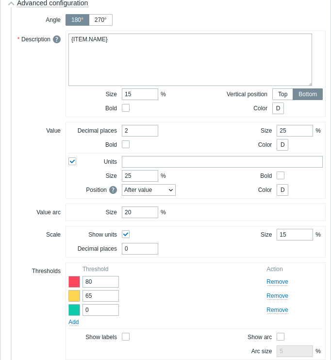
| Ángulo | Seleccione el ángulo del indicador (180° o 270°). |
| Descripción | |
| Descripción | Introduzca la descripción de la métrica. Esta descripción puede sobrescribir el nombre por defecto de la métrica. Se admiten descripciones multilínea. Es posible una combinación de texto y macros soportadas. Se admiten {HOST.*}, {ITEM.*}, {INVENTORY.*} y macros de usuario. |
| Tamaño | Introduzca el tamaño de la fuente para la descripción de la métrica (en porcentaje, relativo a la altura total del widget). |
| Posición vertical | Seleccione la posición vertical de la descripción de la métrica (arriba o abajo, relativa al arco del indicador). |
| Negrita | Marque la casilla para mostrar la descripción de la métrica en negrita. |
| Color | Seleccione el color de la descripción de la métrica desde el selector de color. "D" significa el color por defecto, que depende del tema de la interfaz. Para volver al color por defecto, haga clic en el botón Usar por defecto en el selector de color. |
| Valor | |
| Decimales | Introduzca el número de decimales a mostrar con el valor. Esta opción solo afecta a las métricas que devuelven datos numéricos (float). |
| Tamaño | Introduzca el tamaño de la fuente para el valor (en porcentaje, relativo a la altura del arco del indicador). |
| Negrita | Marque la casilla para mostrar el valor en negrita. |
| Color | Seleccione el color del valor desde el selector de color. "D" significa el color por defecto, que depende del tema de la interfaz. Para volver al color por defecto, haga clic en el botón Usar por defecto en el selector de color. |
| Unidades | |
| Unidades | Marque la casilla para mostrar las unidades junto al valor de la métrica. Si introduce un nombre de unidad, sobrescribirá las unidades establecidas en la configuración de la métrica. |
| Tamaño | Introduzca el tamaño de la fuente para las unidades de la métrica (en porcentaje, relativo a la altura del arco del indicador). |
| Negrita | Marque la casilla para mostrar las unidades de la métrica en negrita. |
| Posición | Seleccione la posición de las unidades de la métrica (arriba, abajo, antes o después, relativo al valor de la métrica). Esta opción se ignora para las siguientes unidades relacionadas con el tiempo: unixtime, uptime, s. |
| Color | Seleccione el color de las unidades de la métrica desde el selector de color. "D" significa el color por defecto, que depende del tema de la interfaz. Para volver al color por defecto, haga clic en el botón Usar por defecto en el selector de color. |
| Arco de valor | |
| Tamaño del arco | Introduzca la altura del arco de valor del indicador (en porcentaje, relativo al radio del arco del indicador). |
| Aguja | |
| Color | Seleccione el color de la aguja del indicador desde el selector de color. "D" significa el color por defecto, que depende del tema de la interfaz. Si se establecen Umbrales, el color por defecto de la aguja depende del color del umbral. Para volver al color por defecto, haga clic en el botón Usar por defecto en el selector de color. |
| Escala | |
| Mostrar unidades | Marque la casilla para mostrar las unidades junto al valor mínimo y máximo del indicador. |
| Tamaño | Introduzca el tamaño de la fuente para el valor mínimo y máximo del indicador (en porcentaje, relativo a la altura del arco del indicador). |
| Decimales | Introduzca el número de decimales a mostrar con el valor mínimo y máximo del indicador. Esta opción solo afecta a las métricas que devuelven datos numéricos (float). |
| Umbrales | |
| Umbrales | Haga clic en Añadir para agregar un umbral, seleccione un color de umbral desde el selector de color y especifique un valor numérico. La lista de umbrales se ordenará de forma ascendente al guardar. Tenga en cuenta que los colores configurados como umbrales solo se mostrarán correctamente para métricas numéricas. Se admiten sufijos (por ejemplo, "1d", "2w", "4K", "8G"). Se admiten mapeos de valores. |
| Mostrar etiquetas | Marque la casilla para mostrar los valores de umbral como etiquetas en la escala del indicador. |
| Mostrar arco | Marque la casilla para mostrar el arco de umbrales del indicador. |
| Tamaño del arco | Introduzca la altura del arco de umbrales del indicador (en porcentaje, relativo al radio del arco del indicador). |