
Item value
Overview
The Item value widget displays the value of a single numeric or string item. It is useful for keeping an eye on important metrics, visualizing thresholds, and detecting sudden changes in the data.
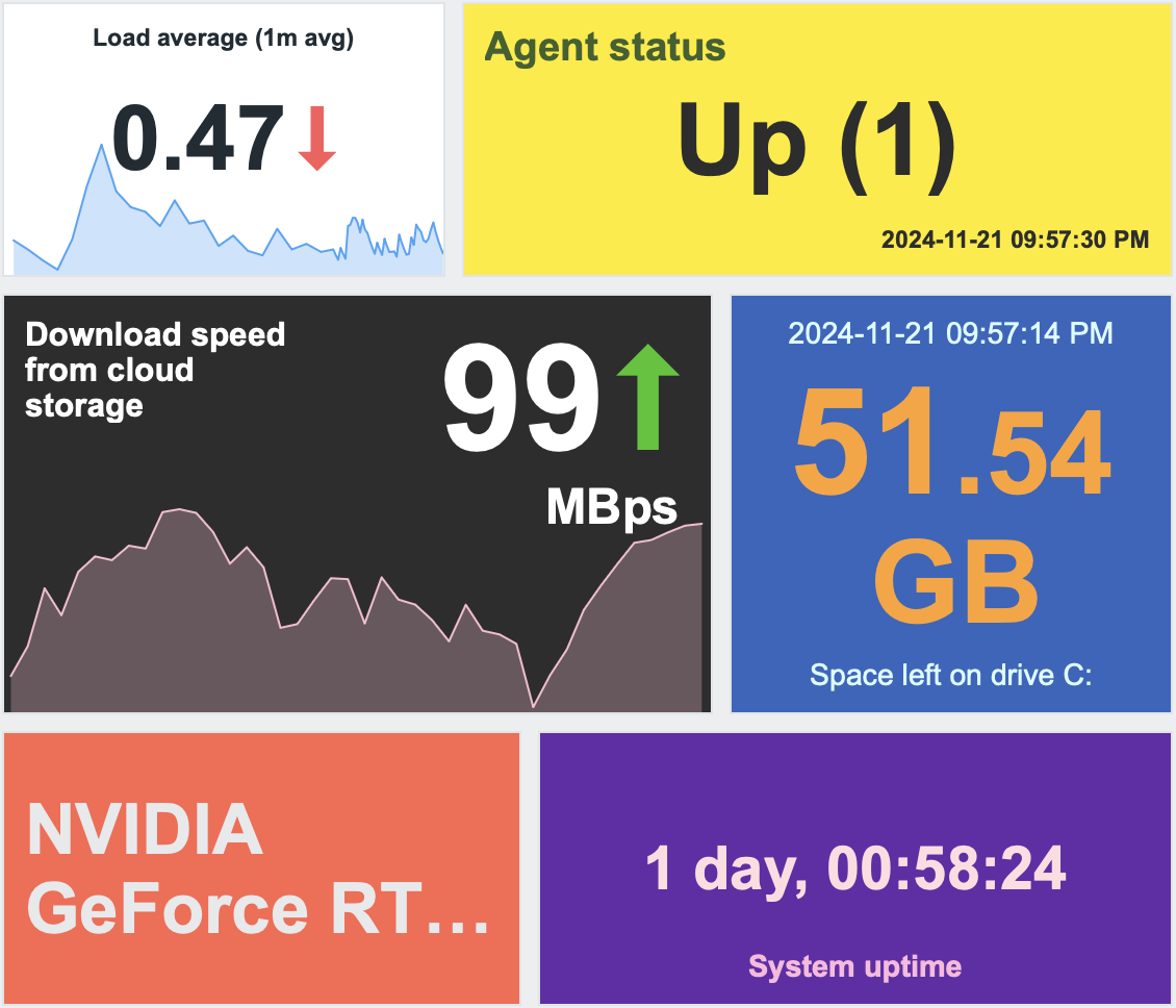
You can configure the widget to display the following:
- Metric timestamp (2024-11-21 09:57:30)
- Item description (Load average (1m), Agent status)
- Item value, change indicator, and units (0.47 ↓, 99 ↑ Mbps)
- Background color
- Sparkline chart for values from the specified time period
Clicking the widget opens an ad-hoc graph for numeric items or latest data for string items.
Configuration
To configure, select Item value as the widget type:
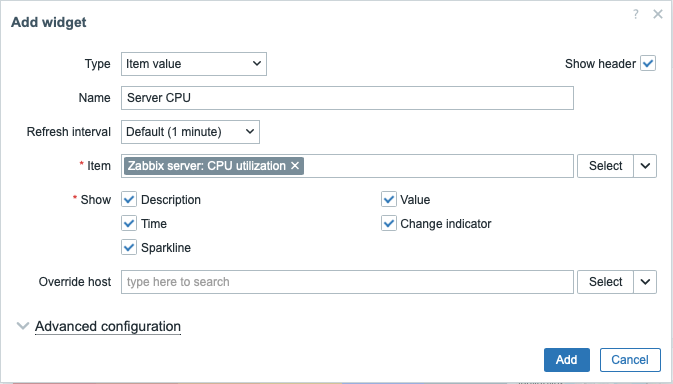
In addition to the parameters that are common for all widgets, you may set the following specific options:
| Item | Select the item. Alternatively, select a compatible widget as the data source for the item. Items returning binary data are not supported. |
| Show | Mark the checkbox to display the respective element: description, value, time, change indicator, sparkline. Unmark to hide. At least one element must be selected. |
| Override host | Select a compatible widget or the dashboard host selector as the data source for hosts. This parameter is not available when configuring the widget on a template dashboard. |
| Advanced configuration | Click the Advanced configuration header to display advanced configuration options. |
Advanced configuration
Advanced configuration options are available in the collapsible Advanced configuration section, and only for those elements that are selected in the Show field (see above).
Note that multiple elements cannot occupy the same space; if they are placed in the same space, an error message will be displayed.
Generic widget parameters
These parameters determine the background color (static or dynamic) for the whole widget and an aggregation function for displaying values.
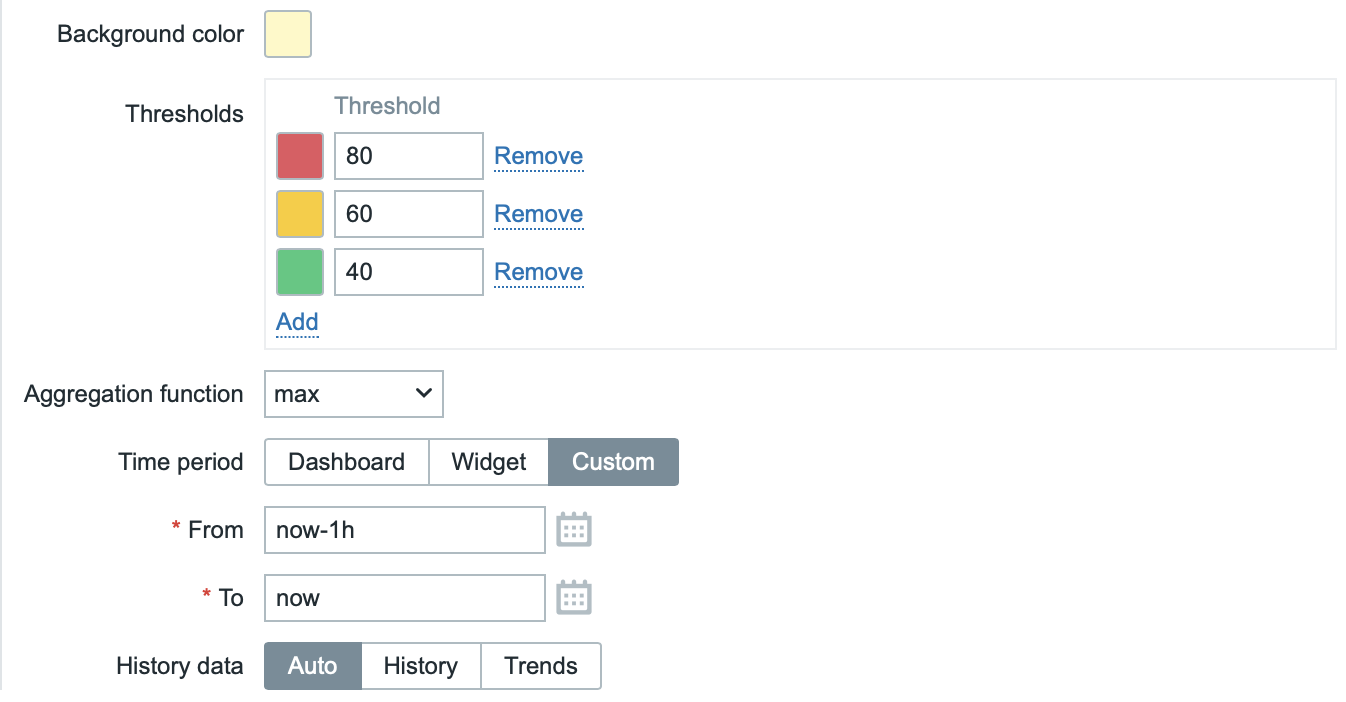
| Background color | Select the background color for the whole widget from the color picker.D stands for default color (depends on the frontend theme). To return to the default value, click the Use default button in the color picker. |
| Thresholds | Configure the dynamic background color for the whole widget. Click Add to add a threshold, select the background color from the color picker, and specify a numeric value. Once the item value equals or is greater than the threshold value, the background color will change. The list will be sorted in ascending order when saved. Note that the dynamic background color will be displayed correctly only for numeric items. |
| Aggregation function | Specify which aggregation function to use within the selected Time period: min - display the smallest value; max - display the largest value; avg - display the average value; count - display the count of values; sum - display the sum of values; first - display the first value; last - display the last value. If not used is selected, the most recent value is displayed (no aggregation). Aggregation allows to display an aggregated value for the chosen interval (5 minutes, an hour, a day), instead of the most recent value. Only numeric data can be displayed for min, max, avg and sum. For count, non-numeric data will be changed to numeric. |
| Time period | Time period to use for aggregating values. Select the data source for the time period: Dashboard - use the dashboard time period selector; Widget - use a compatible widget (set in the Widget parameter); Custom - use a custom time period set in the From and To parameters; if set, a clock icon will be displayed in the upper-right corner of the widget, indicating the set time on mouseover. Note that regardless of the widget's Time period configuration, compatible widgets can still use it as a data source for the time period. This parameter is hidden when Aggregation function is set to "not used". |
| Widget | Enter or select a compatible widget as the data source for the time period. This parameter is available if Time period is set to "Widget". |
| From | Enter or select the start of the time period. Relative time syntax ( now, now/d, now/w-1w, etc.) is supported.This parameter is available if Time period is set to "Custom". |
| To | Enter or select the end of the time period. Relative time syntax ( now, now/d, now/w-1w, etc.) is supported.This parameter is available if Time period is set to "Custom". |
| History data | Take data from history or trends: Auto - automatic selection; History - take history data; Trends - take trend data. This setting applies only to numeric data. Non-numeric data will always be taken from history. |
Description
These parameters determine how the item description should be displayed.
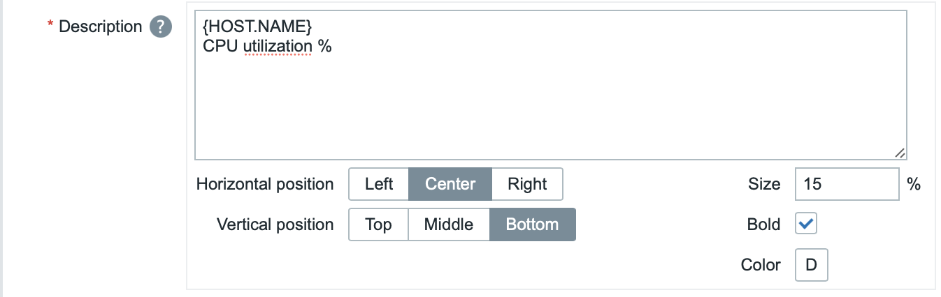
| Description | Enter the item description. This description may override the default item name. Multiline descriptions are supported. A combination of text and supported macros is possible. {HOST.*}, {ITEM.*}, {INVENTORY.*} and user macros are supported. |
| Horizontal position | Select horizontal position of the item description - left, right or center. |
| Vertical position | Select vertical position of the item description - top, bottom or middle. |
| Size | Enter font size height for the item description (in percent relative to total widget height). |
| Bold | Mark the checkbox to display item description in bold type. |
| Color | Select the item description color from the color picker.D stands for default color (depends on the frontend theme). To return to the default value, click the Use default button in the color picker. |
Value
These parameters determine how the item value should be displayed.
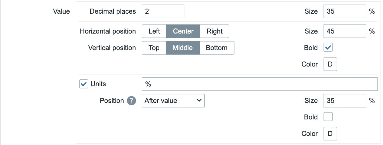
| Decimal places | Select how many decimal places will be displayed with the value. This value will affect only float items. For items with units set to "s", if this value is greater than 0 (the default is 2), the widget rounds the most significant time unit and displays a numeric value (e.g., "10.43m") instead of converting the value into a full time string. When set to 0, the seconds are converted to a human-readable time string (for example, "4h 56m 30s"). |
| Size | Enter font size height for the decimal places (in percent relative to total widget height). |
| Horizontal position | Select horizontal position of the item value - left, right or center. |
| Vertical position | Select vertical position of the item value - top, bottom or middle. |
| Size | Enter font size height for the item value (in percent relative to total widget height). Note that the size of item value is prioritized; other elements have to concede space for the value. With the change indicator though, if the value is too large, it will be truncated to show the change indicator. |
| Bold | Mark the checkbox to display item value in bold type. |
| Color | Select the item value color from the color picker.D stands for default color (depends on the frontend theme). To return to the default value, click the Use default button in the color picker. |
| Units | |
| Units | Mark the checkbox to display units with the item value. If you enter a unit name, it will override the unit from item configuration. |
| Position | Select the item unit position - above, below, before or after the value. |
| Size | Enter font size height for the item unit (in percent relative to total widget height). |
| Bold | Mark the checkbox to display item unit in bold type. |
| Color | Select the item unit color from the color picker.D stands for default color (depends on the frontend theme). To return to the default value, click the Use default button in the color picker. |
Time
These parameters determine how the time (clock value from the item history) should be displayed.
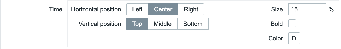
| Horizontal position | Select horizontal position of the time - left, right or center. |
| Vertical position | Select vertical position of the time - top, bottom or middle. |
| Size | Enter font size height for the time (in percent relative to total widget height). |
| Bold | Mark the checkbox to display time in bold type. |
| Color | Select the time color from the color picker.D stands for default color (depends on the frontend theme). To return to the default value, click the Use default button in the color picker. |
Change indicator
This section allows to select the color of change indicators from the color picker.

The change indicators are as follows:
- ↑ - item value is up (for numeric items)
- ↓ - item value is down (for numeric items)
- ↕ - item value has changed (for string items and items with value mapping)
Note:
- Up (↑) and down (↓) indicators are not shown if there's only one value.
- Values are always compared within the same scope; for example:
- The latest value is compared to the previous value.
- A monthly value is compared to the previous month.
- For aggregations, the previous period has the same duration as the selected period, ending immediately before the selected period begins.
D stands for default color (depends on the frontend theme). To return to the default value, click the Use default button in the color picker.
Vertical size of the change indicator is equal to the size of the value (integer part of the value for numeric items).
Sparkline
These parameters determine how the sparkline chart should be displayed.
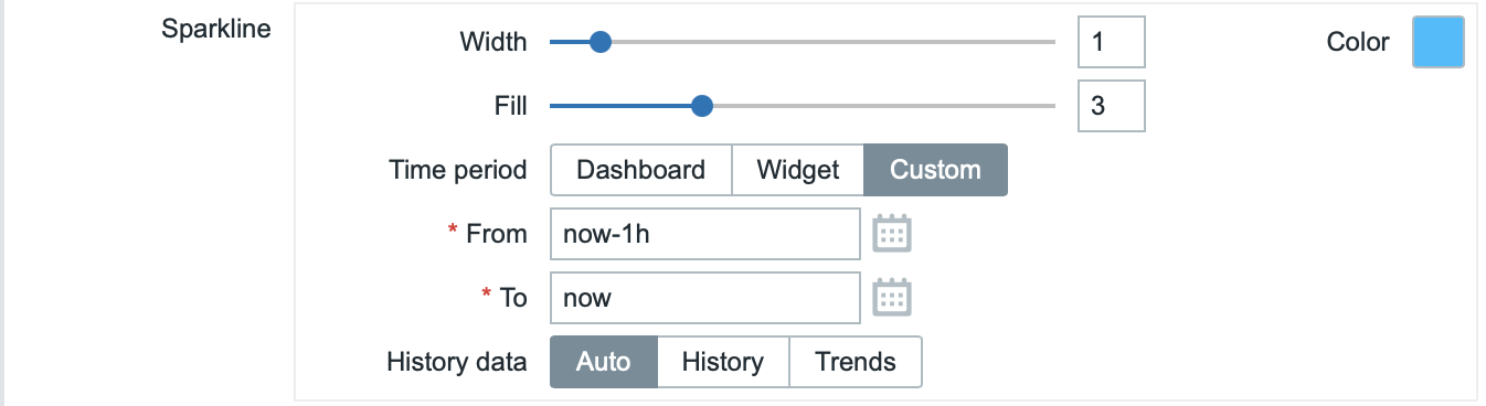
| Width | Set the graph line thickness by using the slider or manually entering a value in the range from 0 to 10. |
| Color | Select line and fill color. |
| Fill | Set fill color transparency level by using the slider or manually entering a value in the range from 0 to 10. |
| Time period | Specify the time period for values to be included into the sparkline chart. Select the data source for the time period: Dashboard - use the dashboard time period selector; Widget - use a compatible widget (set in the Widget parameter); Custom - use a custom time period set in the From and To parameters; if set, a clock icon will be displayed in the upper-right corner of the widget, indicating the set time on mouseover. Note that regardless of the widget's Time period configuration, compatible widgets can still use it as a data source for the time period. This parameter is not available if Aggregation function is set to "not used". |
| Widget | Enter or select a compatible widget as the data source for the time period. This parameter is available if Time period is set to "Widget". |
| From | Enter or select the start of the time period. Relative time syntax ( now, now/d, now/w-1w, etc.) is supported.This parameter is available if Time period is set to "Custom". |
| To | Enter or select the end of the time period. Relative time syntax ( now, now/d, now/w-1w, etc.) is supported.This parameter is available if Time period is set to "Custom". |
| History data | Take data from history or trends: Auto - automatic selection; History - take history data; Trends - take trend data. |