
12 Item value
Overview
This widget is useful for displaying the value of a single item prominently.
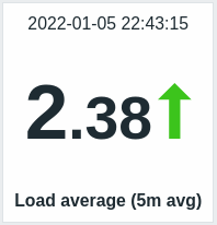
Besides the value itself, additional elements can be displayed, if desired:
- time of the metric
- item description
- change indicator for the value
- background color for the value
- item unit
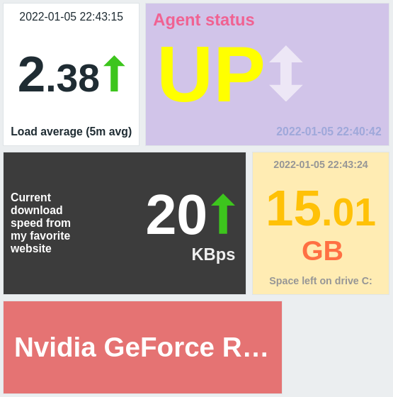
The widget can display numeric and string values. String values are displayed on a single line and truncated, if needed. "No data" is displayed, if there is no value for the item.
Clicking on the value leads to an ad-hoc graph for numeric items or latest data for string items.
The widget and all elements in it can be visually fine-tuned using advanced configuration options, allowing to create a wide variety of visual styles:
Configuration
To configure, select Item value as the widget type:
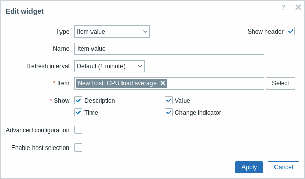
In addition to the parameters that are common for all widgets, you may set the following specific options:
| Item | Select the item. |
| Show | Mark the checkbox to display the respective element (description, value, time, change indicator). Unmark to hide. At least one element must be selected. |
| Advanced configuration | Mark the checkbox to display advanced configuration options. |
| Enable host selection | Mark the checkbox to display a different value depending on the selected host. |
Advanced configuration
Advanced configuration options become available if the Advanced configuration checkbox is marked (see screenshot) and only for those elements that are selected in the Show field (see above).
Additionally, advanced configuration allows to change the background color - static or dynamic - for the whole widget.
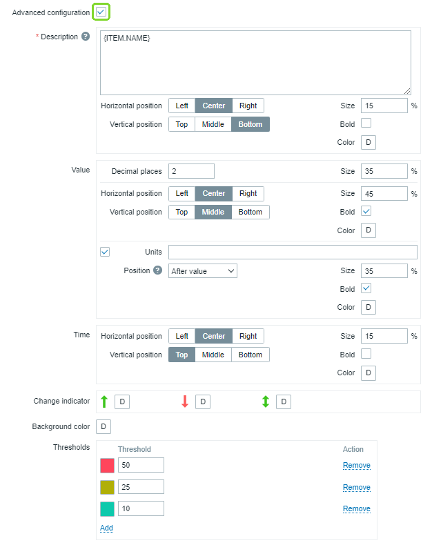
| Description | |
| Description | Enter the item description. This description may override the default item name. Multiline descriptions are supported. A combination of text and supported macros is possible. {HOST.*}, {ITEM.*}, {INVENTORY.*} and user macros are supported. |
| Horizontal position | Select horizontal position of the item description - left, right or center. |
| Vertical position | Select vertical position of the item description - top, bottom or middle. |
| Size | Enter font size height for the item description (in percent relative to total widget height). |
| Bold | Mark the checkbox to display item description in bold type. |
| Color | Select the item description color from the color picker.D stands for default color (depends on the frontend theme). To return to the default value, click the Use default button in the color picker. |
| Value | |
| Decimal places | Select how many decimal places will be displayed with the value. This value will affect only float items. |
| Size | Enter font size height for the decimal places (in percent relative to total widget height). |
| Horizontal position | Select horizontal position of the item value - left, right or center. |
| Vertical position | Select vertical position of the item value - top, bottom or middle. |
| Size | Enter font size height for the item value (in percent relative to total widget height). Note that the size of item value is prioritized; other elements have to concede space for the value. With the change indicator though, if the value is too large, it will be truncated to show the change indicator. |
| Bold | Mark the checkbox to display item value in bold type. |
| Color | Select the item value color from the color picker.D stands for default color (depends on the frontend theme). To return to the default value, click the Use default button in the color picker. |
| Units | |
| Units | Mark the checkbox to display units with the item value. If you enter a unit name, it will override the unit from item configuration. |
| Position | Select the item unit position - above, below, before or after the value. |
| Size | Enter font size height for the item unit (in percent relative to total widget height). |
| Bold | Mark the checkbox to display item unit in bold type. |
| Color | Select the item unit color from the color picker.D stands for default color (depends on the frontend theme). To return to the default value, click the Use default button in the color picker. |
| Time (clock value from item history) | |
| Horizontal position | Select horizontal position of the time - left, right or center. |
| Vertical position | Select vertical position of the time - top, bottom or middle. |
| Size | Enter font size height for the time (in percent relative to total widget height). |
| Bold | Mark the checkbox to display time in bold type. |
| Color | Select the time color from the color picker.D stands for default color (depends on the frontend theme). To return to the default value, click the Use default button in the color picker. |
| Change indicator | Select the color of change indicators from the color picker. The change indicators are as follows: ↑ - item value is up (for numeric items) ↓ - item value is down (for numeric items) ↕ - item value has changed (for string items and items with value mapping) D stands for default color (depends on the frontend theme). To return to the default value, click the Use default button in the color picker.Vertical size of the change indicator is equal to the size of the value (integer part of the value for numeric items). Note that up and down indicators are not shown with just one value. |
| Background color | Select the background color for the whole widget from the color picker.D stands for default color (depends on the frontend theme). To return to the default value, click the Use default button in the color picker. |
| Thresholds | Configure the dynamic background color for the whole widget. Click Add to add a threshold, select the background color from the color picker, and specify a numeric value. Once the item value equals or is greater than the threshold value, the background color will change. The list will be sorted in ascending order when saved. Note that the dynamic background color will be displayed correctly only for numeric items. |
Note that multiple elements cannot occupy the same space; if they are placed in the same space, an error message will be displayed.