
8 Graph
Overview
The graph widget provides a modern and versatile way of visualizing data collected by Zabbix using a vector image drawing technique. This graph widget is supported since Zabbix 4.0. Note that the graph widget supported before Zabbix 4.0 can still be used as Graph (classic). See also Adding widgets section on Dashboards page for more details.
Configuration
To configure, select Graph as type:
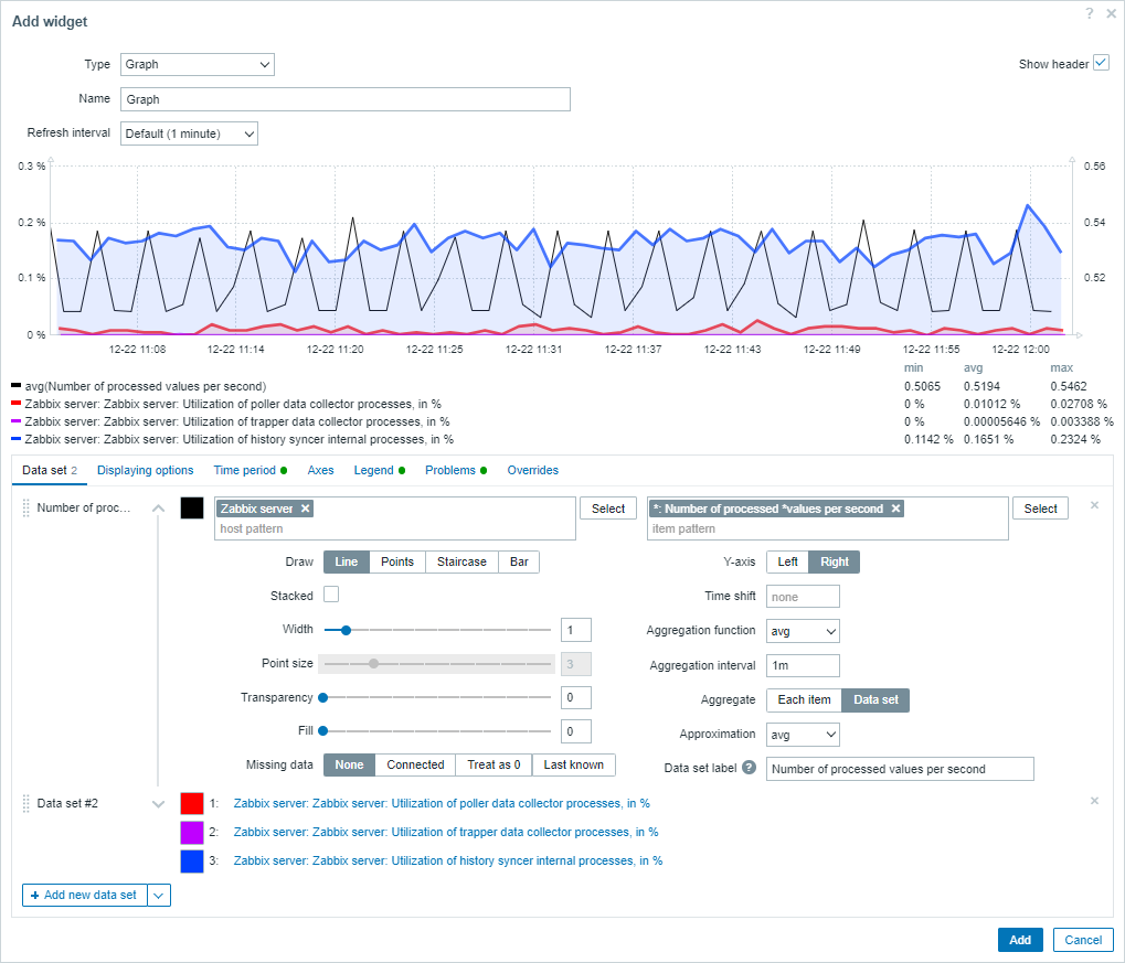
Data set
The Data set tab allows to add data sets and define their visual representation:
| Data set | Enter the host and item patterns; data of items that match the entered patterns is displayed on the graph; up to 50 items may be displayed. Host pattern and item pattern fields are mandatory. Wildcard patterns may be used for selection. For example, * will return results that match zero or more characters. To specify a wildcard pattern, just enter the string manually and press Enter. The wildcard symbol is always interpreted. Therefore, it is not possible to add, for example, an item named item* individually, if there are other matching items (e.g. item2, item3). See data set configuration details. Alternatively to specifying item patterns, you may select a list of items, if the data set has been added with the Item list option (see the description of the Add new data set button). |
|
| Draw | Choose the draw type of the metric. Possible draw types are Line (set by default), Points, Staircase and Bar. Note that if there's only one data point in the line/staircase graph it is drawn as a point regardless of the draw type. The point size is calculated from the line width, but it cannot be smaller than 3 pixels, even if the line width is less. |
|
| Stacked | Mark the checkbox to display data as stacked (filled areas displayed). This option is disabled when Points draw type is selected. | |
| Width | Set the line width. This option is available when Line or Staircase draw type is selected. | |
| Point size | Set the point size. This option is available when Points draw type is selected. | |
| Transparency | Set the transparency level. | |
| Fill | Set the fill level. This option is available when Line or Staircase draw type is selected. | |
| Missing data | Select the option for displaying missing data: None - the gap is left empty Connected - two border values are connected Treat as 0 - the missing data is displayed as 0 values Last known - the missing data is displayed with the same value as the last known value Not applicable for the Points and Bar draw type. |
|
| Y-axis | Select the side of the graph where the Y-axis will be displayed. | |
| Time shift | Specify time shift if required. You may use time suffixes in this field. Negative values are allowed. | |
| Aggregation function | Specify which aggregation function to use: min - display the smallest value max - display the largest value avg - display the average value sum - display the sum of values count - display the count of values first - display the first value last - display the last value none - display all values (no aggregation) Aggregation allows to display an aggregated value for the chosen interval (5 minutes, an hour, a day), instead of all values. See also: Aggregation in graphs. |
|
| Aggregation interval | Specify the interval for aggregating values. You may use time suffixes in this field. A numeric value without a suffix will be regarded as seconds. | |
| Aggregate | Specify whether to aggregate: Each item - each item in the dataset will be aggregated and displayed separately. Data set - all dataset items will be aggregated and displayed as one value. |
|
| Approximation | Specify what value to display when more than one value exists per vertical graph pixel: all - display the smallest, the largest and the average values min - display the smallest value max - display the largest value avg - display the average value This setting is useful when displaying a graph for a large time period with frequent update interval (such as one year of values collected every 10 minutes). |
|
| Data set label | Specify the data set label that is displayed in graph Data set configuration and in graph Legend (for aggregated data sets). All data sets are numbered including those with a specified Data set label. If no label is specified, the data set will be labeled automatically according to its number (e.g. "Data set #2", "Data set #3", etc.). Data set numbering is recalculated after reordering/dragging data sets. Data set labels that are too long will be shortened to fit where displayed (e.g. "Number of proc..."). |
|
Existing data sets are displayed in a list. You may:
 -
click on the move icon and drag a data set to a new place in the
list
-
click on the move icon and drag a data set to a new place in the
list -
click on the expand icon to expand data set details. When expanded, this icon turns into a collapse icon.
-
click on the expand icon to expand data set details. When expanded, this icon turns into a collapse icon. -
click on the color icon to change the base color, either from the color picker or manually. The base color is used to calculate different colors for each item of the data set.
-
click on the color icon to change the base color, either from the color picker or manually. The base color is used to calculate different colors for each item of the data set.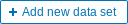 -
click on this button to add an empty data set allowing to select the host/item pattern.
-
click on this button to add an empty data set allowing to select the host/item pattern.
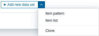
- If you click on the downward pointing icon next to the Add new data set button, a drop-down menu appears allowing to add a new data set with item pattern/item list or by cloning the currently open data set. If all data sets are collapsed, the Clone option is not available.
Data set configuration details
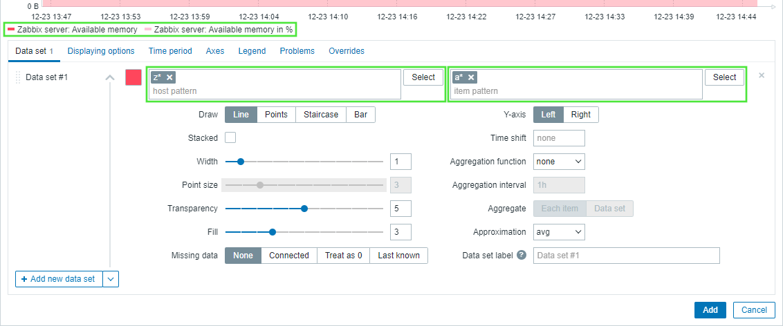
The host pattern and item pattern fields in the Data set tab both recognize full names or patterns containing a wildcard symbol (*). This functionality enables to select all the host names and item names containing the selected pattern. Most importantly, while typing the item name or item pattern in the item pattern field, only the items that belong to the selected host name(s) are displayed on a drop-down list. For example, having typed a pattern z* in the host pattern field, the drop-down list displays all the host names containing this pattern: z*, Zabbix server, and Zabbix proxy. After pressing Enter, this pattern is accepted and is displayed as z*. Similarly, the pattern can be created in the item pattern field. For example, having typed the pattern a* in the item pattern field, the drop-down list displays all the item names containing this pattern: a*, Available memory, Available memory in %.
See the image of the Data set tab below.
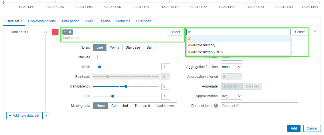
After pressing Enter, this pattern is accepted and is displayed as a*, and all the selected items that belong to the selected host name(s) are displayed above the Data set tab. See the image of the Data set tab below.
Displaying options
The Displaying options tab allows to define history data selection:
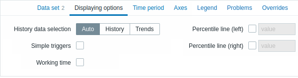
| History data selection | Set the source of graph data: Auto - data are sourced according to the classic graph algorithm (default) History - data from history Trends - data from trends |
| Simple triggers | Mark the checkbox to show the trigger thresholds for simple triggers. The thresholds will be drawn as dashed lines using the trigger severity color. A simple trigger is a trigger with one function (only last, max, min, avg) for one item in the expression.A maximum of three triggers can be drawn. Note that the trigger has to be within the drawn range to be visible. |
| Working time | Mark the checkbox to show working time on the graph. Working time (working days) is displayed in graphs as a white background, while non-working time is displayed in gray (with the Original blue default frontend theme). |
| Percentile line (left) | Mark the checkbox and enter the percentile value to show the specified percentile as a line on the left Y-axis of the graph. If, for example, a 95% percentile is set, then the percentile line will be at the level where 95 percent of the values fall under. |
| Percentile line (right) | Mark the checkbox and enter the percentile value to show the specified percentile as a line on the right Y-axis of the graph. If, for example, a 95% percentile is set, then the percentile line will be at the level where 95 percent of the values fall under. |
Time period
The Time period tab allows to set a custom time period:
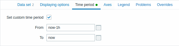
| Set custom time period | Mark this checkbox to set the custom time period for the graph (unmarked by default). |
| From | Set the start time of the custom time period for the graph. |
| To | Set the end time of the custom time period for the graph. |
Axes
The Axes tab allows to customize how axes are displayed:
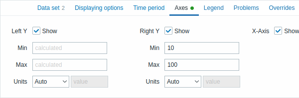
| Left Y | Mark this checkbox to make left Y-axis visible. The checkbox may be disabled if unselected either in Data set or in Overrides tab. |
| Right Y | Mark this checkbox to make right Y-axis visible. The checkbox may be disabled if unselected either in Data set or in Overrides tab. |
| X-Axis | Unmark this checkbox to hide X-axis (marked by default). |
| Min | Set the minimum value of the corresponding axis. Visible range minimum value of Y-axis is specified. |
| Max | Set the maximum value of the corresponding axis. Visible range maximum value of Y-axis is specified. |
| Units | Choose the unit for the graph axis values from the dropdown. If the Auto option is chosen axis values are displayed using units of the first item of the corresponding axis. Static option allows you to assign the corresponding axis' custom name. If the Static option is chosen and the value input field left blank the corresponding axis' name will only consist of a numeric value. |
Legend
The Legend tab allows to customize the graph legend:
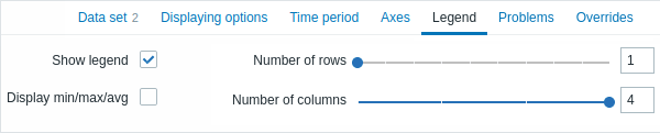
| Show legend | Unmark this checkbox to hide the legend on the graph (marked by default). |
| Display min/max/avg | Mark this checkbox to display the minimum, maximum and average values of the item in the legend. |
| Number of rows | Set the number of legend rows to be displayed. |
| Number of columns | Set the number of legend columns to be displayed. |
Problems
The Problems tab allows to customize the problem display:
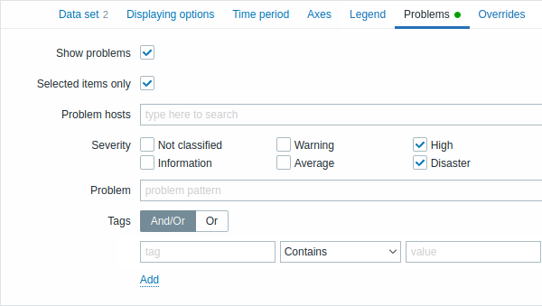
| Show problems | Mark this checkbox to enable problem displaying on the graph (unmarked, i.e. disabled by default). |
| Selected items only | Mark this checkbox to include problems for the selected items only to be displayed on the graph. |
| Problem hosts | Select the problem hosts to be displayed on the graph. Wildcard patterns may be used (for example, * will return results that match zero or more characters). To specify a wildcard pattern, just enter the string manually and press Enter. While you are typing, note how all matching hosts are displayed in the dropdown. |
| Severity | Mark problem severities to filter problems to be displayed on the graph. If no severities are marked, all problems will be displayed. |
| Problem | Specify the problem's name to be displayed on the graph. |
| Tags | Specify problem tags to limit the number of problems displayed in the widget. It is possible to include as well as exclude specific tags and tag values. Several conditions can be set. Tag name matching is always case-sensitive. There are several operators available for each condition: Exists - include the specified tag names Equals - include the specified tag names and values (case-sensitive) Contains - include the specified tag names where the tag values contain the entered string (substring match, case-insensitive) Does not exist - exclude the specified tag names Does not equal - exclude the specified tag names and values (case-sensitive) Does not contain - exclude the specified tag names where the tag values contain the entered string (substring match, case-insensitive) There are two calculation types for conditions: And/Or - all conditions must be met, conditions having the same tag name will be grouped by the Or condition Or - enough if one condition is met |
Overrides
The Overrides tab allows to add custom overrides for data sets:
Overrides are useful when several items are selected for a data set
using the * wildcard and you want to change how the items are
displayed by default (e.g. default base color or any other property).
Existing overrides (if any) are displayed in a list. To add a new override:
- Click on the
 button
 - Select hosts and items for the override. Alternatively, you may
enter host and item patterns. Wildcard patterns may be used (for
example,
*will return results that match zero or more characters). To specify a wildcard pattern, just enter the string manually and press Enter. While you are typing, note how all matching hosts are displayed in the dropdown. The wildcard symbol is always interpreted, therefore it is not possible to add, for example, an item named "item*" individually if there are other matching items (e.g. item2, item3). Host pattern and item pattern fields are mandatory. - Click on
 ,
to select override parameters. At least one override parameter
should be selected. For parameter descriptions, see the Data set
tab above.
,
to select override parameters. At least one override parameter
should be selected. For parameter descriptions, see the Data set
tab above.
Information displayed by the graph widget can be downloaded as a .png image using the widget menu:
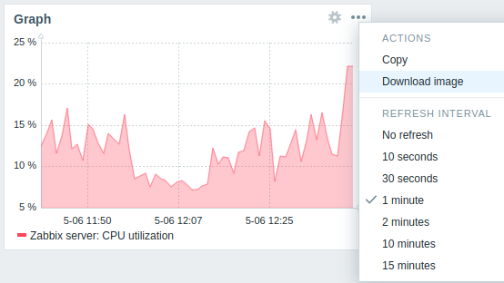
A screenshot of the widget will be saved to the Downloads folder.