
7. Радиальный датчик
Обзор
Радиальный датчик отображает значение отдельного элемента данных в виде шкалы спидометра.
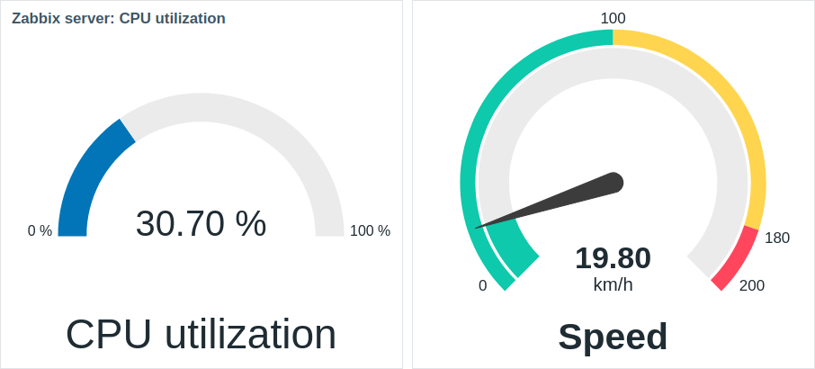
После настройки виджет может состоять из следующих элементов:
- Описание элемента данных (например, «Утилизация процессора (CPU utilization)» или «Скорость (Speed)»)
- Значение элемента данных (например, «30.70» или «19.80»)
- Единицы измерения элемента данных (например, «%» или «км/ч (km/h)»)
- Масштаб шкалы (например, «0%/100%» или «0/100/180/200»)
- Дуга шкалы (дуга значения и дуга пороговых значений датчика)
- Стрелка шкалы
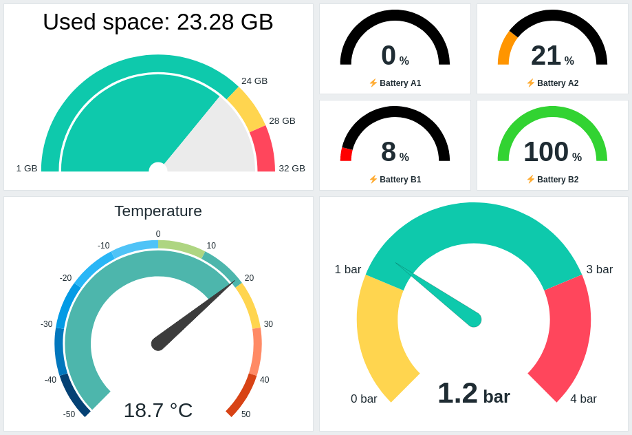
Визуальную настройку виджета можно выполнить с помощью параметров расширенной настройки, что позволяет создавать самые разнообразные визуальные стили:
Радиальный датчик может отображать только числовые значения. Отображение бинарных значений не поддерживается.
Нажатие на виджет радиального датчика приводит к отображению графика для соответствующего элемента данных.
Настройка
Для настройки выберите Радиальный датчик (Gauge) в качестве типа:
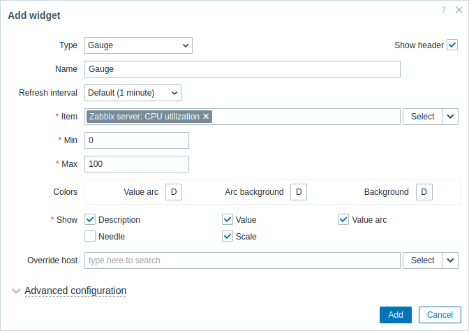
В дополнение к параметрам, которые являются общими для всех виджетов, вы можете выставить следующие специфичные опции:
| Элемент данных (Item) |
Выберите элемент данных. В качестве альтернативы выберите для элементов данных в качестве источника данных совместимый виджет. Это поле с функцией автодополнения; таким образом, после начала ввода имени элемента данных будет автоматически предложен список совпадающих элементов данных в выпадающем меню. Обратите внимание, что вы можете выбрать только элементы данных, которые возвращают числовые значения. |
| Мин (Min) |
Введите минимальное значение шкалы. Поддерживаются суффиксы (например, «1d», «2w», «4K», «8G»). Поддерживаются преобразования значений. |
| Макс (Max) |
Введите максимальное значение шкалы. Поддерживаются суффиксы (например, «1d», «2w», «4K», «8G»). Поддерживаются преобразования значений. |
| Цвета (Colors) |
Выберите цвет из палитры: Значение дуги (Value arc) — выберите цвет дуги значений радиального датчика; Фон дуги (Arc background) — выберите цвет фона дуги значений и дуги пороговых значений радиального датчика; Фон (Background) — выберите цвет фона радиального датчика. «D» обозначает цвет по умолчанию, который зависит от темы веб-интерфейса. Если заданы Пороги (Thresholds), цвет по умолчанию для Значения дуги (Value arc) зависит от цвета порога. Чтобы вернуться к цвету по умолчанию, нажмите кнопку Использовать умолчание (Use default) в палитре. |
| Показать (Show) |
Отметьте флажок для отображения соответствующего элемента радиального датчика — описание (description), значение (value), дага значений (value arc), стрелка (needle), шкала (scale) (минимальное и максимальное значение радиального датчика в начале и в конце дуги значений). Снимите флажок, чтобы скрыть. Должен быть выбран хотя бы один элемент. Обратите внимание, что стрелка и шкала радиального датчика могут отображаться, если отображается дуга значений или дуга пороговых значений (смотрите опции расширенной настройки). Также обратите внимание, что если отображается стрелка радиального датчика, значение располагается под стрелкой; если же стрелка скрыта, значение выравнивается по нижнему краю дуги. |
| Переопределение узла сети (Override host) |
Выберите для узла сети в качестве источника данных совместимый виджет или панель. Этот параметр недоступен при настройке виджета на панели шаблона. |
| Расширенная настройка (Advanced configuration) |
Нажмите на заголовок Расширенная настройка (Advanced configuration) для отображения опций расширенной настройки. Здесь же вы сможете настроить элементы радиального датчика, выбранные в поле Показать (Show). |
Расширенная настройка
Параметры расширенной настройки доступны в сворачиваемом разделе Расширенная настройка (Advanced configuration):
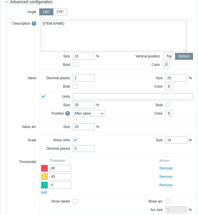
| Угол (Angle) | Выберите угол шкалы (180° или 270°). |
| Описание (Description) | |
| Описание (Description) |
Введите описание элемента данных. Это описание может переопределять название элемента данных по умолчанию. Поддерживаются многострочные описания. Допустима комбинация текста и поддерживаемых макросов. Поддерживаются макросы {HOST.*}, {ITEM.*}, {INVENTORY.*} и пользовательские макросы. |
| Размер (Size) | Введите высоту шрифта для описания элемента данных (в процентах, относительно общей высоты виджета). |
| Расположение по вертикали (Vertical position) |
Выберите расположение по вертикали описания элемента данных (по верхнему либо нижнему краю, относительно дуги шкалы). |
| Жирный (Bold) | Установите флажок, чтобы описание отображалось жирным шрифтом. |
| Цвет (Color) |
Выберите из палитры цветов цвет описания элемента данных. «D» означает цвет по умолчанию (зависит от темы веб-интерфейса). Чтобы вернуться к значению по умолчанию, нажмите в палитре кнопку Использовать умолчание (Use default). |
| Значение (Value) | |
| Число десятичных знаков (Decimal places) |
Введите количество десятичных знаков, отображаемых со значением. Эта опция влияет только на элементы данных, которые возвращают значения с типом числовой (с плавающей точкой). |
| Размер (Size) | Введите высоту шрифта для значения (в процентах, относительно высоты дуги). |
| Жирный (Bold) | Установите флажок, чтобы значение отображалось жирным шрифтом. |
| Цвет (Color) |
Выберите из палитры цветов цвет значения. «D» означает цвет по умолчанию (зависит от темы веб-интерфейса). Чтобы вернуться к значению по умолчанию, нажмите в палитре кнопку Использовать умолчание (Use default). |
| Единицы измерения (Units) | |
| Единицы измерения (Units) |
Установите флажок, чтобы вместе со значением элемента данных отображались единицы измерения. Если вы вводите название единицы измерения, это переопределит единицы измерения, заданные в настройках элемента данных. |
| Размер (Size) | Введите высоту шрифта для единиц измерения элемента данных (в процентах, относительно высоты дуги). |
| Жирный (Bold) | Установите флажок, чтобы единицы измерения отображались жирным шрифтом. |
| Расположение (Position) |
Выберите расположение единиц измерения элемента данных (выше, ниже, перед или после, относительно значения элемента данных). Эта опция игнорируется для слудещих единиц измерения, относящихся ко времени: unixtime, uptime, s. |
| Цвет (Color) |
Выберите из палитры цветов цвет единиц измерения. «D» означает цвет по умолчанию (зависит от темы веб-интерфейса). Чтобы вернуться к значению по умолчанию, нажмите в палитре кнопку Использовать умолчание (Use default). |
| Значение дуги (Value arc) | |
| Размер дуги (Arc size) |
Введите высоту значения дуги радиального датчика (в процентах, относительно радиуса дуги). |
| Стрелка (Needle) | |
| Цвет (Color) |
Выберите из палитры цветов цвет стрелки радиального датчика. «D» означает цвет по умолчанию (зависит от темы веб-интерфейса). Если заданы Пороги, цвет по умолчанию для стрелки зависит от цвета порога . Чтобы вернуться к значению по умолчанию, нажмите в палитре кнопку Использовать умолчание (Use default). |
| Шкала (Scale) | |
| Показывать единицы измерения (Show units) |
Установите флажок, чтобы вместе с минимальным и максимальным значением шкалы отображались единицы измерения. |
| Размер (Size) |
Введите высоту шрифта для минимального и максимального значения шкалы (в процентах, относительно высоты дуги шкалы). |
| Число десятичных знаков (Decimal places) |
Введите количество десятичных знаков, отображаемых с минимальным и максимальным значением шкалы. Эта опция влияет только на элементы данных, которые возвращают значения с типом числовой (с плавающей точкой). |
| Пороги (Thresholds) | |
| Пороги (Thresholds) |
Нажмите Добавить (Add) для добавления порога, выберите цвет порога из палитры и укажите числовое значение. При сохранении список порогов будет отсортирован в возрастающем порядке. Обратите внимание, что цвета, настроенные для порогов, будут правильно отображаться только для числовых элементов данных. Поддерживаются суффиксы (например, «1d», «2w», «4K», «8G»). Поддерживаются преобразования значений. |
| Показывать подписи (Show labels) | Установите флажок, чтобы пороговые значения отображались как подписи на шкале. |
| Показать дугу (Show arc) | Установите флажок, чтобы отображалась дуга порогов. |
| Размер дуги (Arc size) |
Введите высоту дуги порогов (в процентах, относительно радиуса дуги значений). |
Информация, отображаемая виджетом радиального датчика, может быть загружена как изображение .png, используя меню виджетов:
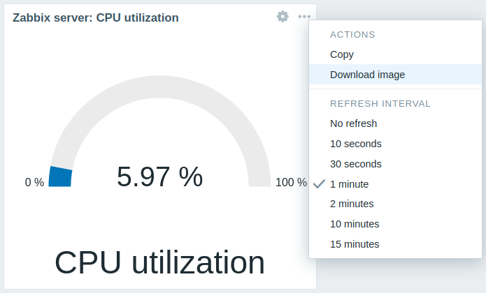
Снимок экрана виджета будет сохранён в папку Загрузки (Downloads).