
7 ゲージ
概要
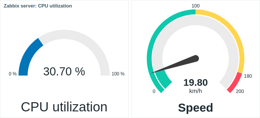
ゲージウィジェットは、単一項目の値をゲージとして表示します。
設定時、ウィジェットは以下の要素で構成されます:
- 項目説明(例:「CPU使用率」、「速度」)
- 項目値(例:「30.70」、「19.80」)
- 項目値の単位(例:「%」、「km/h」)
- ゲージの目盛り(例:「0%/100%」、「0/100/180/200」) -ゲージアーク(ゲージ値アークとゲージしきい値アーク) -ゲージ針
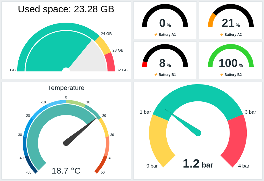
ウィジェットは詳細設定オプションを使用して視覚的に微調整でき、多様なビジュアルスタイルを作成できます:
ゲージウィジェットは数値のみ表示可能です。二進値の表示はサポートされていません。ゲージウィジェットをクリックすると、該当項目のグラフが表示されます。
設定
設定するには、タイプとして Gauge を選択します:
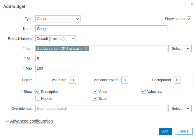
すべてのウィジェットに共通のパラメータに加えて、次の固有オプションを設定できます:
| Item | アイテムを選択します。 または、アイテムのdata sourceとして互換性のあるウィジェットを選択します。 このフィールドはオートコンプリートに対応しているため、アイテム名の入力を開始すると一致するアイテムのドロップダウンが表示されます。 数値[/manual/config/items/item#configuration]データを返すアイテムのみ選択できることに注意してください。 |
| Min | Gauge の最小値を入力します。 接尾辞(たとえば "1d"、"2w"、"4K"、"8G")がサポートされています。値のマッピングがサポートされています。 |
| Max | Gauge の最大値を入力します。 接尾辞(たとえば "1d"、"2w"、"4K"、"8G")がサポートされています。値のマッピングがサポートされています。 |
| Colors | カラーピッカーから色を選択します: Value arc - gauge の値の弧の色を選択します; Arc background - gauge の値の弧と gauge のしきい値の弧の背景色を選択します; Background - ウィジェットの背景色を選択します。 "D" はデフォルト色を表し、Webインターフェースのテーマに依存します。Thresholds が設定されている場合、Value arc のデフォルト色はしきい値の色に依存します。デフォルト色に戻すには、カラーピッカーの Use default ボタンをクリックします。 |
| Show | 対応する gauge 要素 - 説明、値、値の弧、針、スケール(gauge 弧の開始点と終了点における gauge の最小値と最大値) - を表示するには、チェックボックスをオンにします。非表示にするにはオフにします。少なくとも 1 つの要素を選択する必要があります。 gauge の値の弧または gauge のしきい値の弧(advanced configuration オプションを参照)が表示されている場合、gauge の針とスケールを表示できることに注意してください。また、gauge の針が表示されている場合、値は針の下に配置されます。針が非表示の場合、値は gauge 弧の下端に揃えられます。 |
| Override host | ホストのdata sourceとして、互換性のあるウィジェットまたはダッシュボードを選択します。 このパラメータは、テンプレートダッシュボードでウィジェットを設定する場合は使用できません。 |
| Advanced configuration | Advanced configuration 見出しをクリックすると、advanced configuration オプションが表示されます。ここでは、Show フィールドで選択した gauge 要素を調整することもできます。 |
詳細設定
折りたたみ可能な詳細設定セクションで、詳細設定オプションを利用できます。
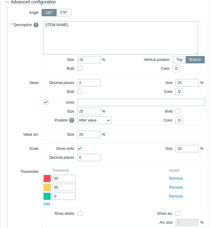
| 角度 | ゲージの角度(180°または270°)を選択します。 |
| 説明 | |
| 説明 | アイテムの説明を入力します。この説明はデフォルトのアイテム名よりも優先される場合があります。 複数行の説明がサポートされています。テキストとサポートされているマクロの組み合わせが可能です。 {HOST.*}、{ITEM.*}、{INVENTORY.*}、およびユーザーマクロがサポートされています。 |
| サイズ | アイテムの説明のフォントサイズの高さを(ウィジェット全体の高さに対する割合で)入力します。 |
| 垂直位置 | アイテムの説明の垂直位置(ゲージアークに対する上または下)を選択します。 |
| 太字 | アイテムの説明を太字で表示するには、チェックボックスをオンにします。 |
| 色 | カラーピッカーからアイテムの説明の色を選択します。 "D"はデフォルトの色を表し、フロントエンドのテーマによって異なります。デフォルトの色に戻すには、カラーピッカーのデフォルトを使用ボタンをクリックします。 |
| 値 | |
| 小数点以下の桁数 | 値に表示する小数点以下の桁数を入力します。 このオプションは、数値(浮動小数点)データを返すアイテムにのみ影響します。 |
| サイズ | 値のフォントサイズの高さを(ゲージアークの高さに対する割合で)入力します。 |
| 太字 | 値を太字で表示するには、チェックボックスをオンにしてください。 |
| 色 | カラーピッカーから値の色を選択してください。 "D"はデフォルトの色で、フロントエンドのテーマによって異なります。デフォルトの色に戻すには、カラーピッカーのデフォルトを使用ボタンをクリックしてください。 |
| 単位 | |
| 単位 | アイテムの値に単位を表示するには、チェックボックスをオンにしてください。 単位名を入力すると、アイテム設定で設定された単位が上書きされます。 |
| サイズ | アイテムの単位のフォントサイズの高さを、ゲージの円弧の高さに対するパーセントで入力します。 |
| 太字 | アイテムの単位を太字で表示するには、チェックボックスをオンにしてください。 |
| 位置 | アイテム単位の位置(アイテム値を基準として、上、下、前、後)を選択します。 このオプションは、以下の時間関連単位では無視されます:unixtime、uptime、s。 |
| 色 | カラーピッカーからアイテム単位の色を選択します。 "D"はデフォルトの色で、フロントエンドテーマによって異なります。デフォルトの色に戻すには、カラーピッカーのデフォルトを使用ボタンをクリックします。 |
| 値円弧 | |
| 円弧サイズ | ゲージ値円弧の高さをパーセントで入力します(ゲージ円弧半径に対する相対値) |
| 針 | |
| 色 | カラーピッカーからゲージ針の色を選択します。 "D"はデフォルトの色で、フロントエンドテーマによって異なります。しきい値が設定されている場合、針のデフォルトの色はしきい値の色によって異なります。デフォルトの色に戻すには、カラーピッカーのデフォルトを使用ボタンをクリックします。 |
|スケール|<|
|単位を表示|ゲージの最小値と最大値に単位を表示するには、チェックボックスをオンにします。|
|サイズ|ゲージの最小値と最大値のフォントサイズの高さを入力します(ゲージの円弧の高さに対するパーセント単位)。|
|小数点以下の桁数|ゲージの最小値と最大値に表示する小数点以下の桁数を入力します。
このオプションは、数値(浮動小数点)データを返すアイテムにのみ影響します。|
|しきい値|<|
|しきい値|しきい値を追加するには、[追加] をクリックし、カラーピッカーからしきい値の色を選択して数値を指定します。
しきい値リストは、保存時に昇順に並べ替えられます。
しきい値として設定された色は、数値項目に対してのみ正しく表示されることに注意してください。
サフィックス (例: "1d"、"2w"、"4K"、"8G") がサポートされています。値のマッピング がサポートされています。|
|ラベルを表示|チェックボックスをオンにすると、しきい値がゲージスケールのラベルとして表示されます。|
|円弧を表示|チェックボックスをオンにすると、ゲージしきい値の円弧が表示されます。|
|円弧のサイズ|ゲージしきい値の円弧の高さを、ゲージ円弧の半径に対するパーセントで入力します。|
ゲージウィジェットに表示される情報は、ウィジェットメニューを使用して .png 画像としてダウンロードできます。
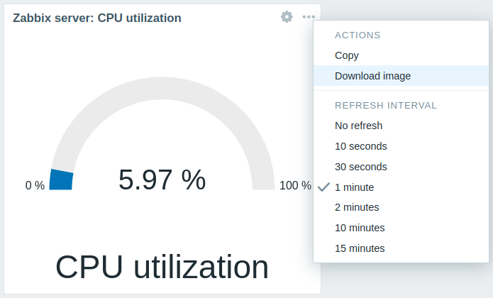
ウィジェットのスクリーンショットは Downloads フォルダに保存されます。