
このページで
2 カスタムグラフ
概要
カスタムグラフは、その名の通りカスタマイズ機能を提供します。
シンプルグラフは単一のアイテムのデータを表示するのに適していますが、設定機能はありません。
したがって、グラフのスタイルや線の表示方法を変更したい場合や、複数のアイテム(例えば、1つのグラフで受信トラフィックと送信トラフィックを比較したい場合)を比較したい場合は、カスタムグラフが必要です。
カスタムグラフは手動で設定します。
ホストまたは複数のホスト、または単一のテンプレートに対して作成できます。
カスタムグラフの設定
カスタムグラフを作成するには、次の手順を実行します。
- データ収集 > ホスト(またはテンプレート) に移動する
- 対象のホストまたはテンプレートの行にある Graphs をクリックする
- Graphs 画面で Create graph をクリックする
- グラフ属性を編集する
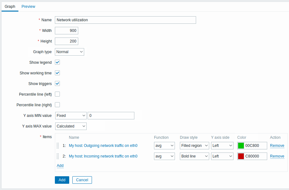
必須入力フィールドには、赤いアスタリスクが付いています。
グラフ属性:
| Parameter | Description | |
|---|---|---|
| Name | 一意のグラフ名。 このフィールドでは式 macros がサポートされていますが、 avg、last、min、max 関数のみ、かつ時間をパラメータとして使用する場合に限ります(例: {?avg(/host/key,1h)})。{HOST.HOST<1-9>} マクロは、このマクロ内で使用でき、グラフ内の1番目、2番目、3番目などのホストを参照します。例: {?avg(/{HOST.HOST2}/key,1h)}。なお、このマクロで1番目のホストを参照するのは冗長です。1番目のホストは暗黙的に参照できるため、例: {?avg(//key,1h)}。 |
|
| Width | グラフの幅(ピクセル単位、プレビューおよび円グラフ/分割円グラフのみ)。 | |
| Height | グラフの高さ(ピクセル単位)。 | |
| Graph type | グラフの種類: Normal - 通常のグラフ。値は線で表示されます Stacked - 積み上げグラフ。塗りつぶし領域で表示されます Pie - 円グラフ Exploded - 「分割」円グラフ。各部分が円から「切り出された」ように表示されます |
|
| Show legend | このチェックボックスをオンにすると、グラフの凡例が表示されます。 | |
| Show working time | 選択すると、非稼働時間が灰色の背景で表示されます。このパラメータは円グラフおよび分割円グラフでは使用できません。 | |
| Show triggers | 選択すると、simple triggers が、トリガーの深刻度の色の上に黒い破線付きの線として表示されます。このパラメータは円グラフおよび分割円グラフでは使用できません。 | |
| Percentile line (left) | 左Y軸のパーセンタイルを表示します。たとえば95%パーセンタイルを設定すると、値の95%がその下に収まるレベルにパーセンタイル線が表示されます。明るい緑色の線で表示されます。通常のグラフでのみ使用できます。 | |
| Percentile line (right) | 右Y軸のパーセンタイルを表示します。たとえば95%パーセンタイルを設定すると、値の95%がその下に収まるレベルにパーセンタイル線が表示されます。明るい赤色の線で表示されます。通常のグラフでのみ使用できます。 | |
| Y axis MIN value | Y軸の最小値: Calculated - Y軸の最小値が自動計算されます。 Fixed - Y軸の最小値を固定します。 Item - 選択したアイテムの最新値が最小値になります。 このパラメータは円グラフおよび分割円グラフでは使用できません。 |
|
| Y axis MAX value | Y軸の最大値: Calculated - Y軸の最大値が自動計算されます。 Fixed - Y軸の最大値を固定します。 Item - 選択したアイテムの最新値が最大値になります。 このパラメータは円グラフおよび分割円グラフでは使用できません。 |
|
| 3D view | 3Dスタイルを有効にします。円グラフおよび分割円グラフでのみ使用できます。 | |
| Items | このグラフに表示するデータのアイテム。アイテムを選択するには Add をクリックします。表示オプション(関数、描画スタイル、左/右軸の表示、色)も選択できます。 | |
| Sort order (0→100) | 描画順序。0が最初に処理されます。他の線や領域の背後(または前面)に描画するために使用できます。 行の先頭にあるアイコンを使用してアイテムをドラッグ&ドロップし、並び順や、どのアイテムを他のアイテムより前面に表示するかを設定できます。 |
|
| Name | 選択したアイテムの名前がリンクとして表示されます。リンクをクリックすると、利用可能な他のアイテムの一覧が開きます。 | |
| Type | 種類(円グラフおよび分割円グラフでのみ使用可能): Simple - アイテムの値が円グラフ上に比例表示されます Graph sum - アイテムの値が円全体を表します 「graph sum」アイテムの色は、「proportional」アイテムによって占有されていない範囲でのみ表示される点に注意してください。 |
|
| Function | アイテムについて、縦方向のグラフ1ピクセルあたりに複数の値が存在する場合に表示する値を選択します: all - 可能なすべての値(最小、最大、平均)をグラフに表示します。短い期間ではこの設定は影響しません。縦方向のグラフ1ピクセルにデータが集中する長い期間でのみ、'all' は最小、最大、平均を表示し始めます。この関数は Normal グラフタイプでのみ使用できます。参照: グラフの生成 from history/trends。 avg - 平均値を表示します last - 最新値を表示します。この関数は、グラフタイプとして Pie/Exploded pie が選択されている場合にのみ使用できます。 max - 最大値を表示します min - 最小値を表示します |
|
| Draw style | 描画スタイルを選択します(通常のグラフでのみ使用可能。積み上げグラフでは塗りつぶし領域が常に使用されます)。アイテムデータに適用するスタイルは、Line、Bold line、Filled region、Dot、Dashed line、Gradient line です。 | |
| Y axis side | アイテムデータを表示するY軸の側を選択します。Left、Right。 | |
| Color | アイテムデータに適用する色を選択します。 | |
グラフのプレビュー
プレビュータブでは、グラフのプレビューが表示され、作成している内容をすぐに確認できます。
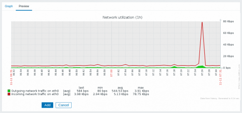
テンプレートアイテムの場合、プレビューにはデータが表示されないことに注意してください。
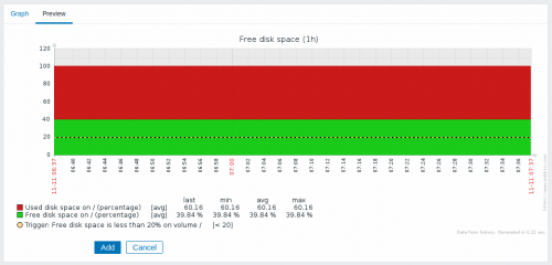
この例では、トリガーレベルを表示する破線の太線と、凡例に表示されるトリガー情報に注目してください。
表示できるトリガーラインは3本までです。
トリガーが3つ以上ある場合は、重大度の低いトリガーが優先して表示されます。
グラフの高さが120ピクセル未満に設定されている場合、凡例にはトリガーが表示されません。